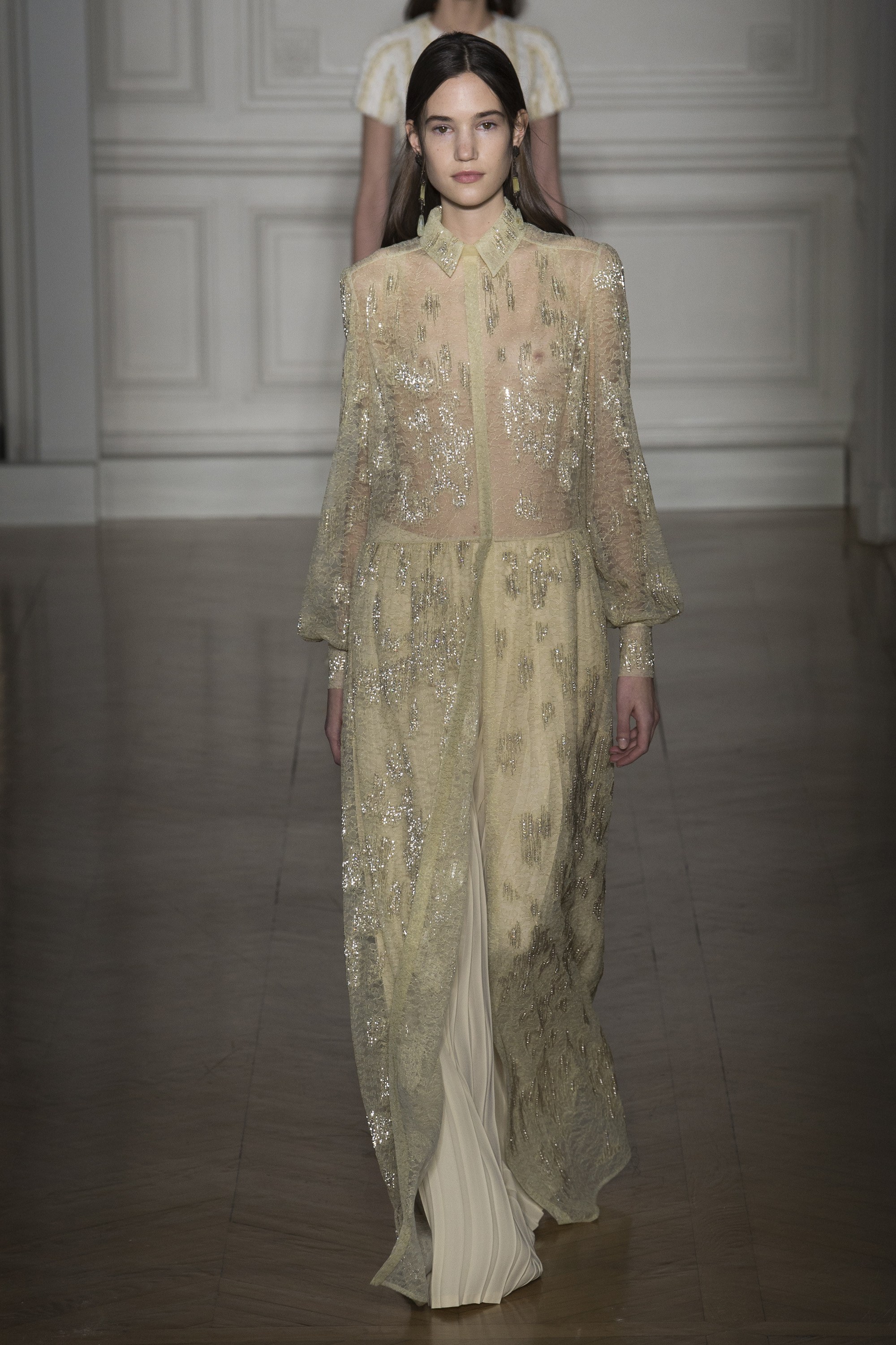
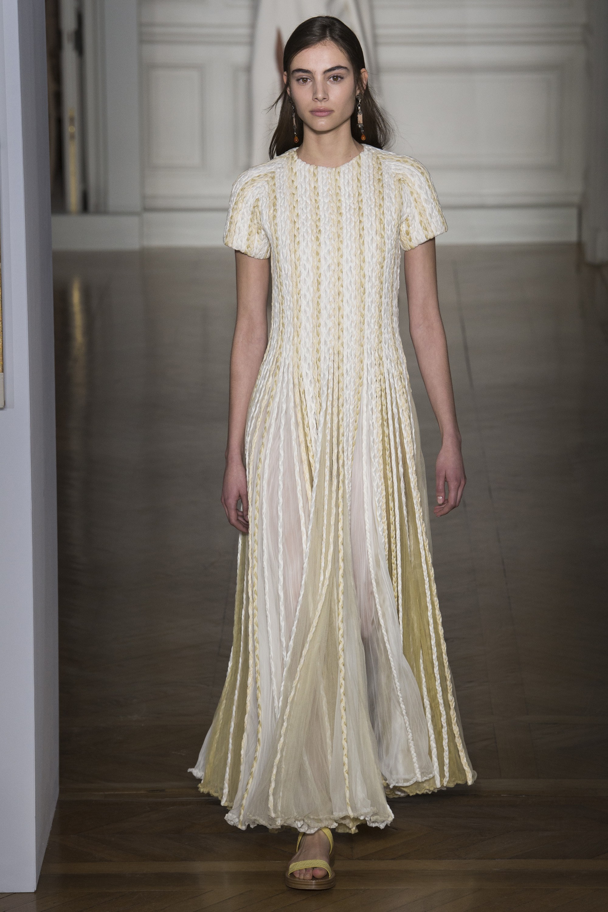
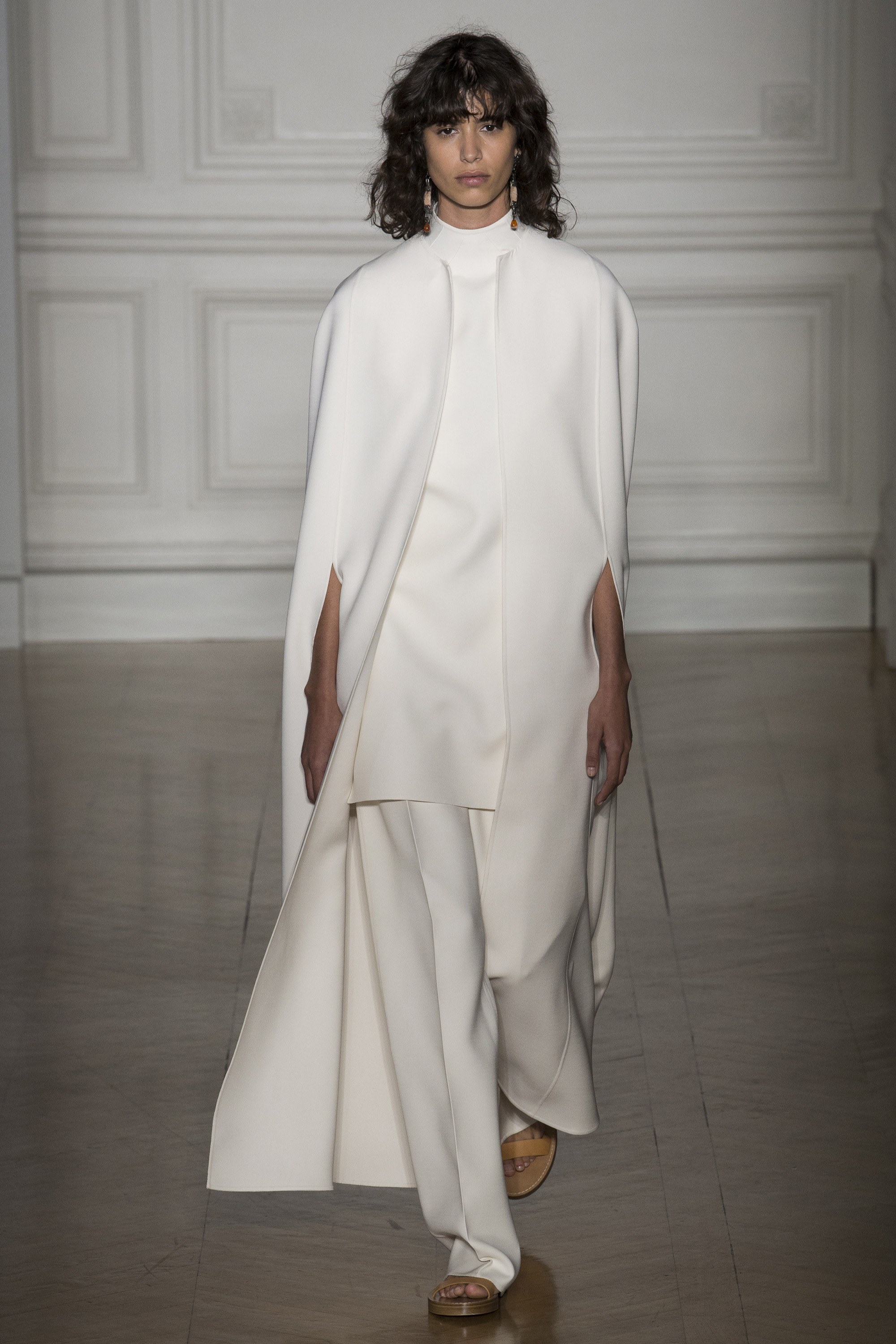
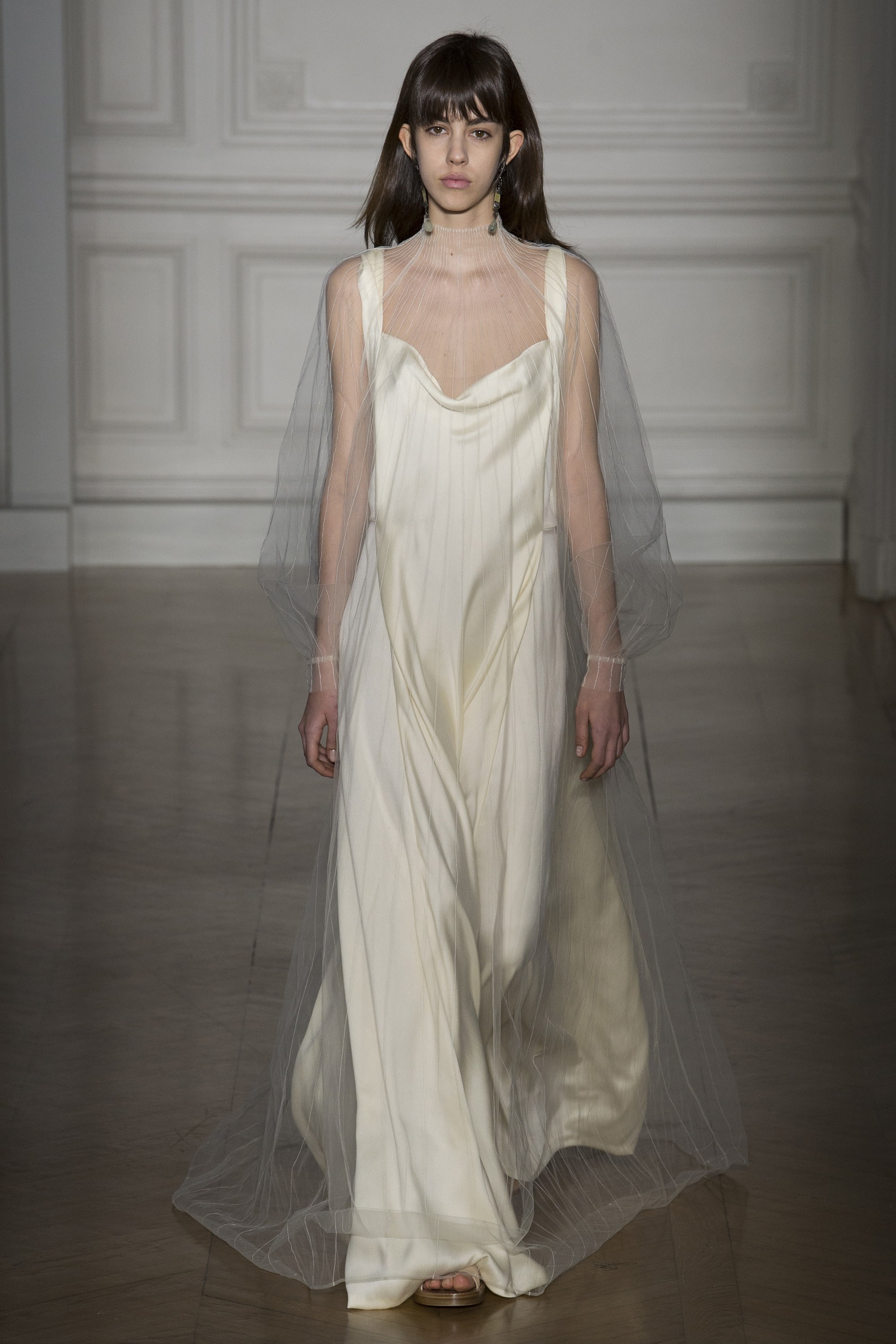
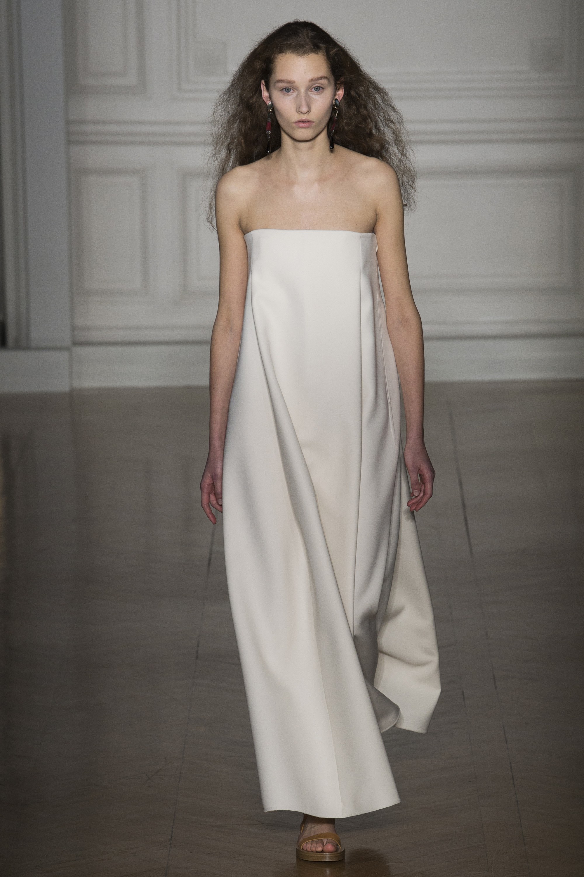
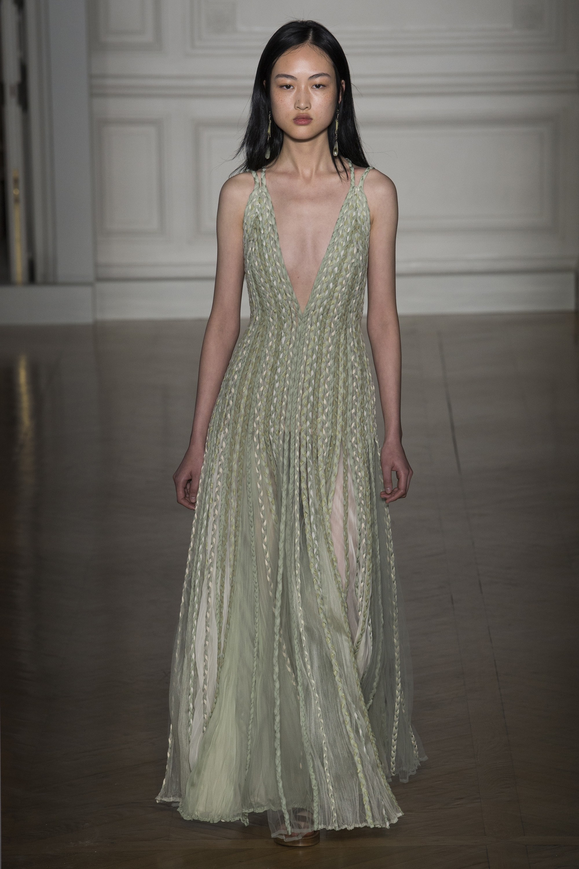
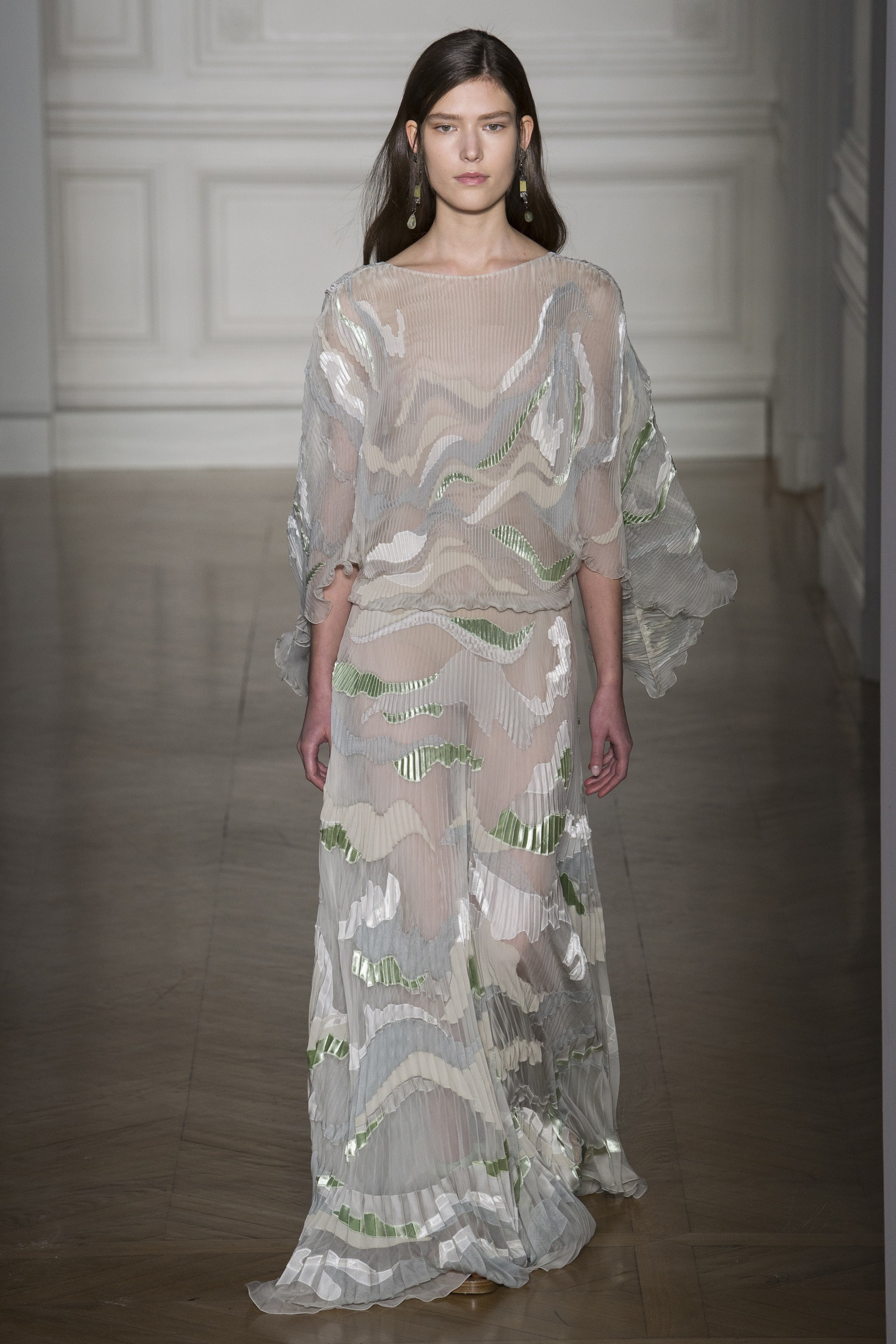
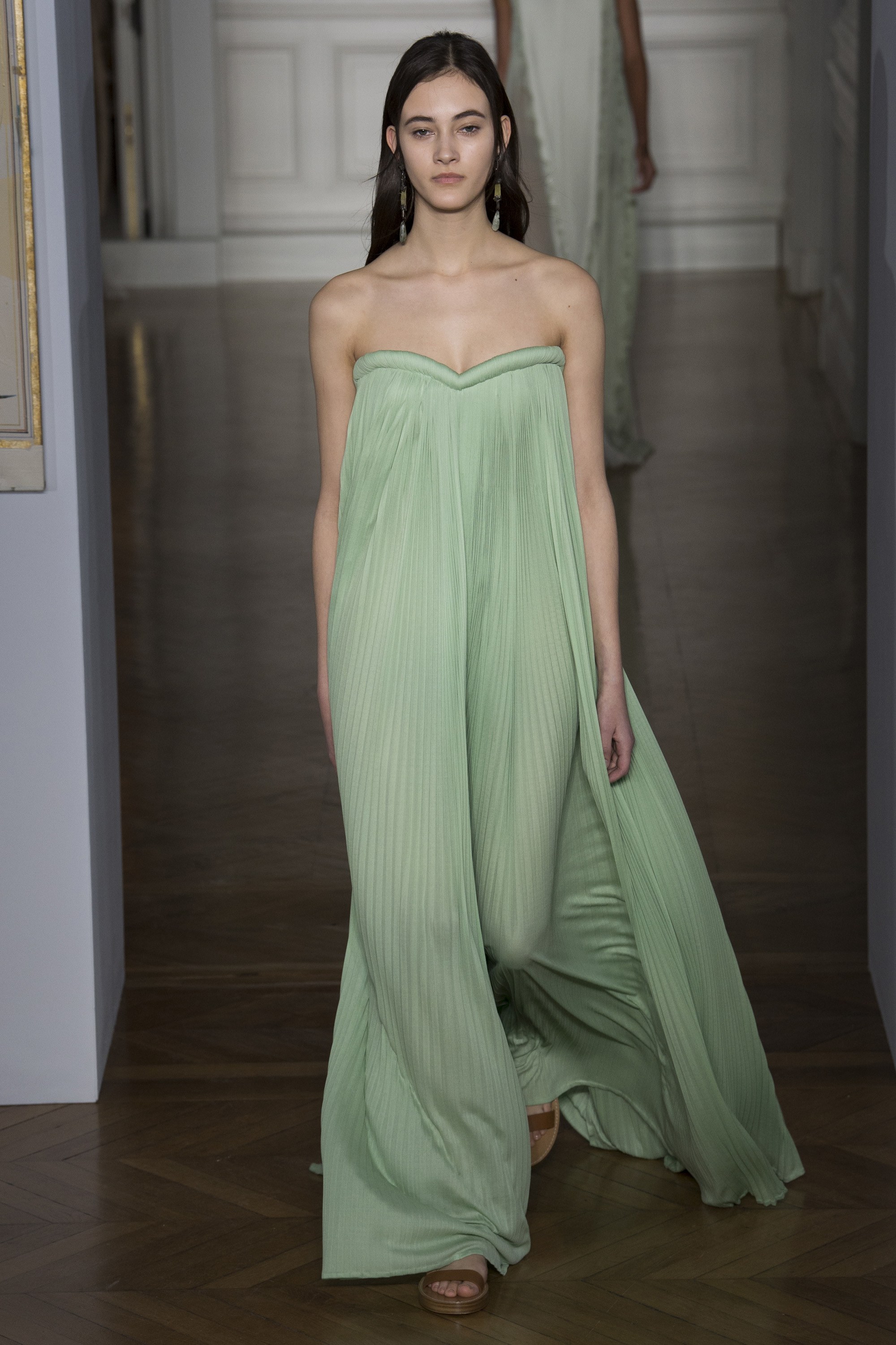
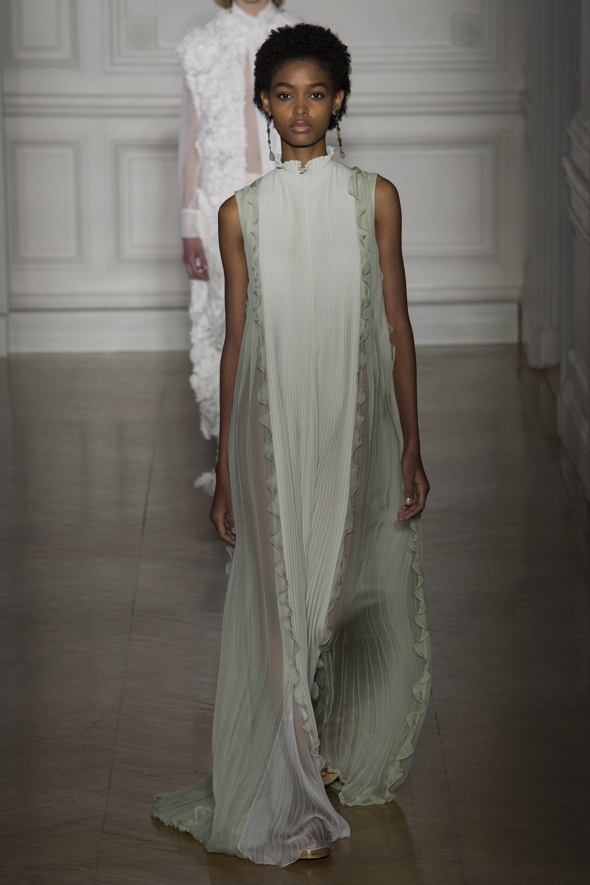
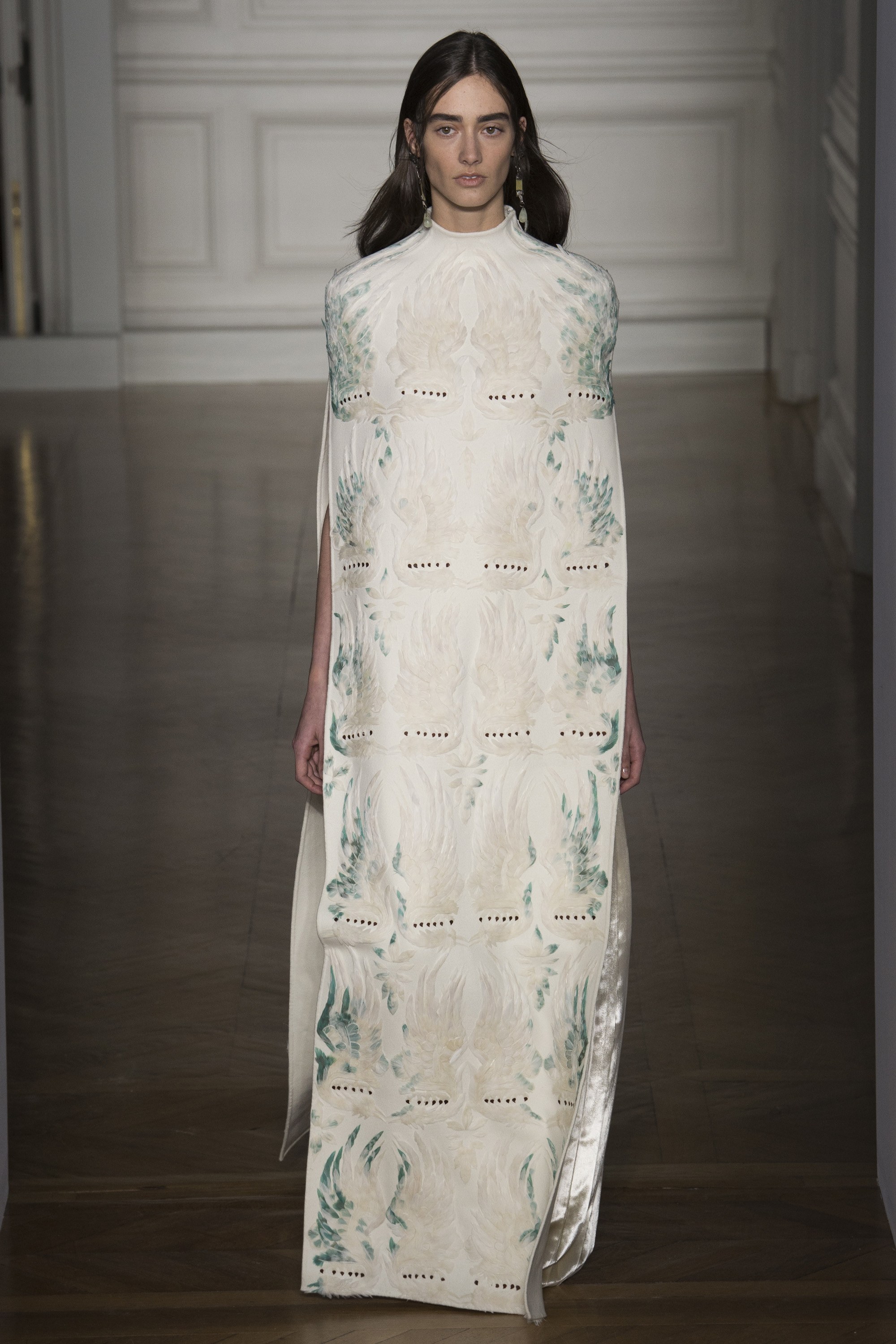
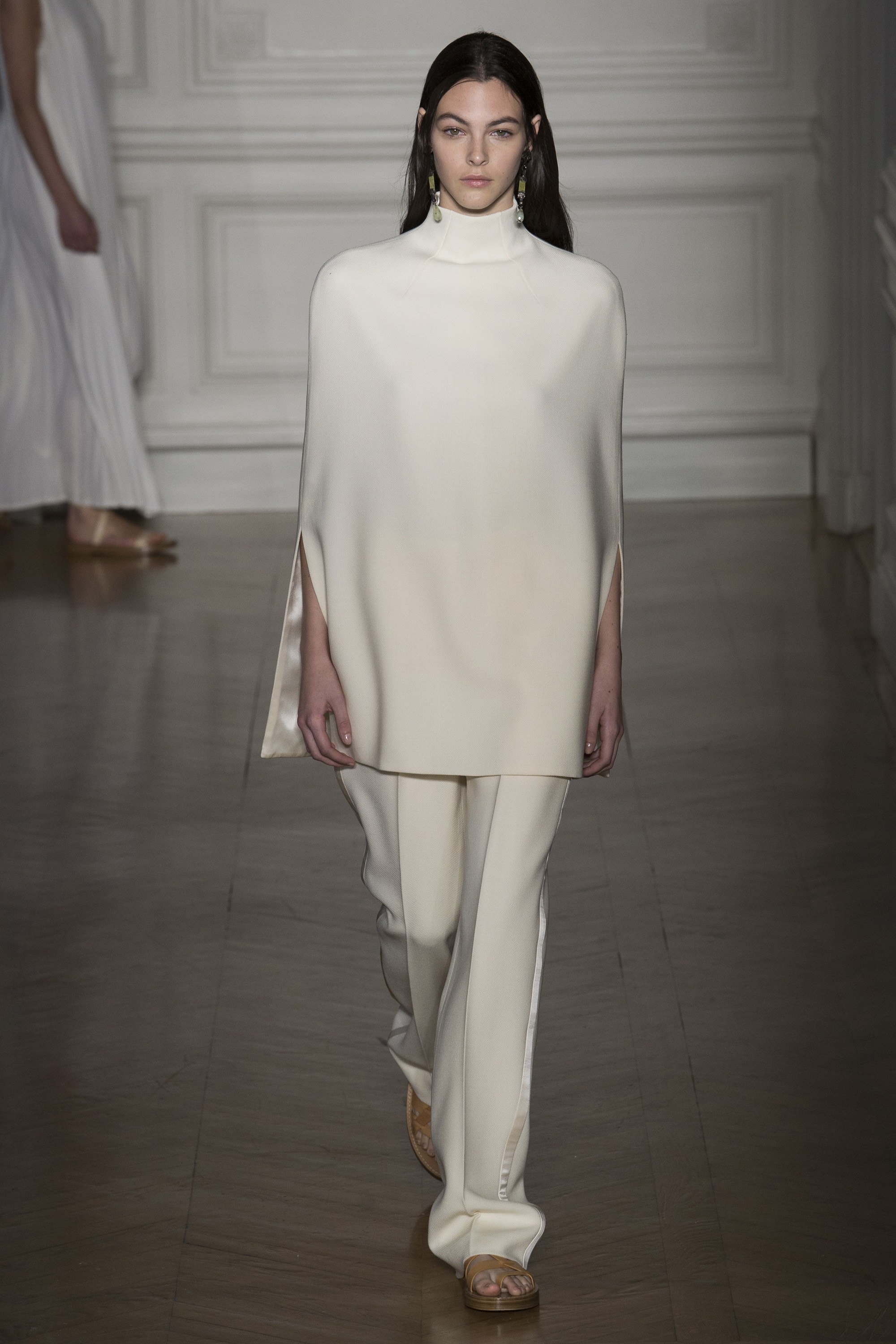
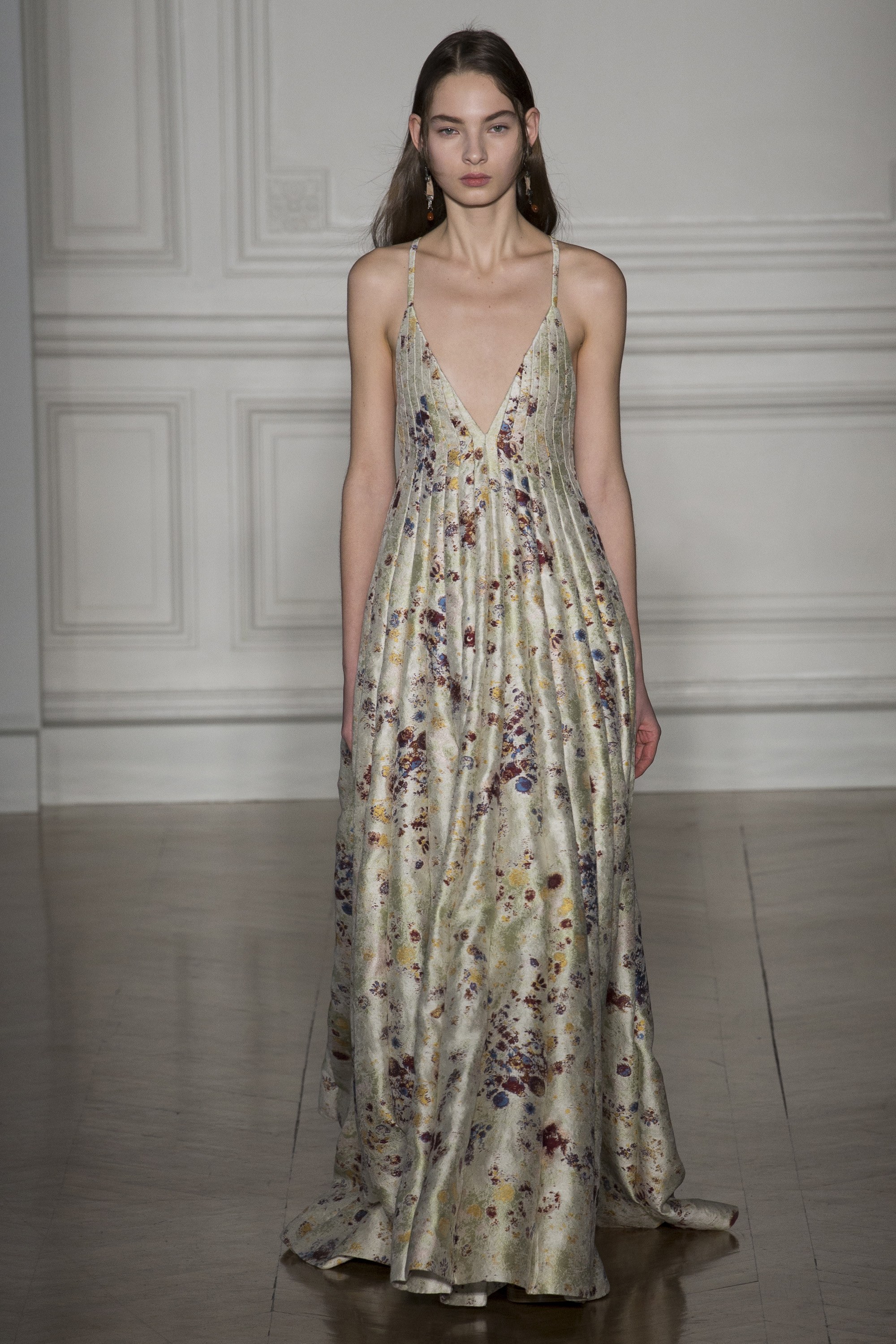
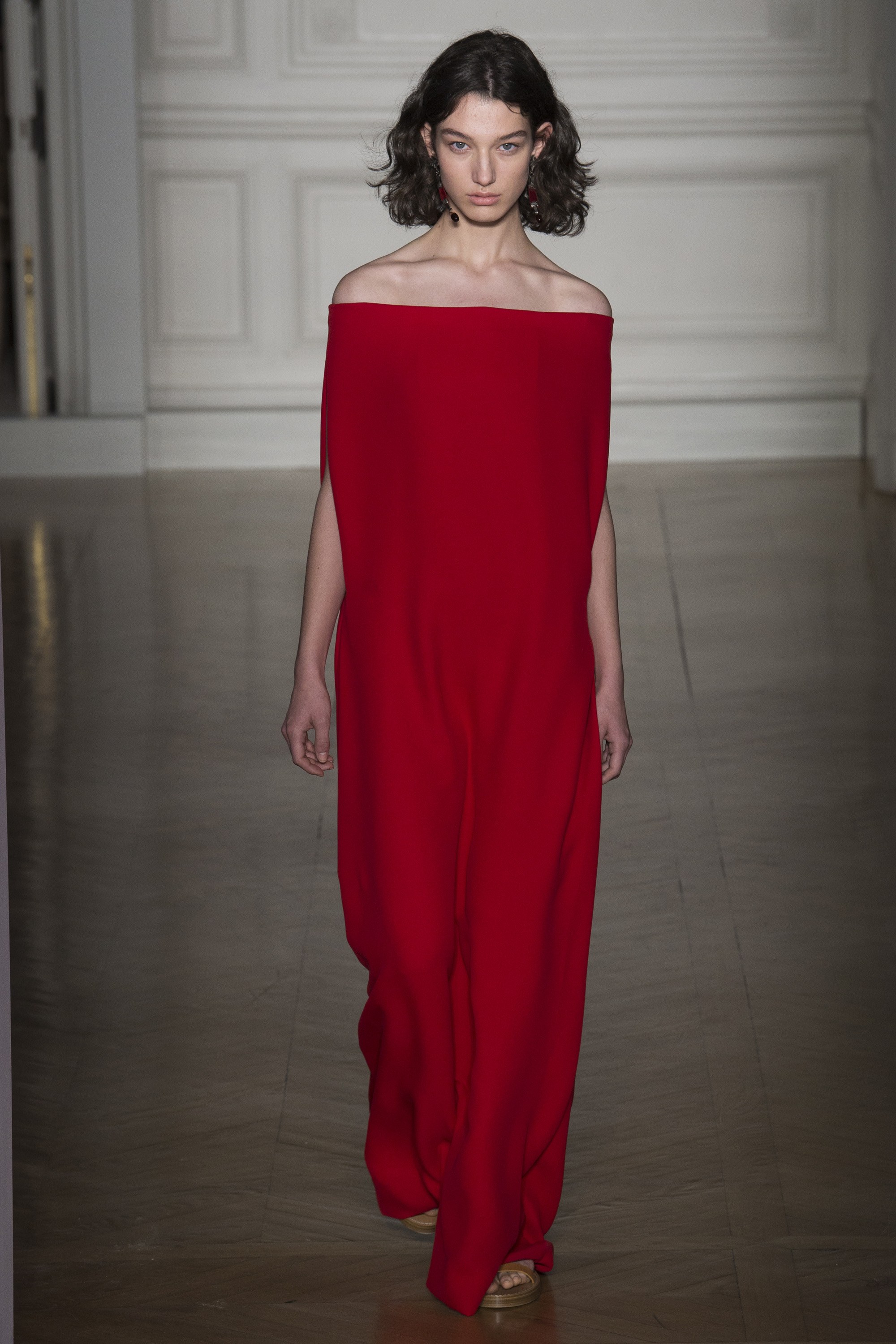
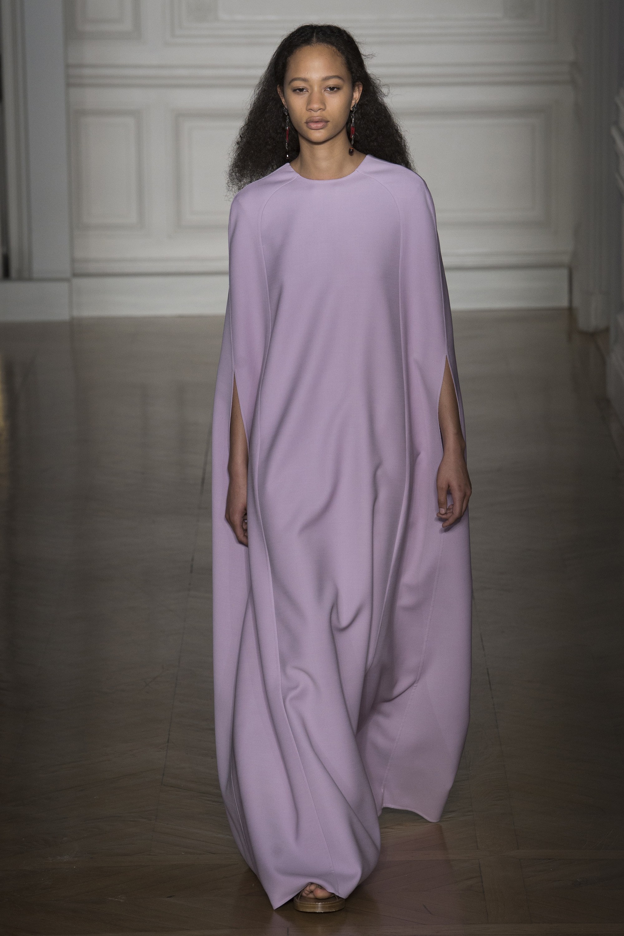
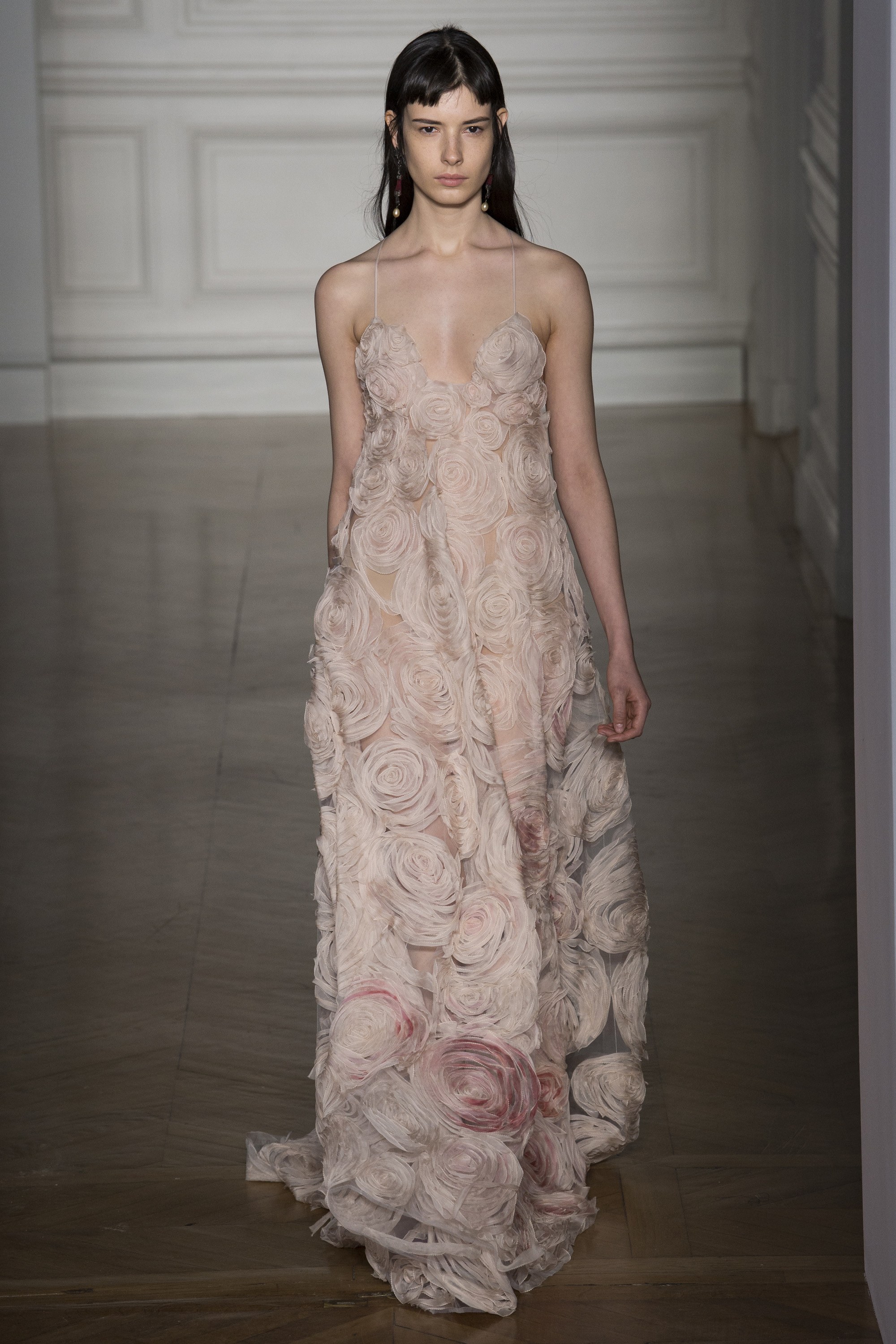
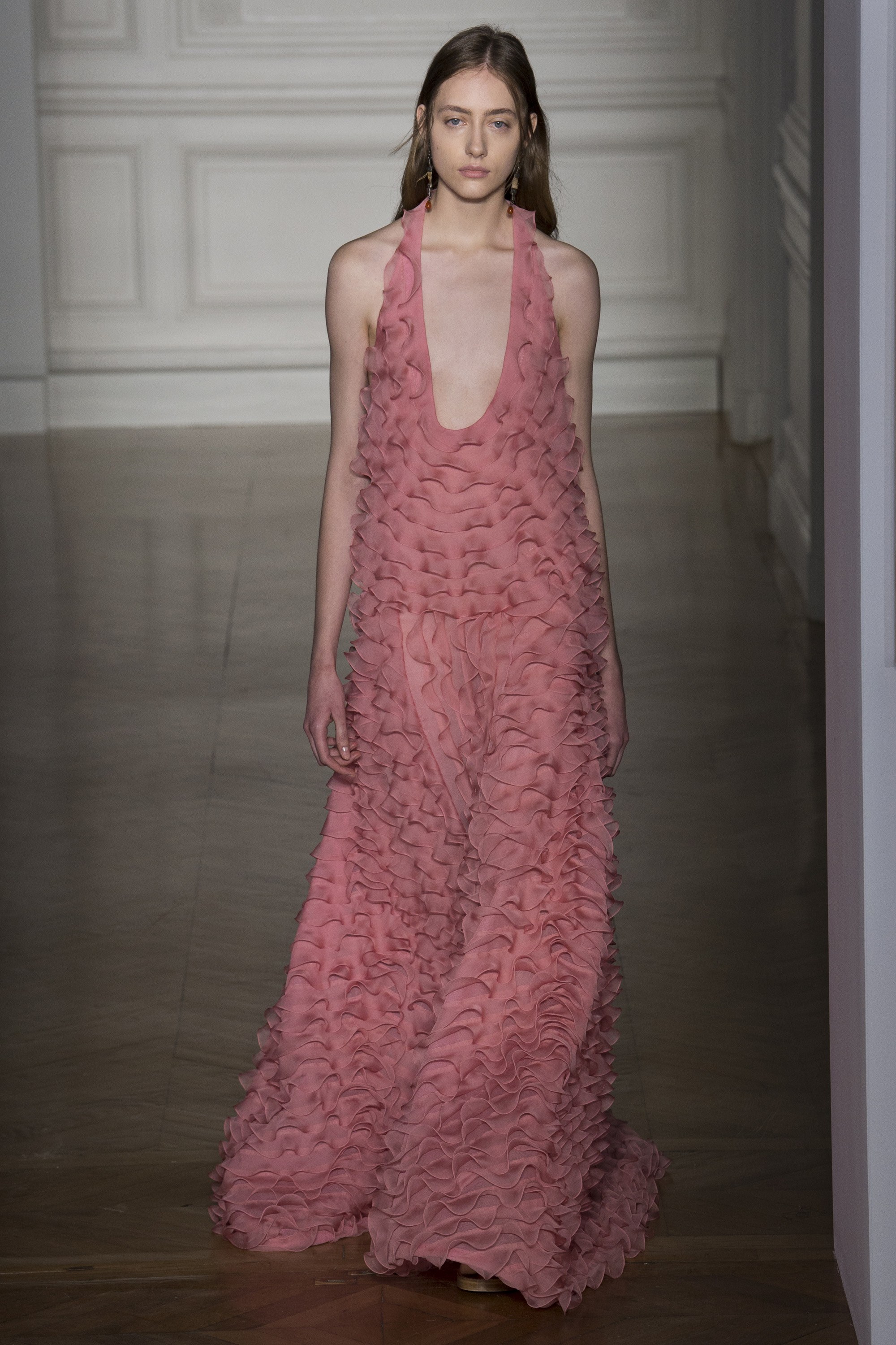
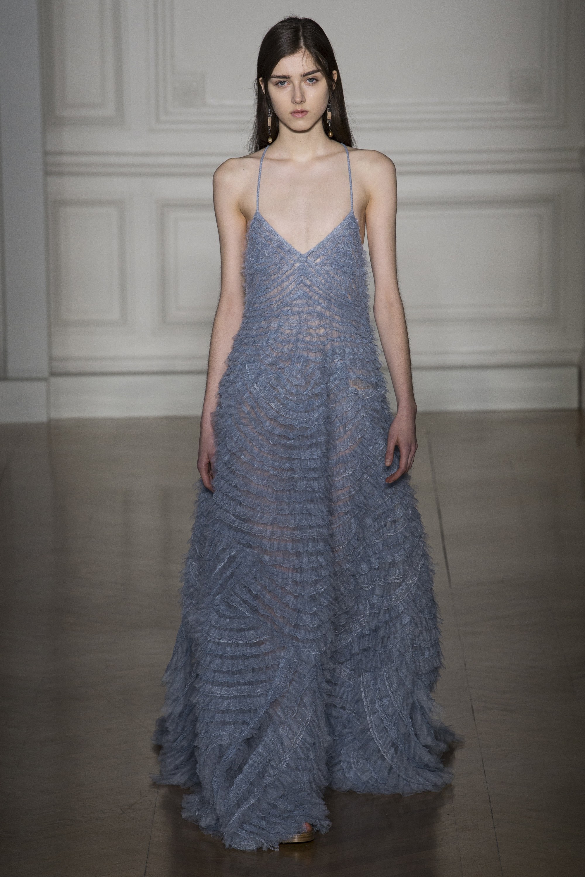
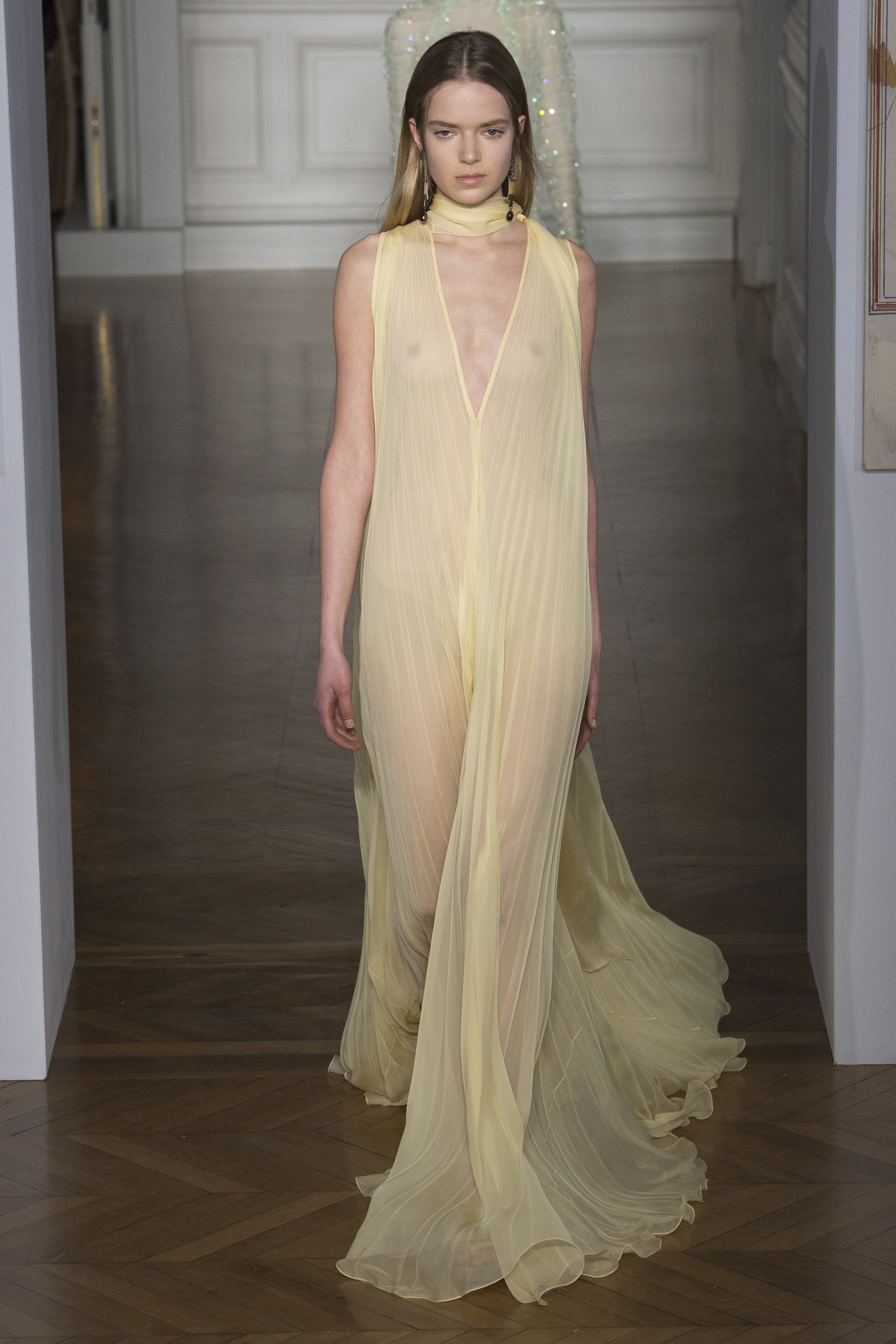
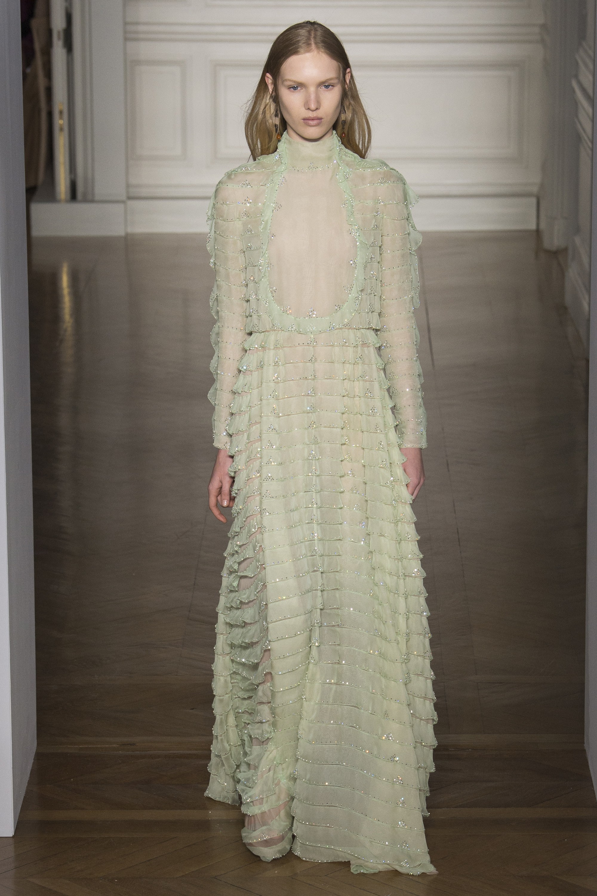
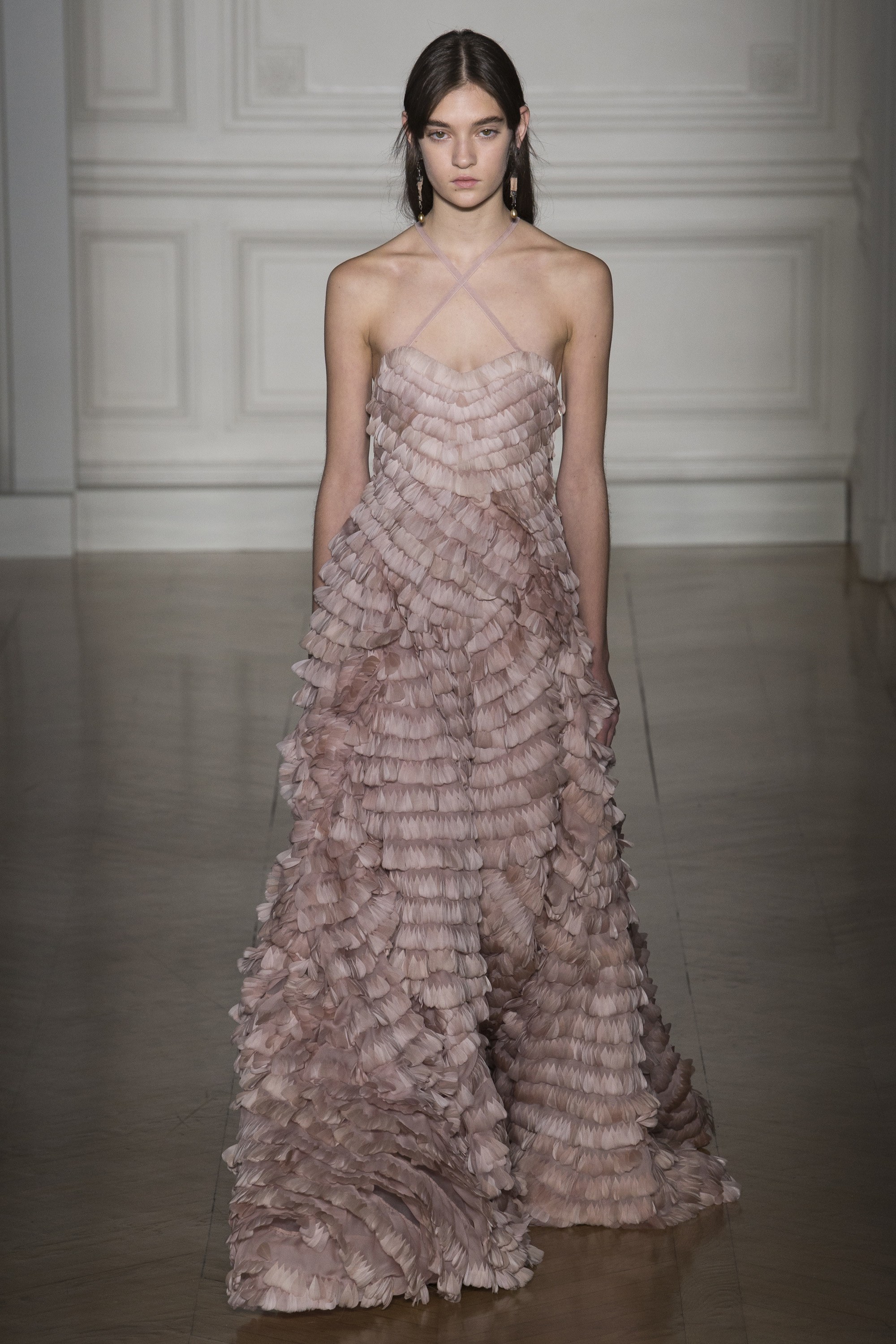
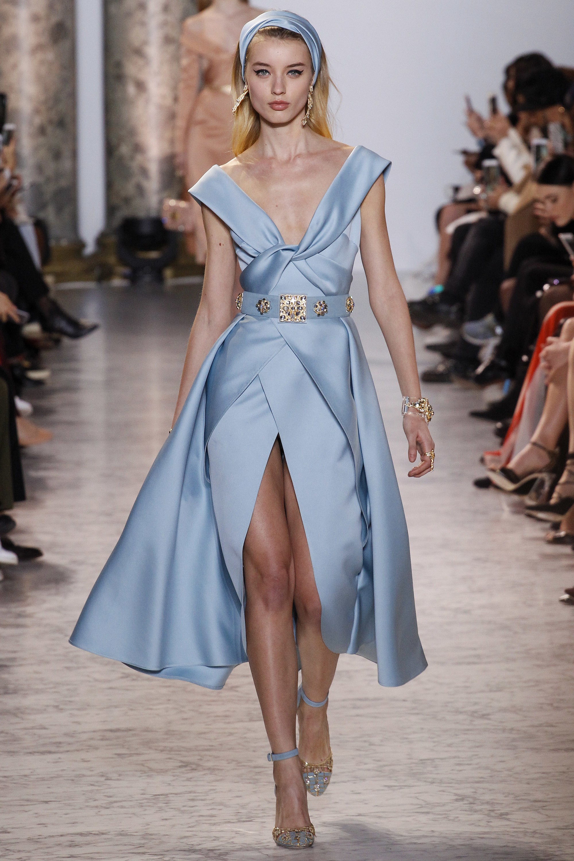
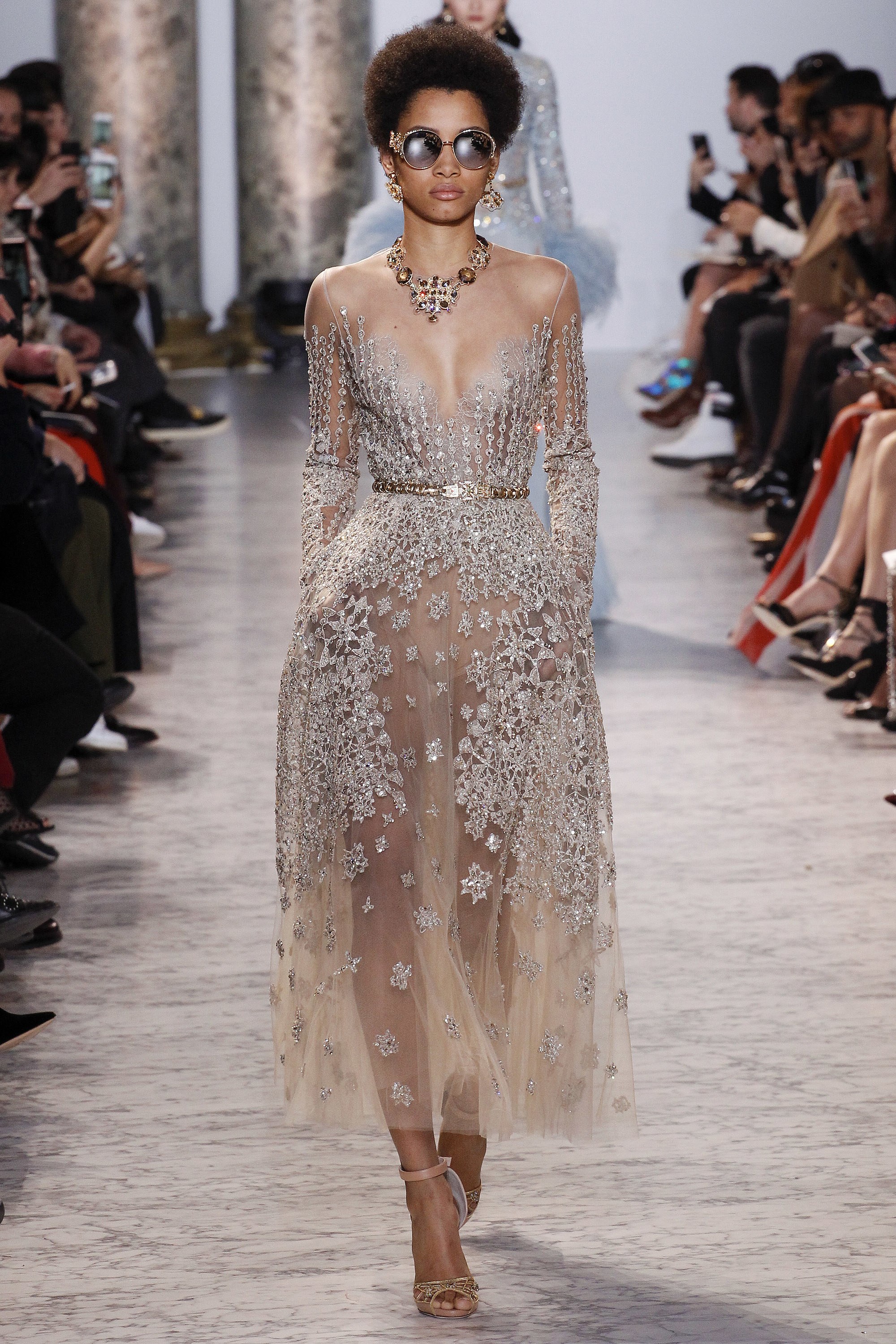
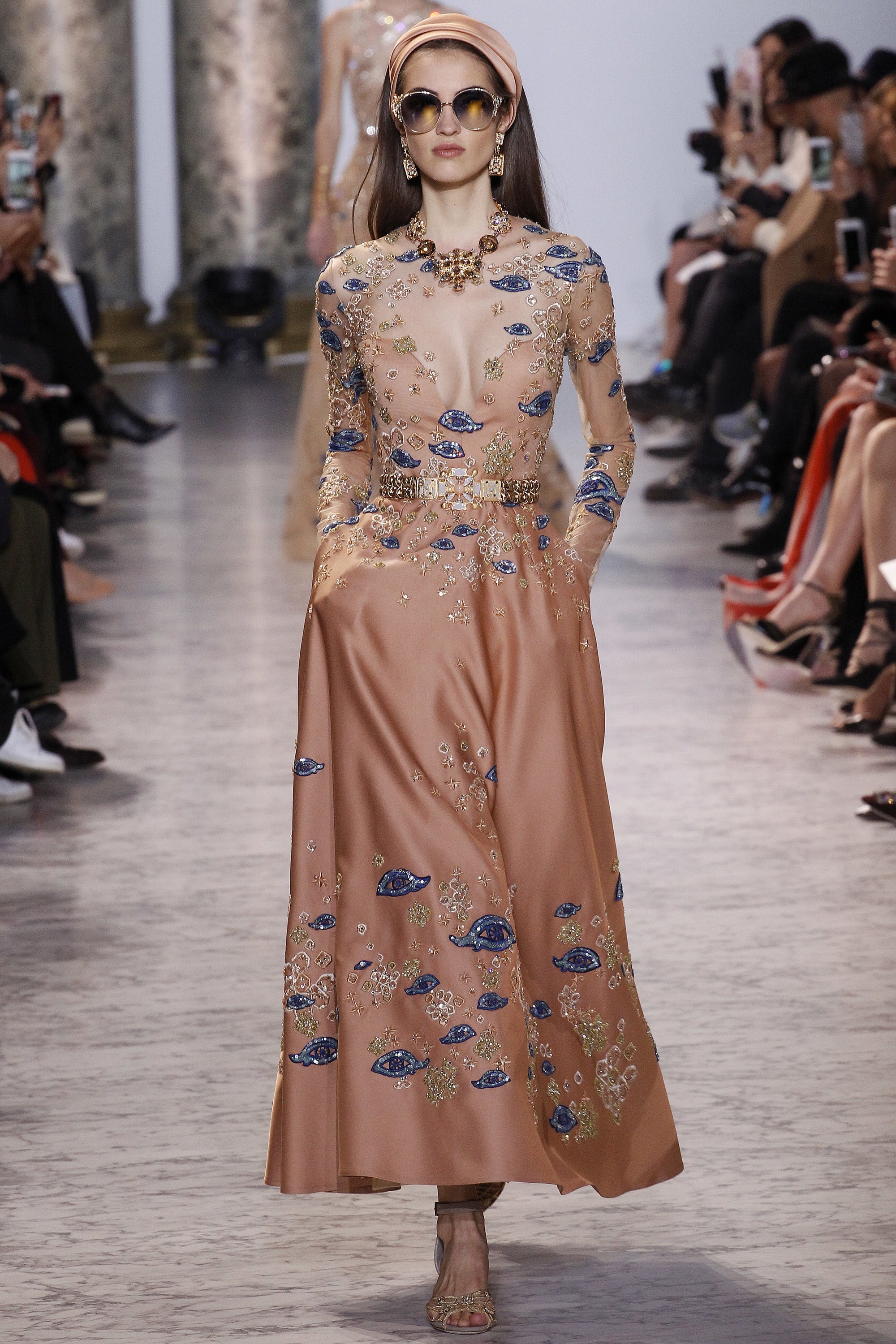
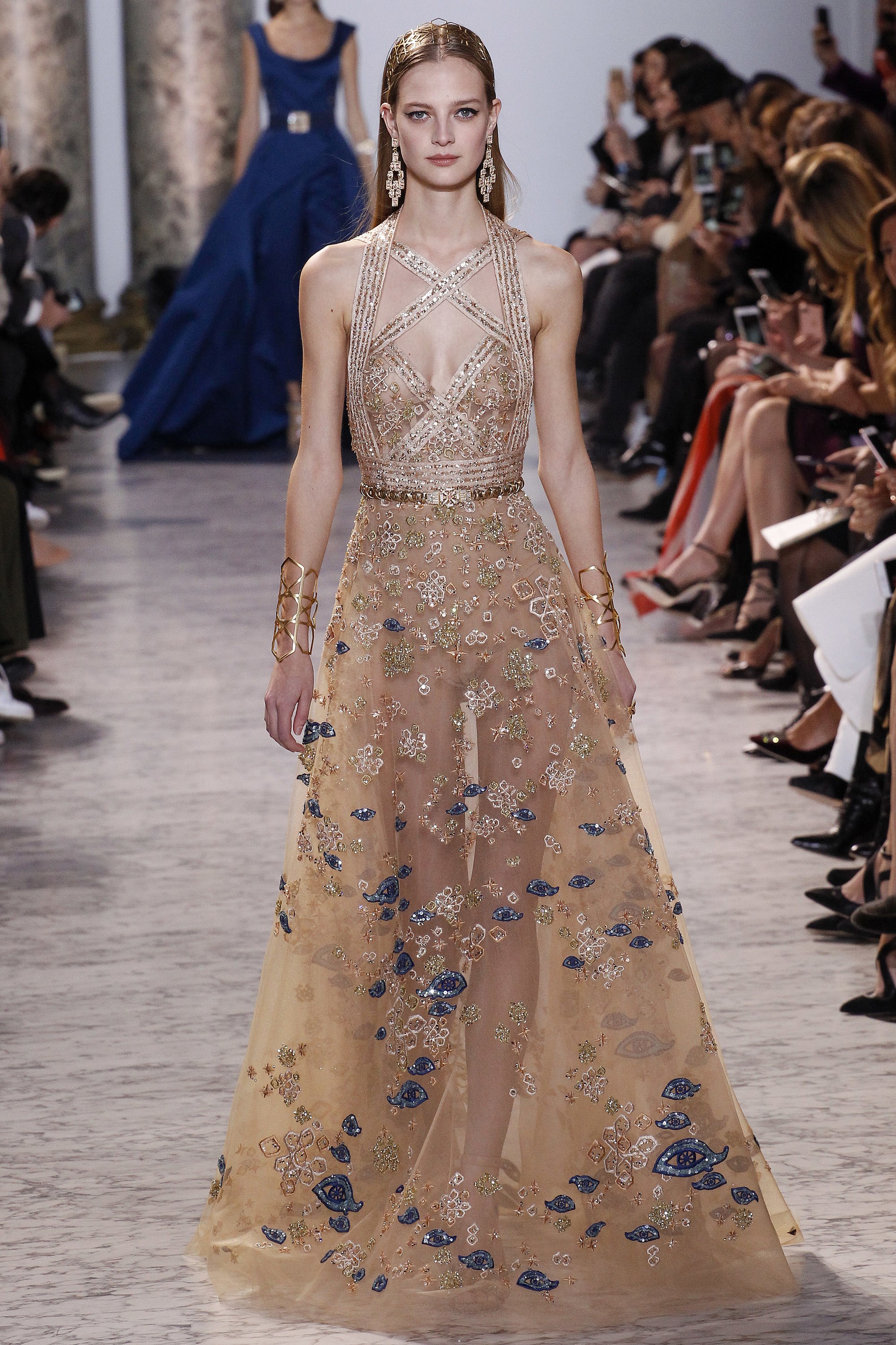
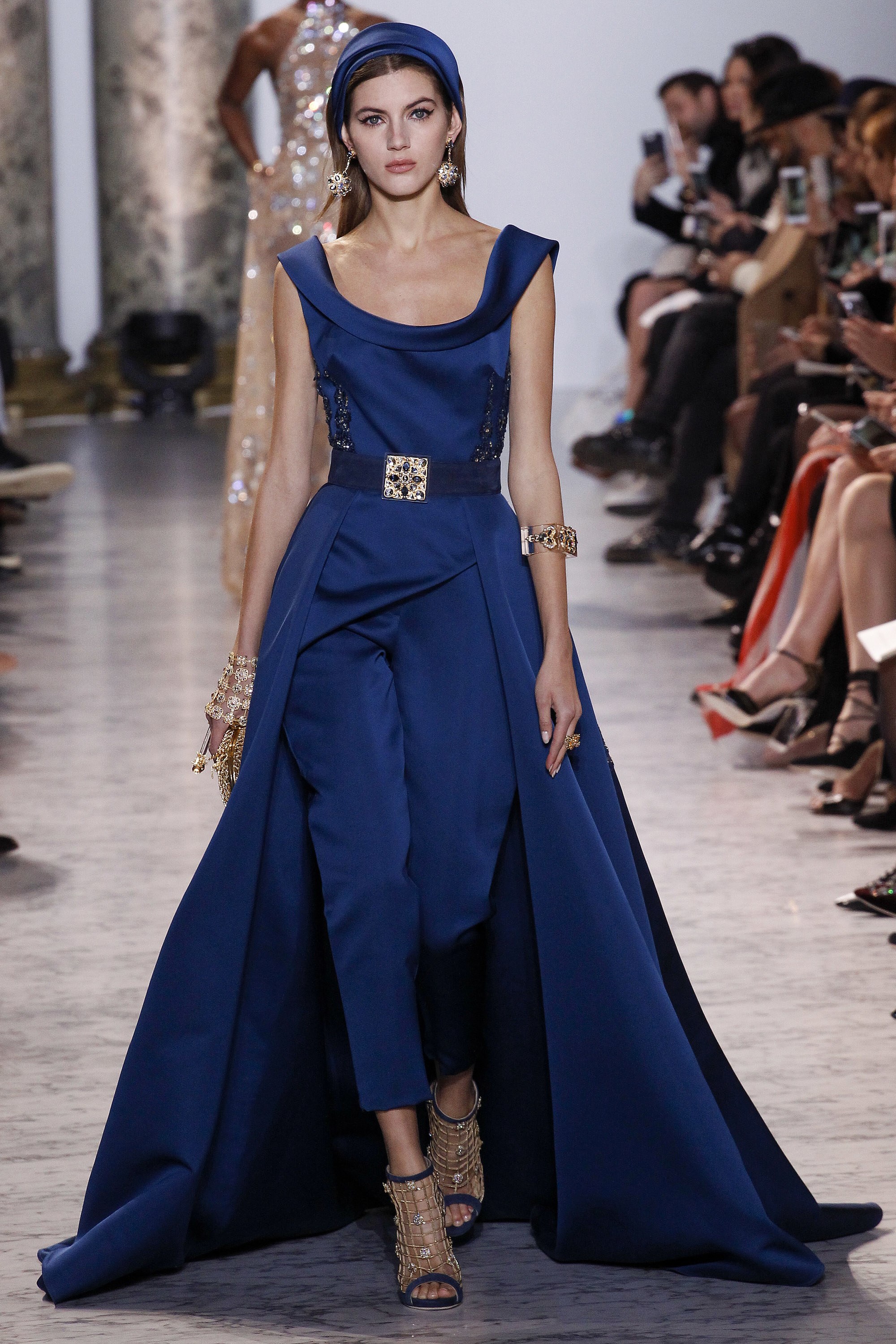
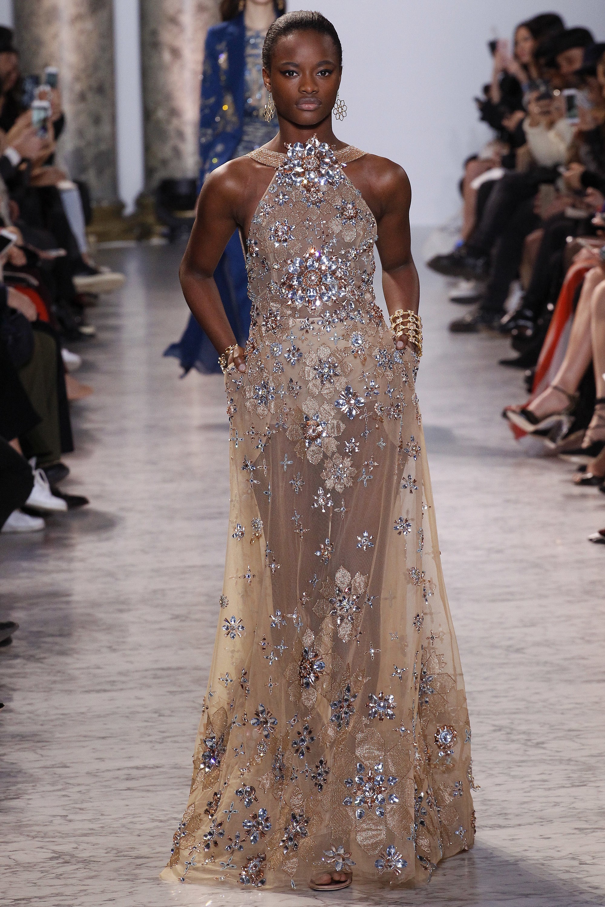
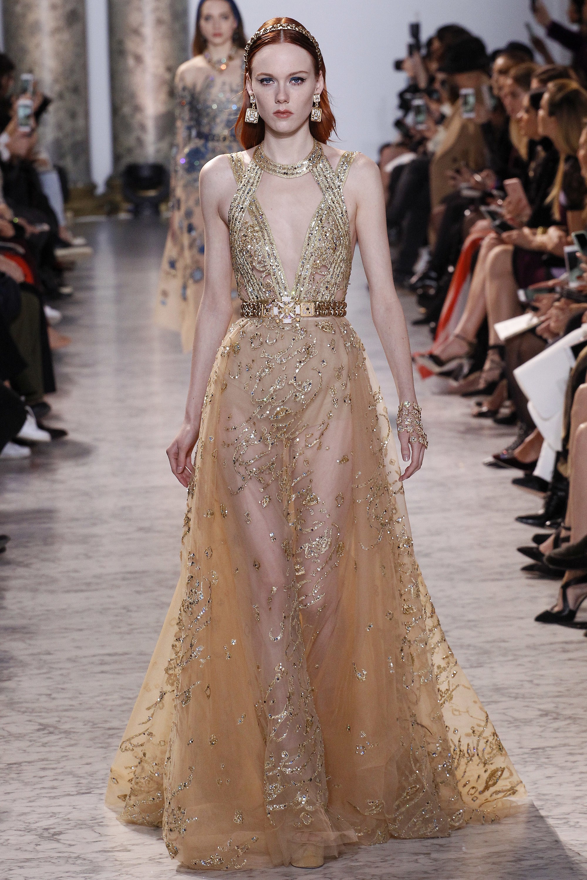
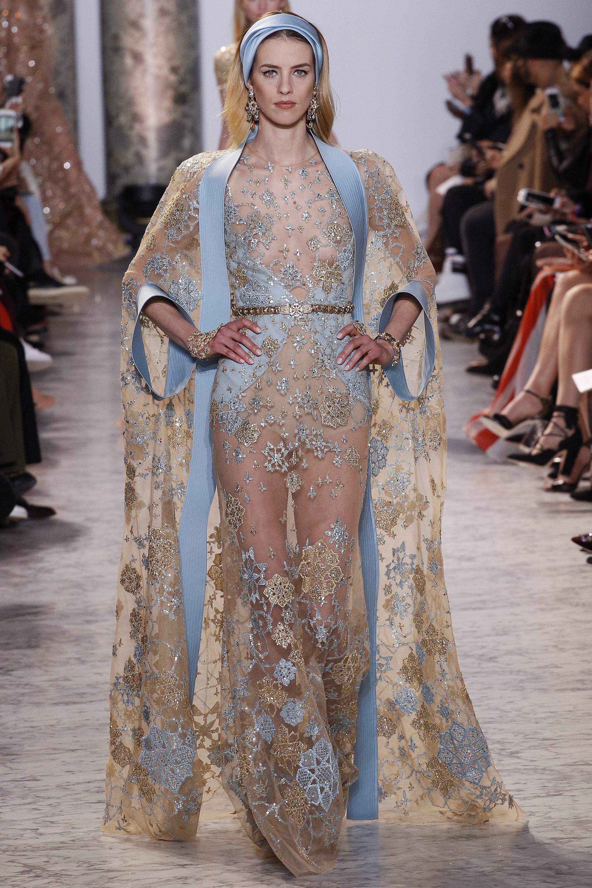
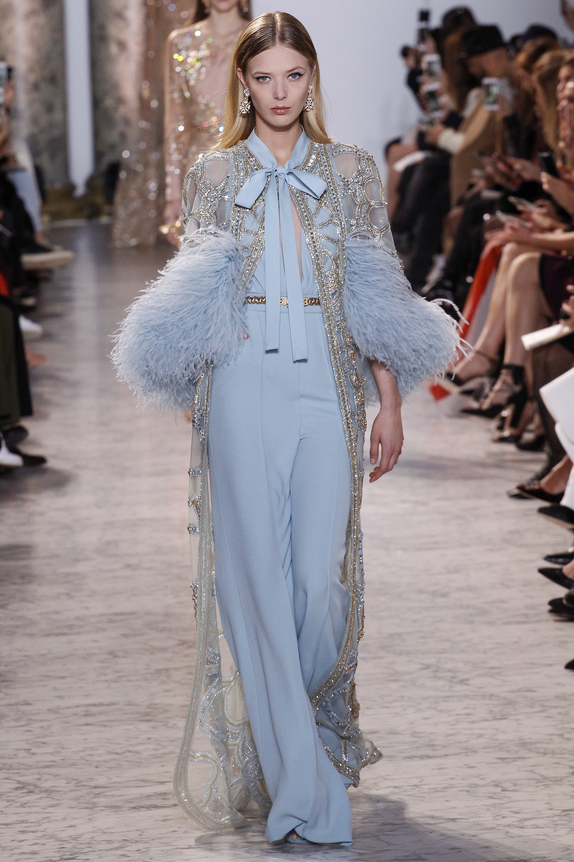
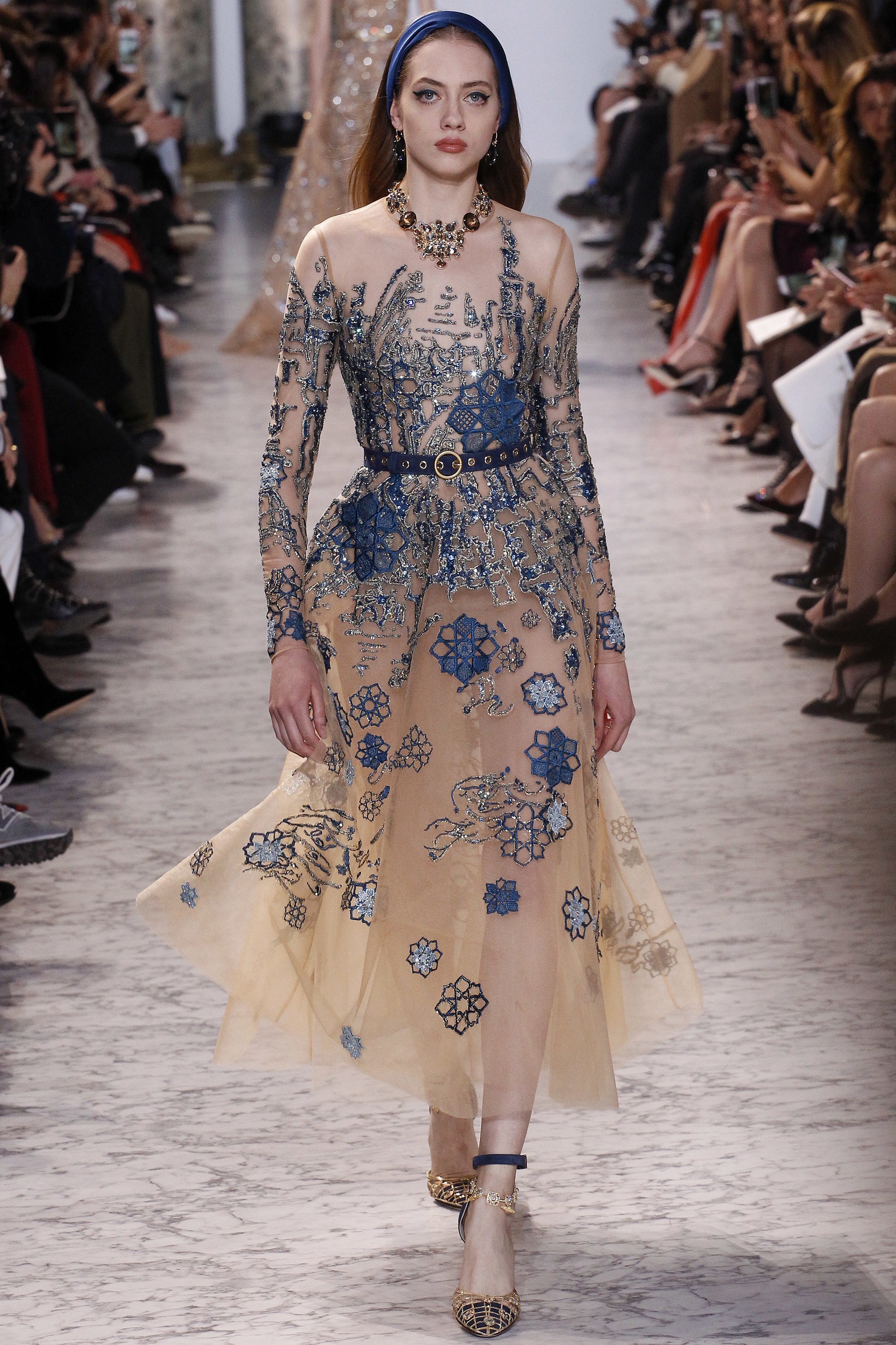
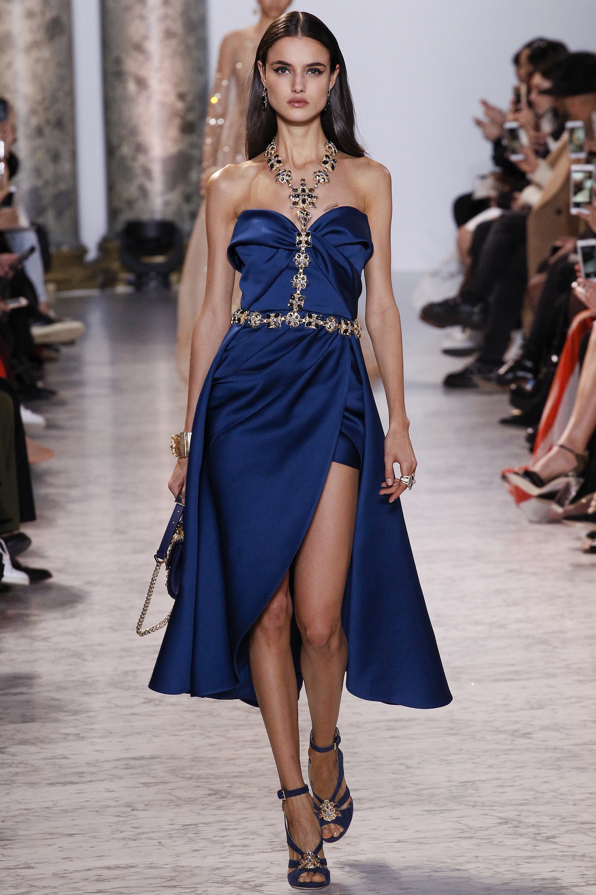
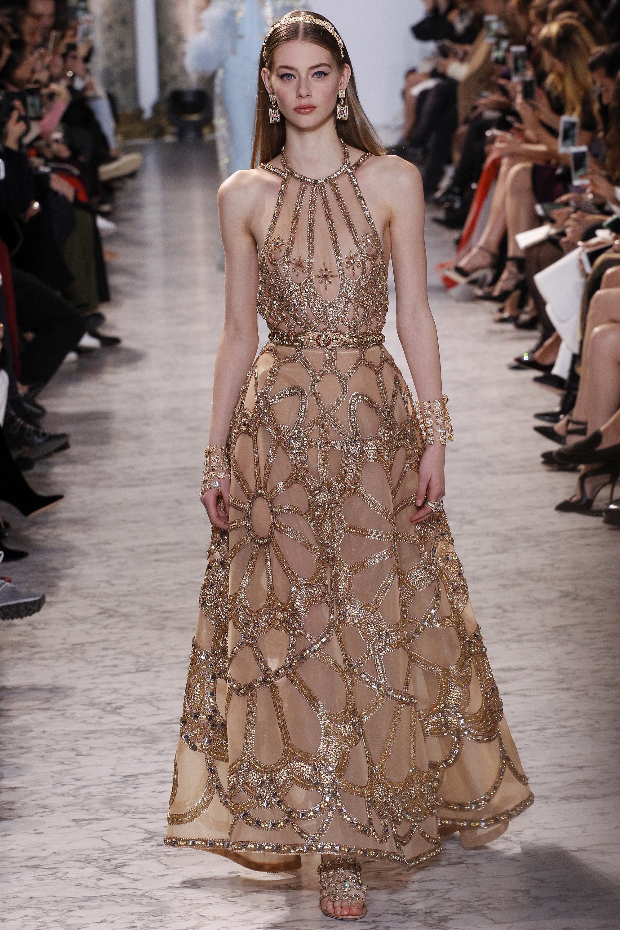
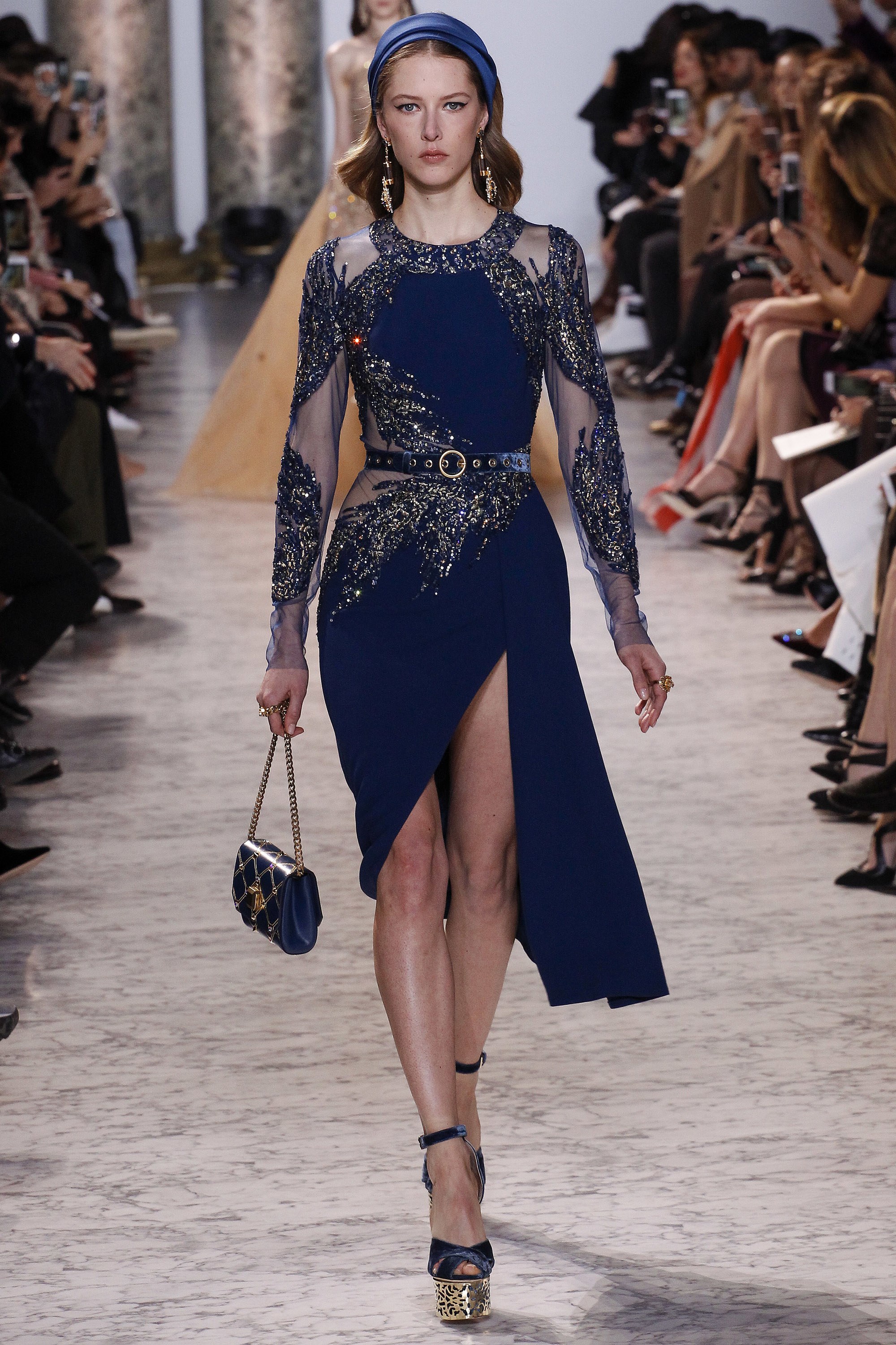
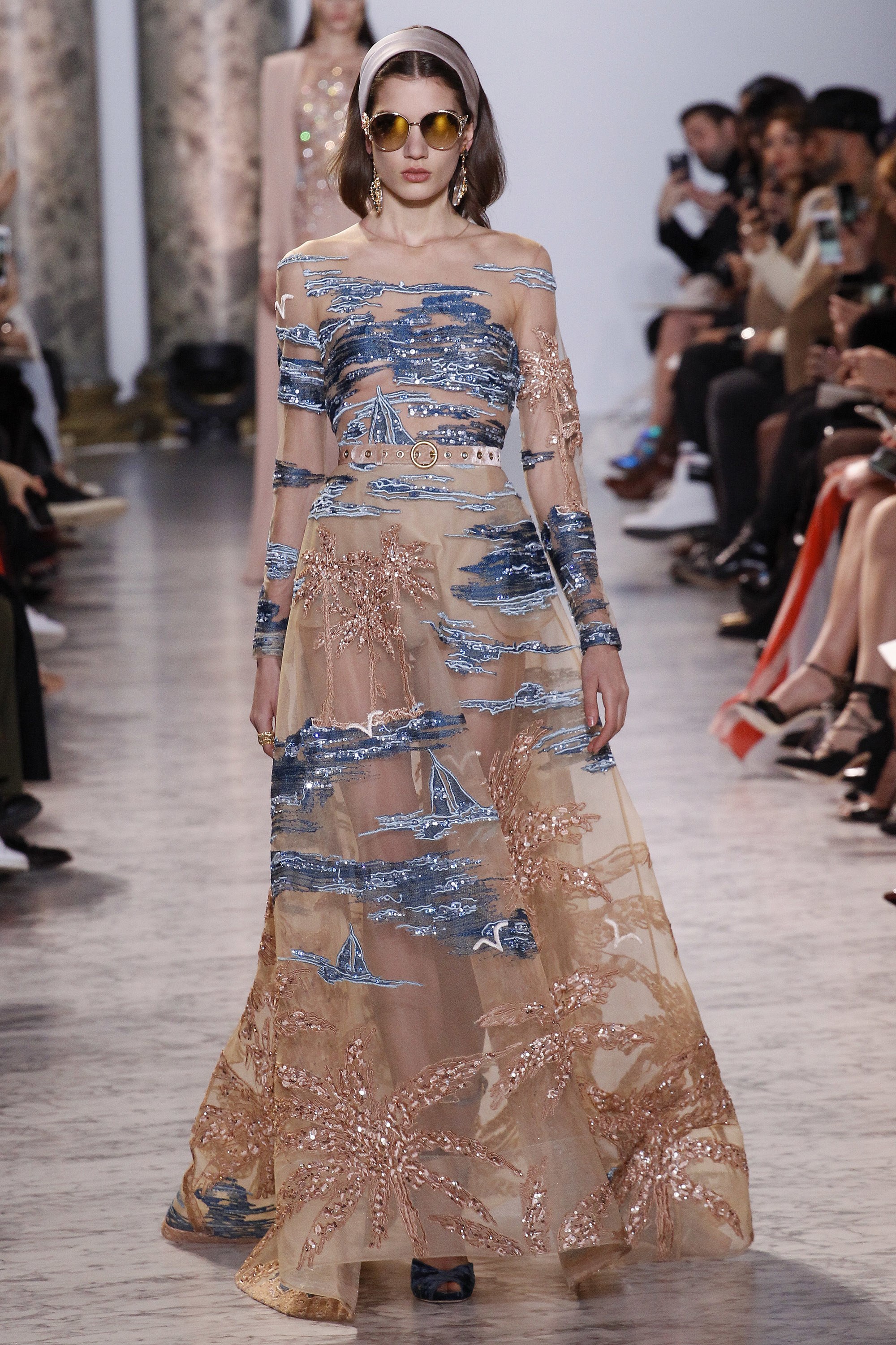
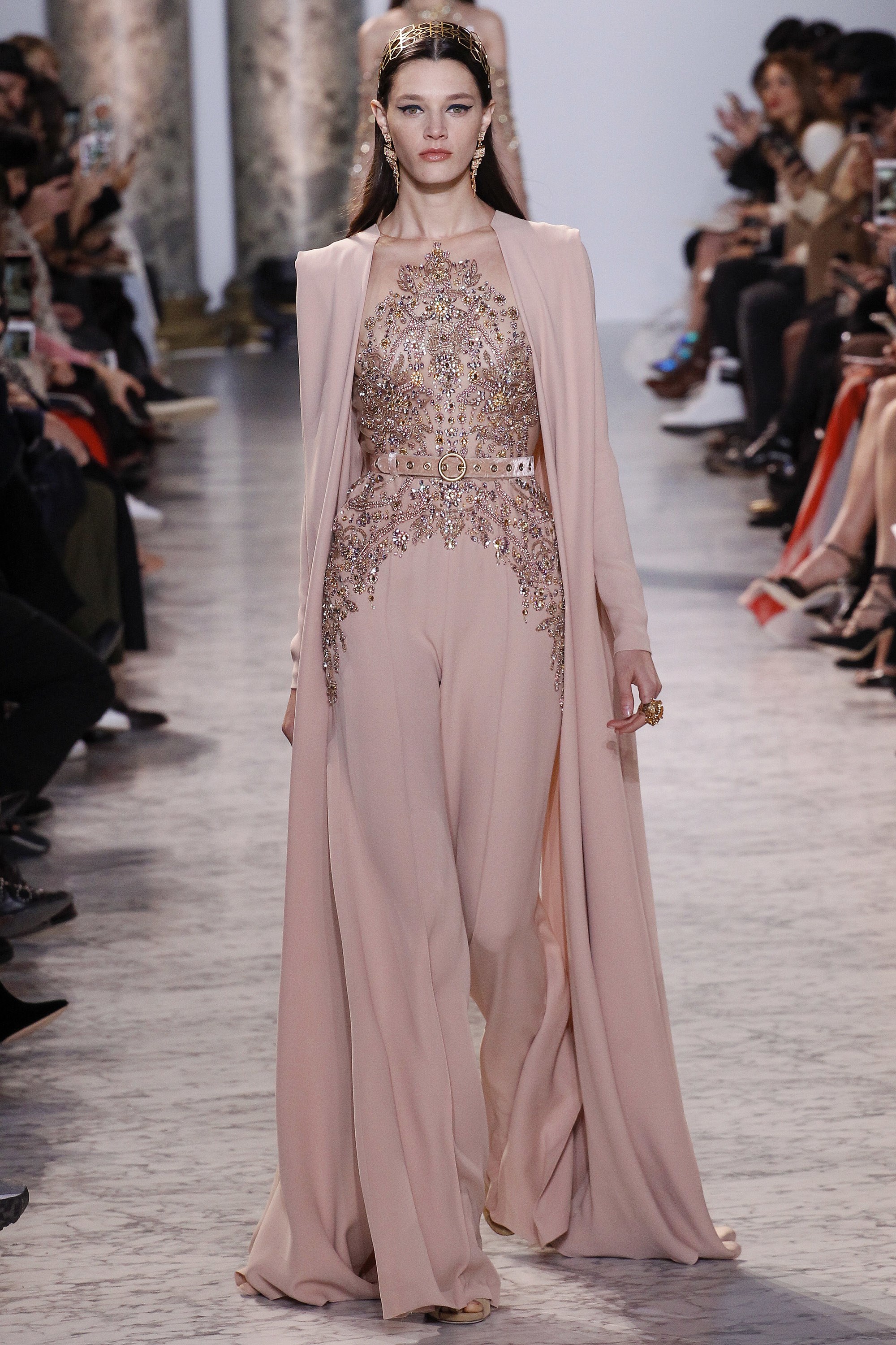
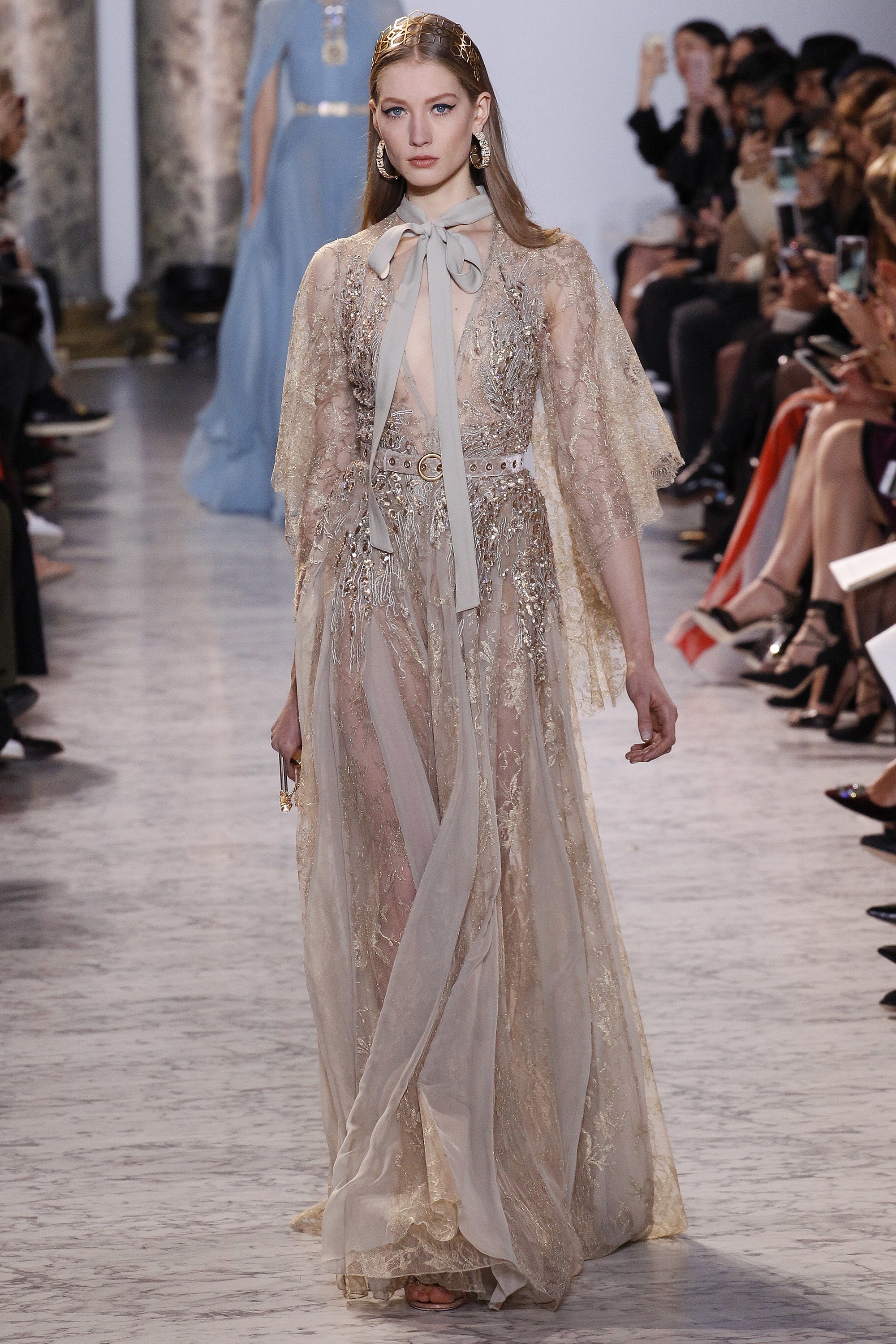
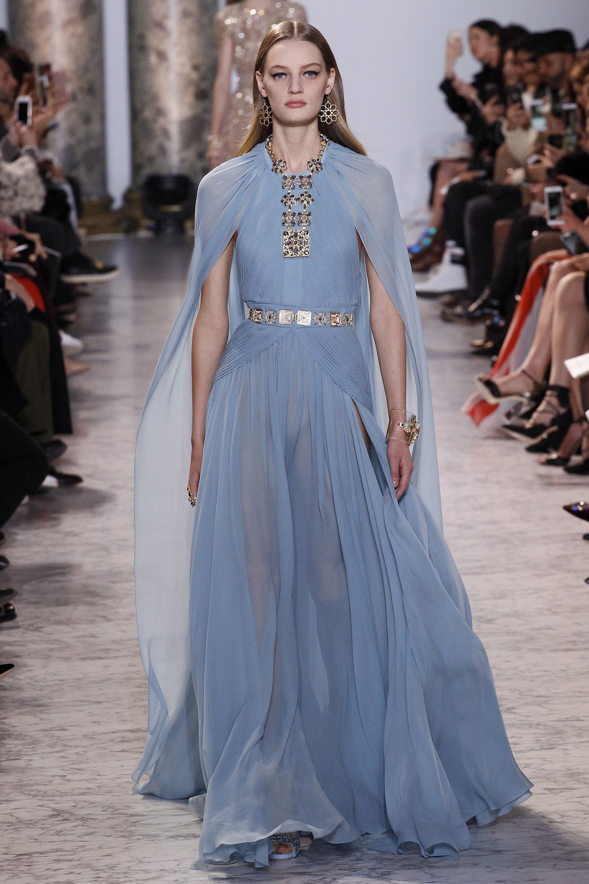
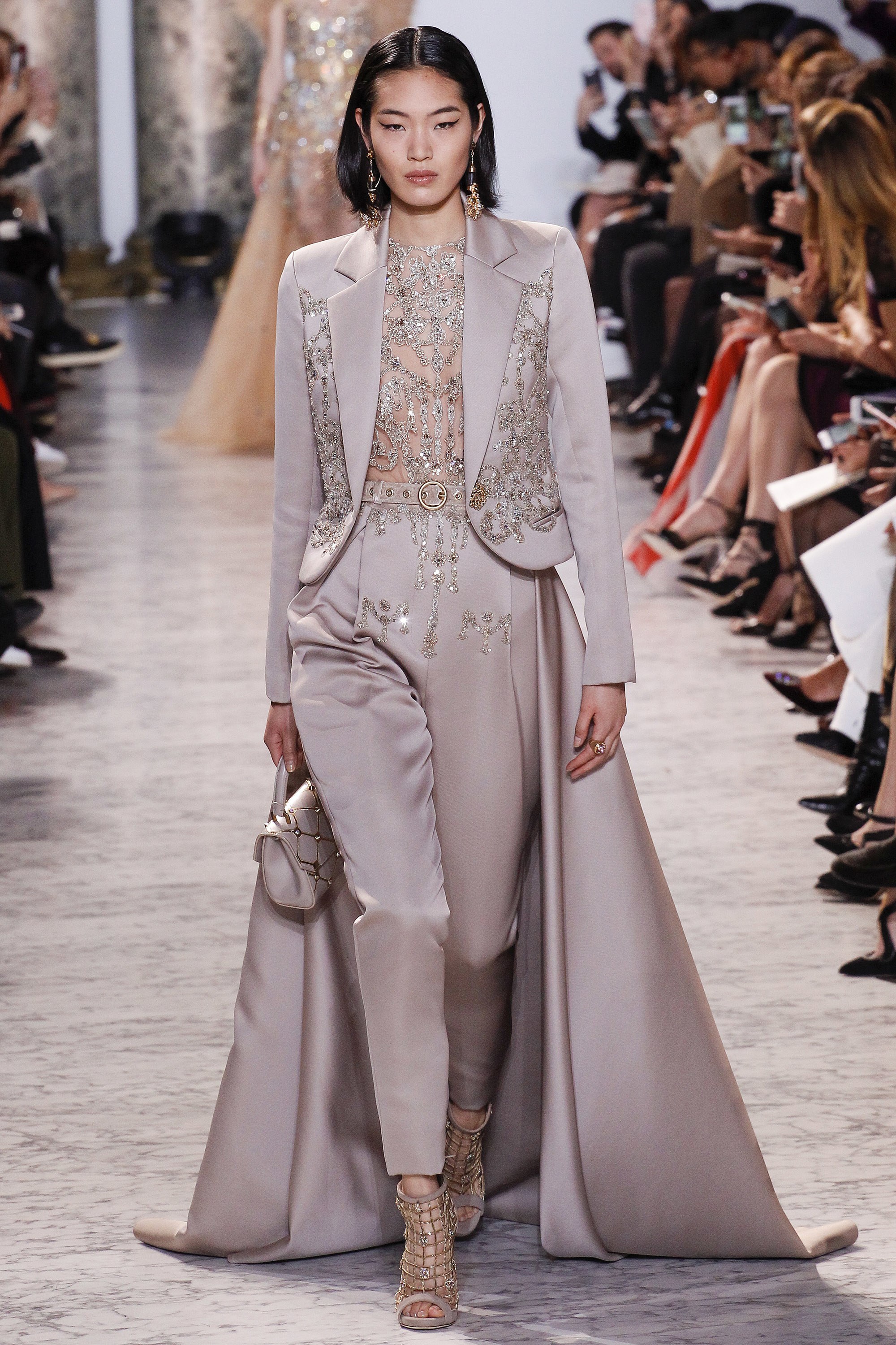
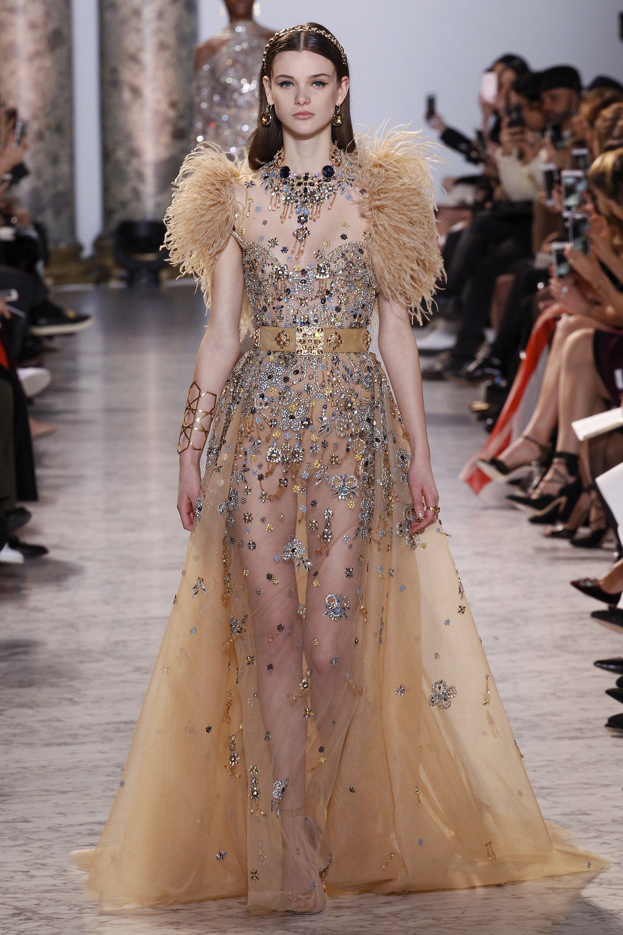
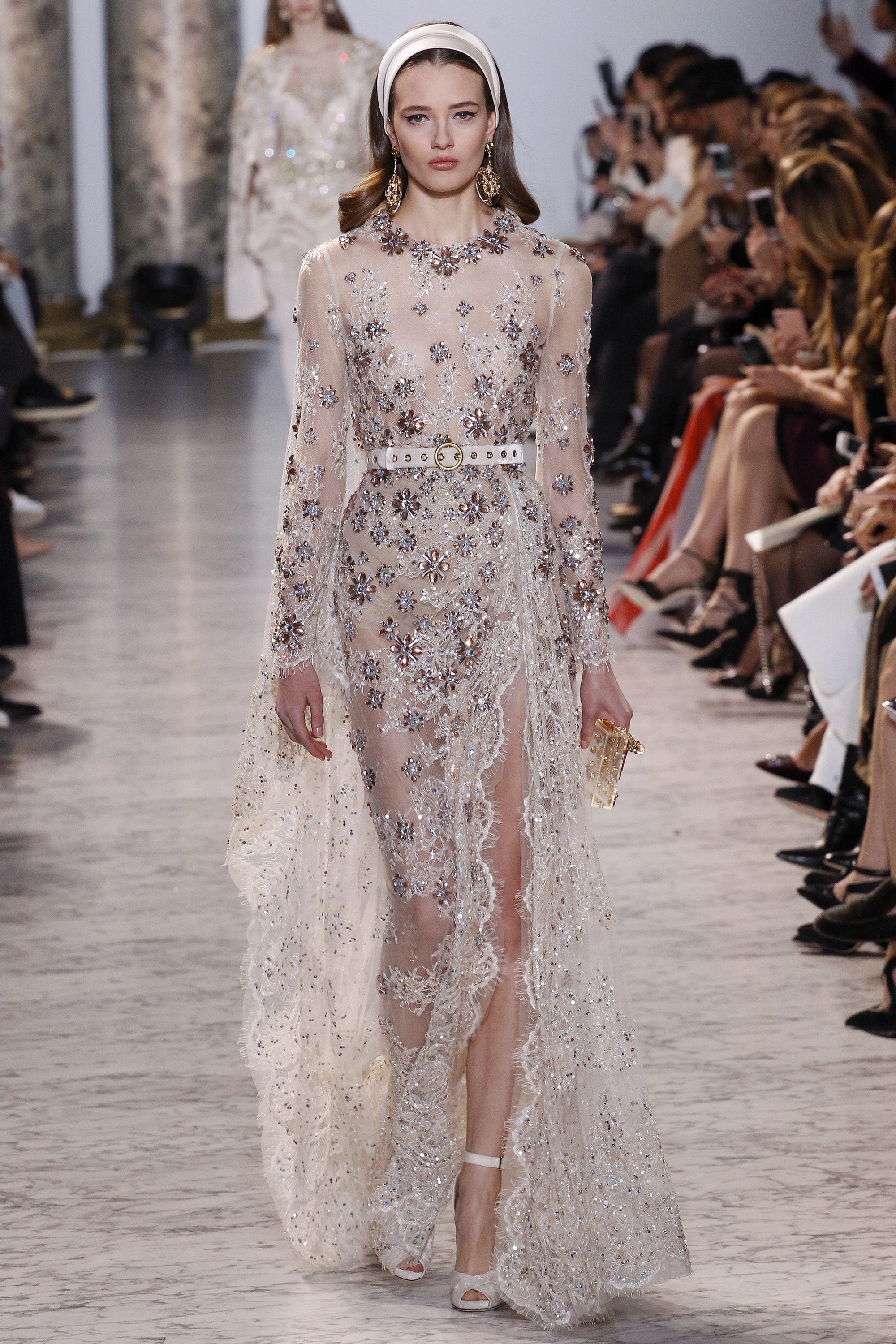
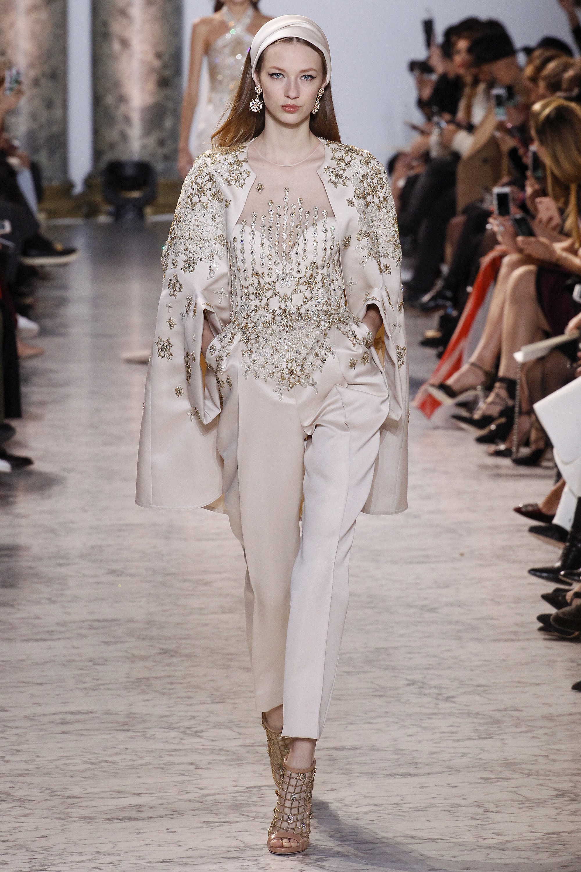
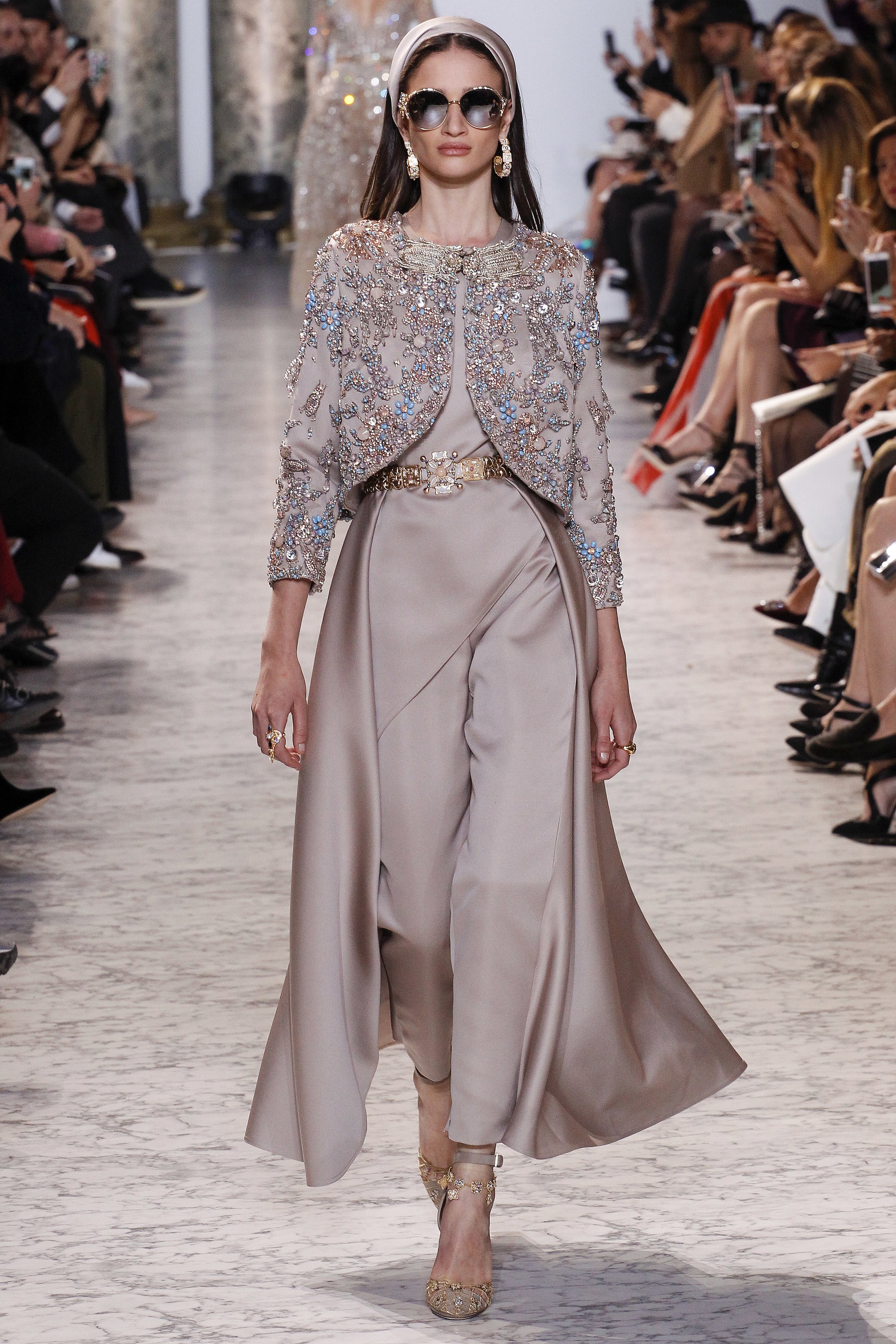
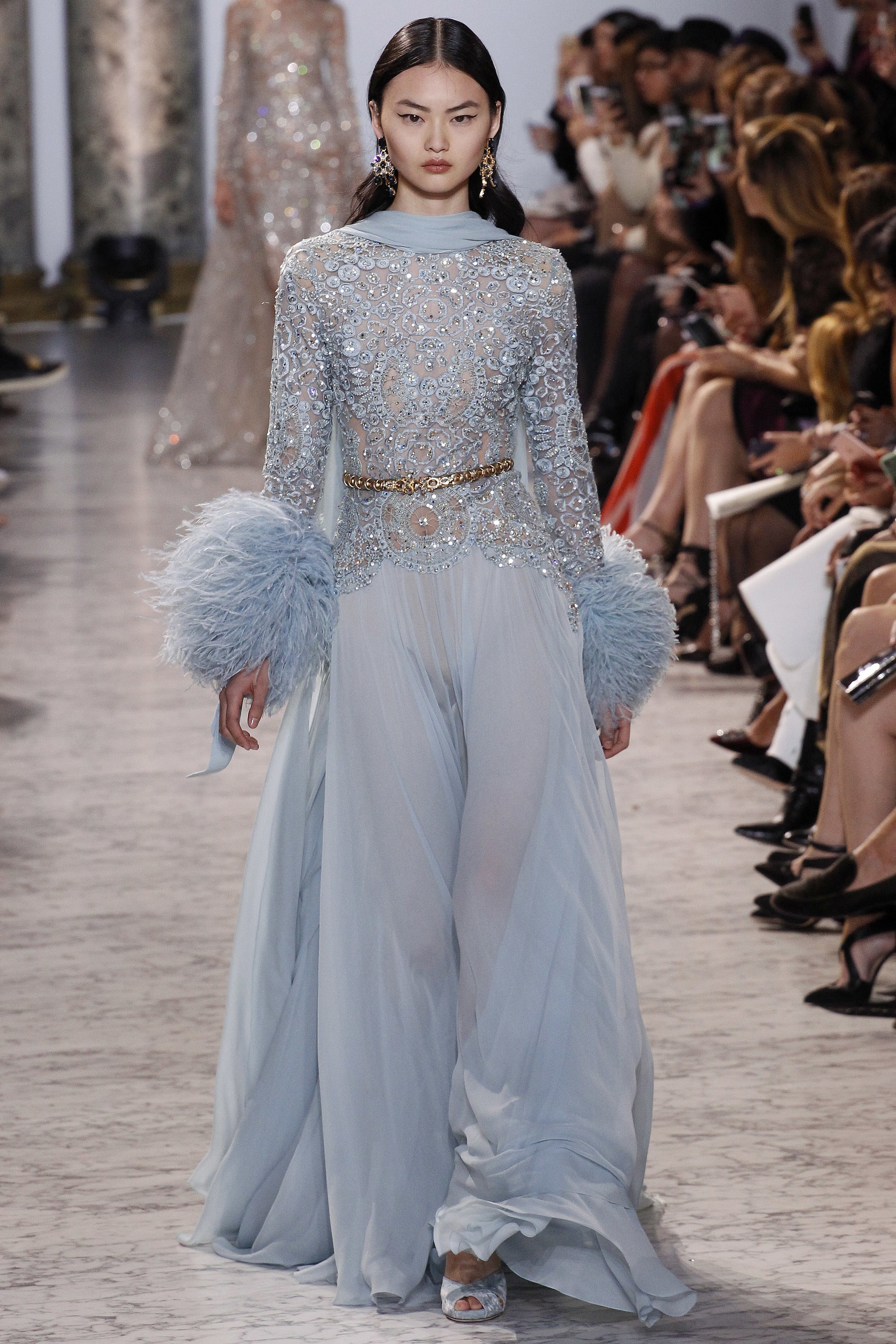
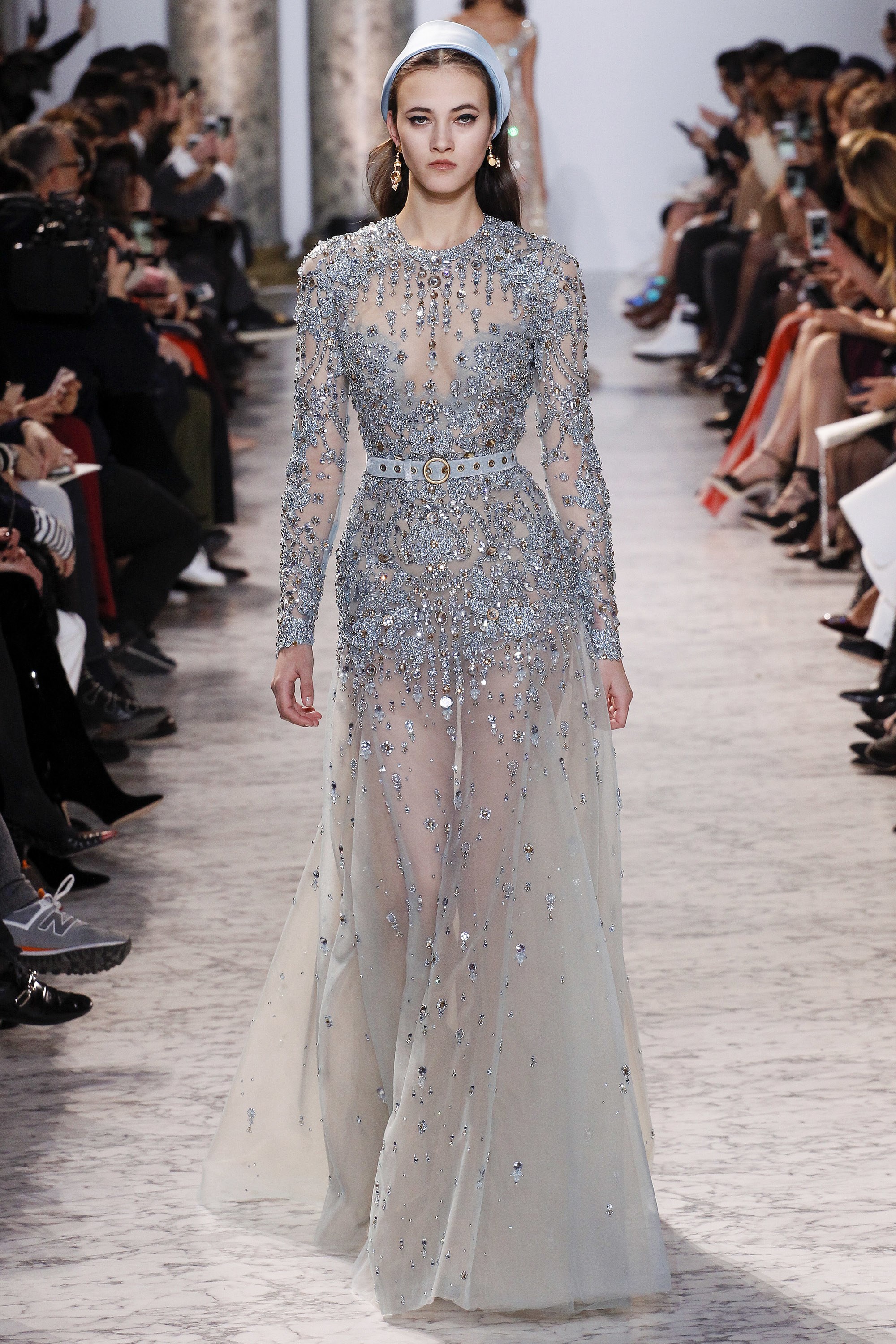
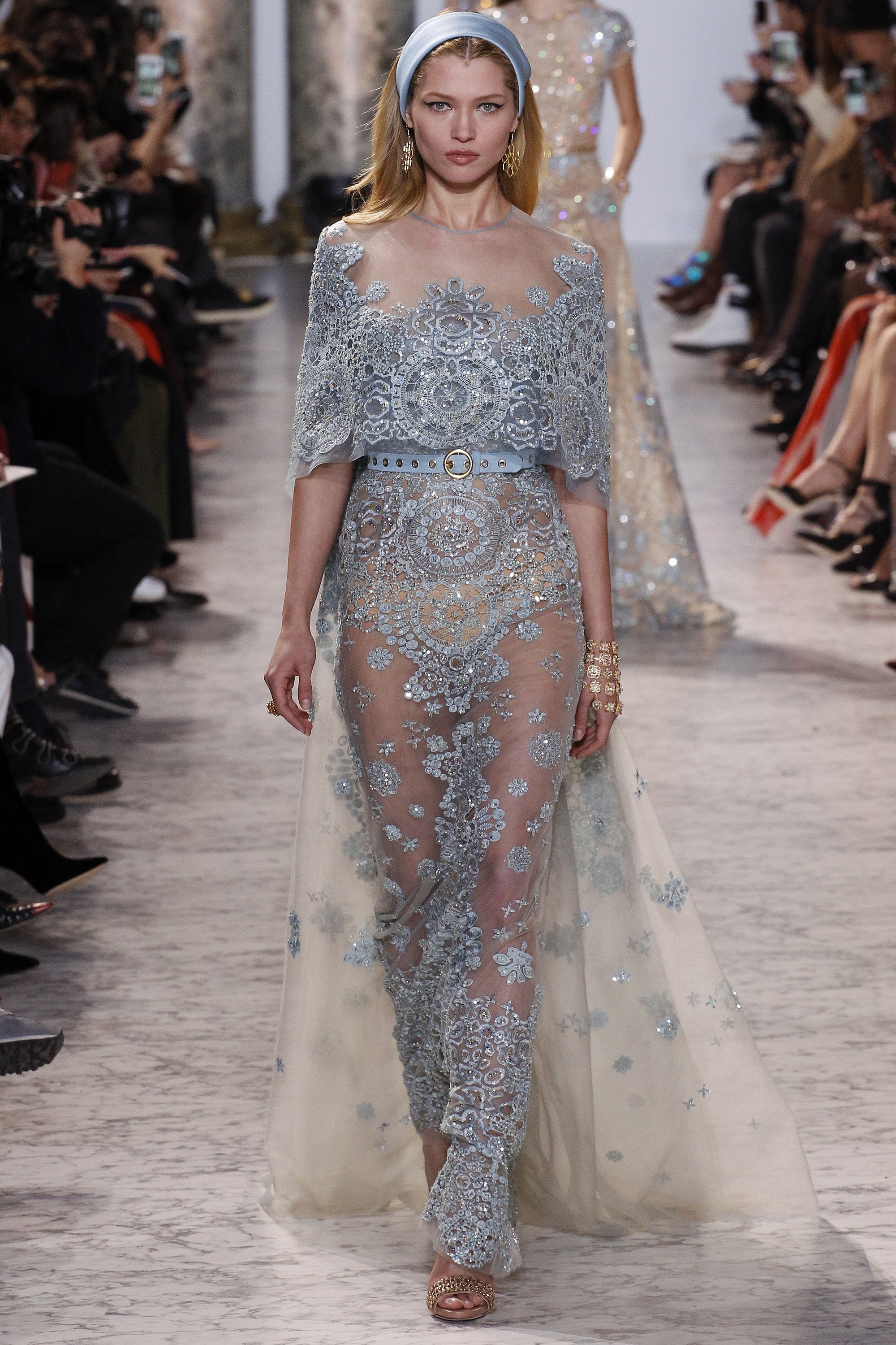
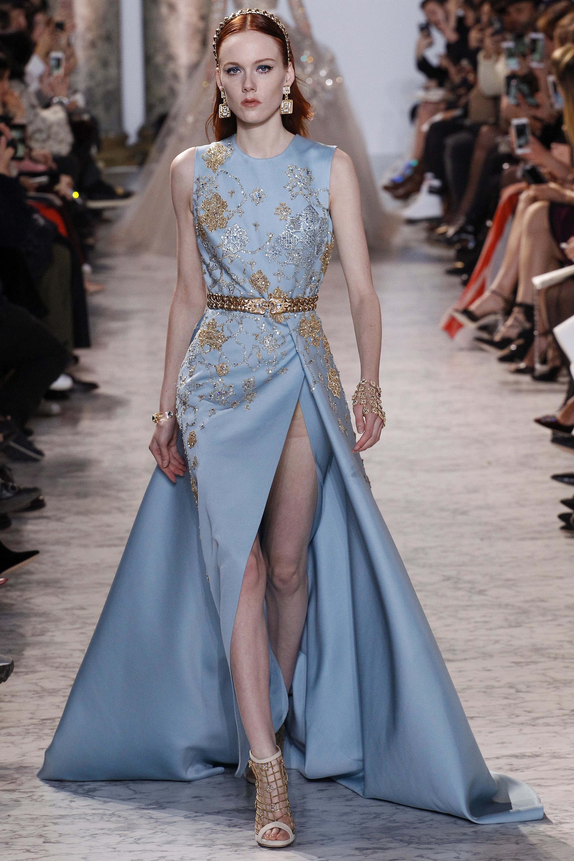
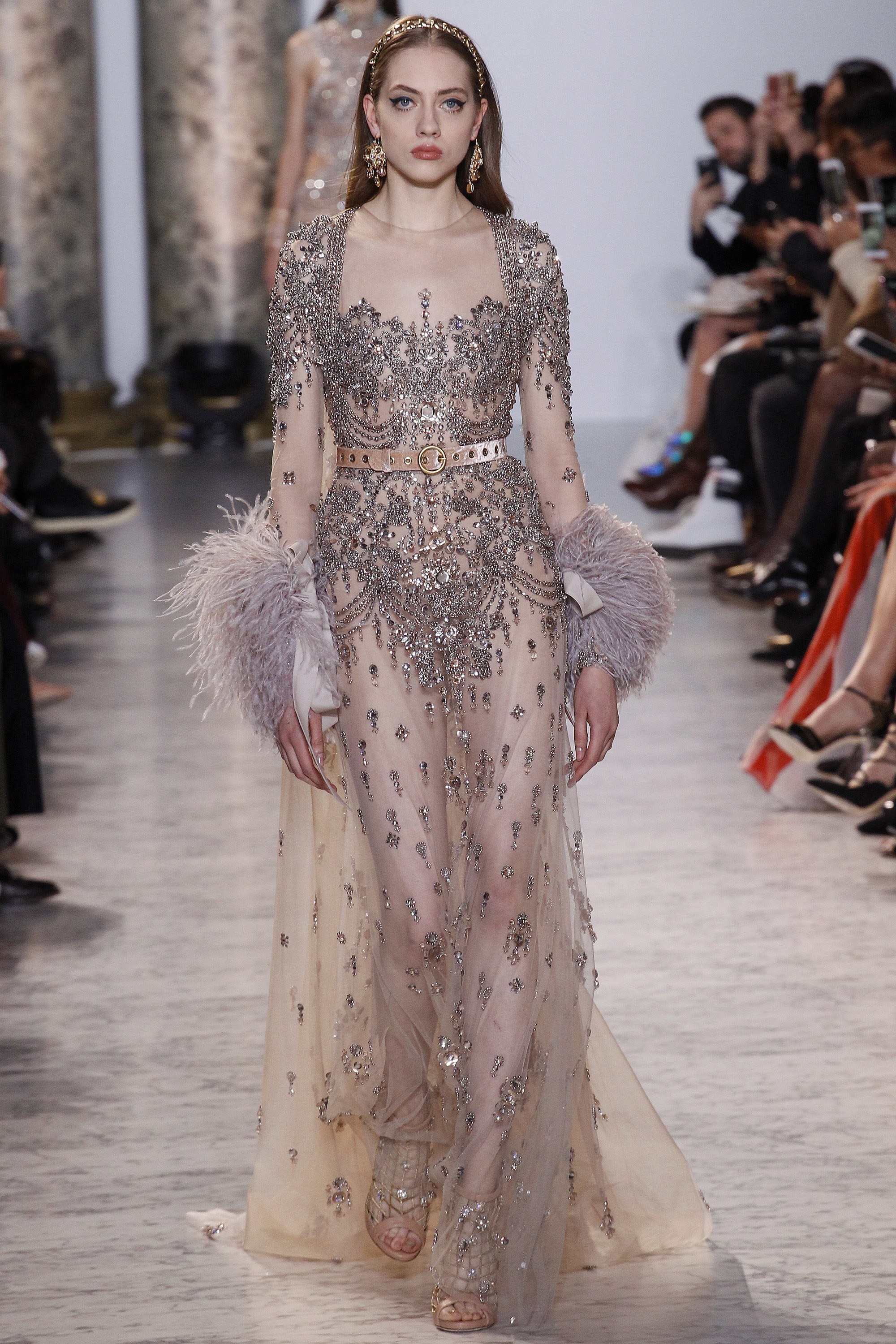
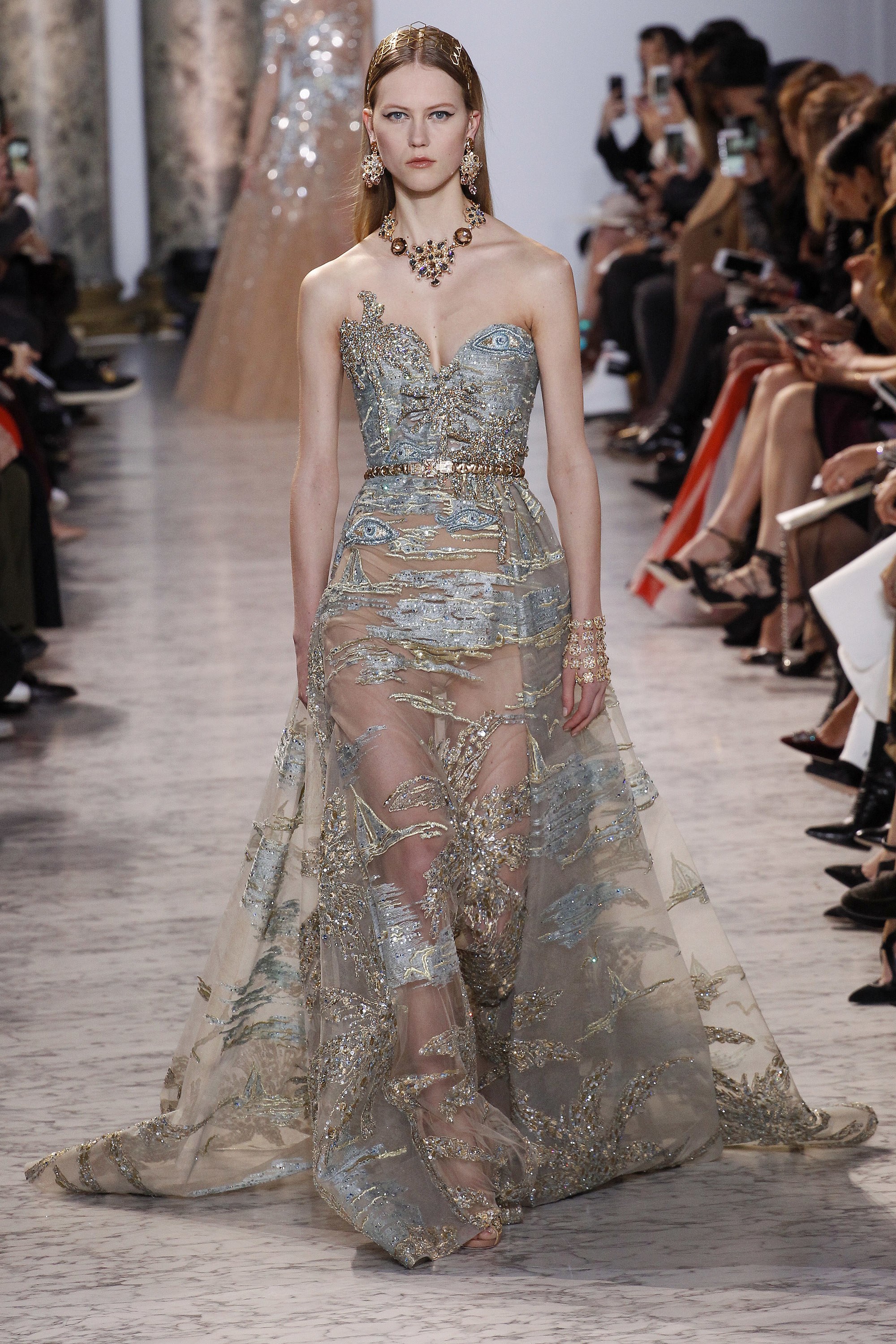
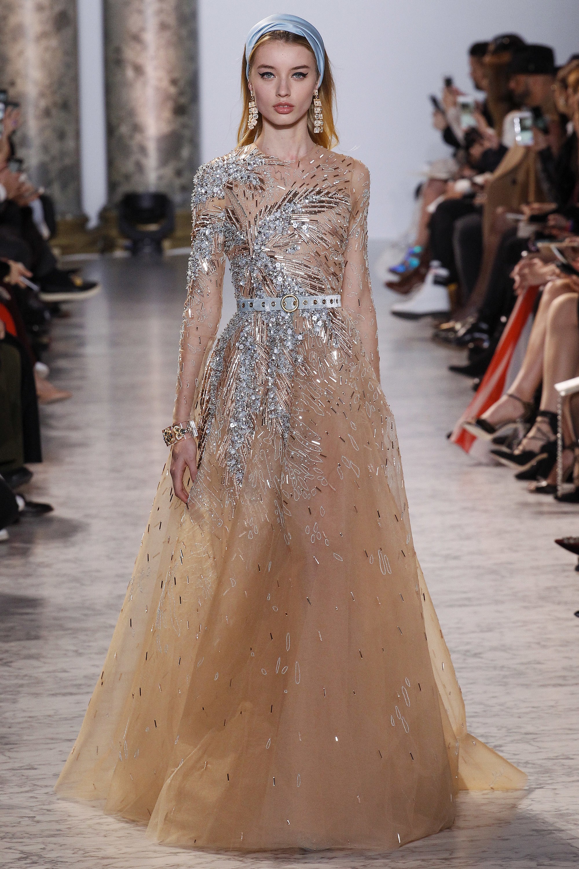
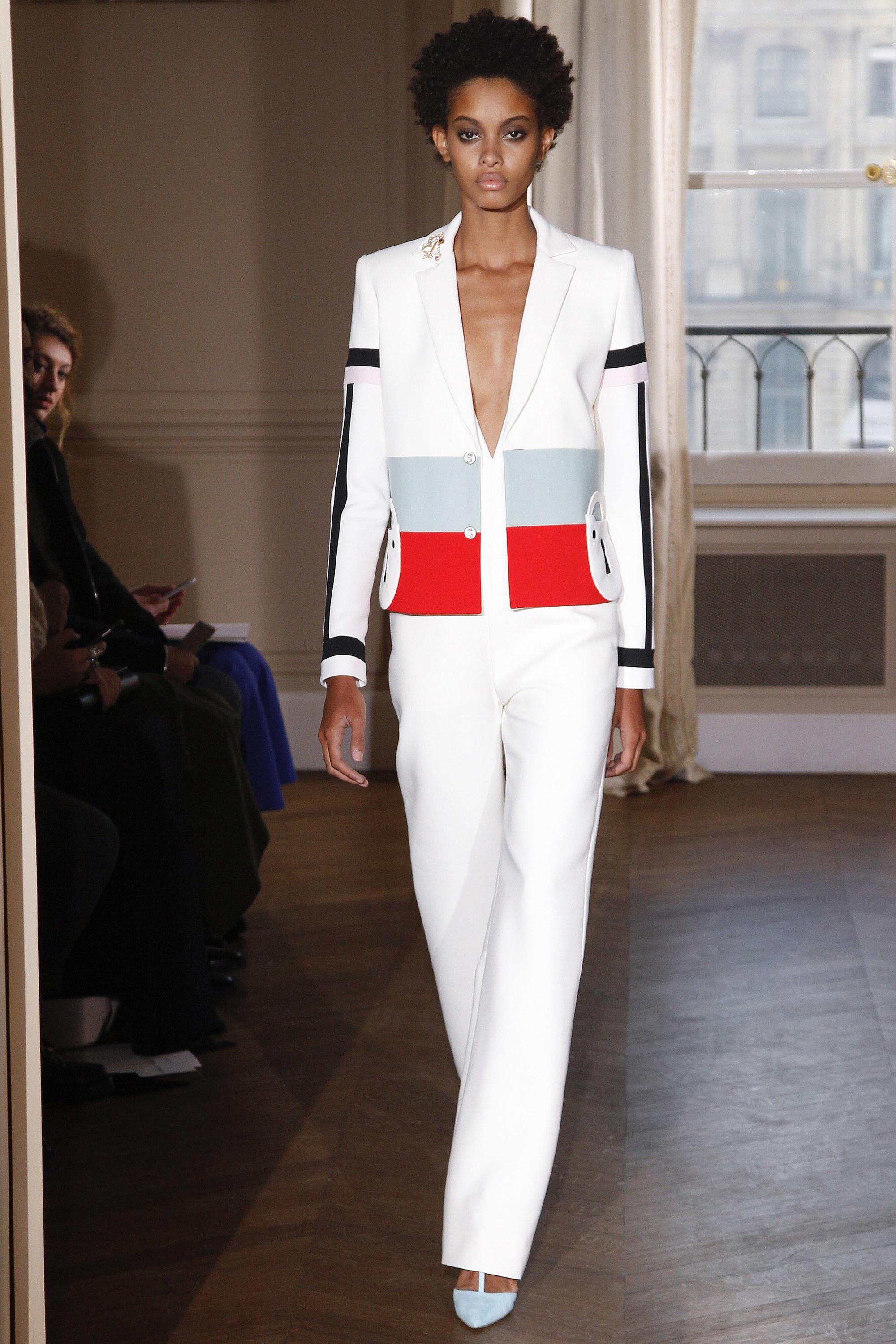
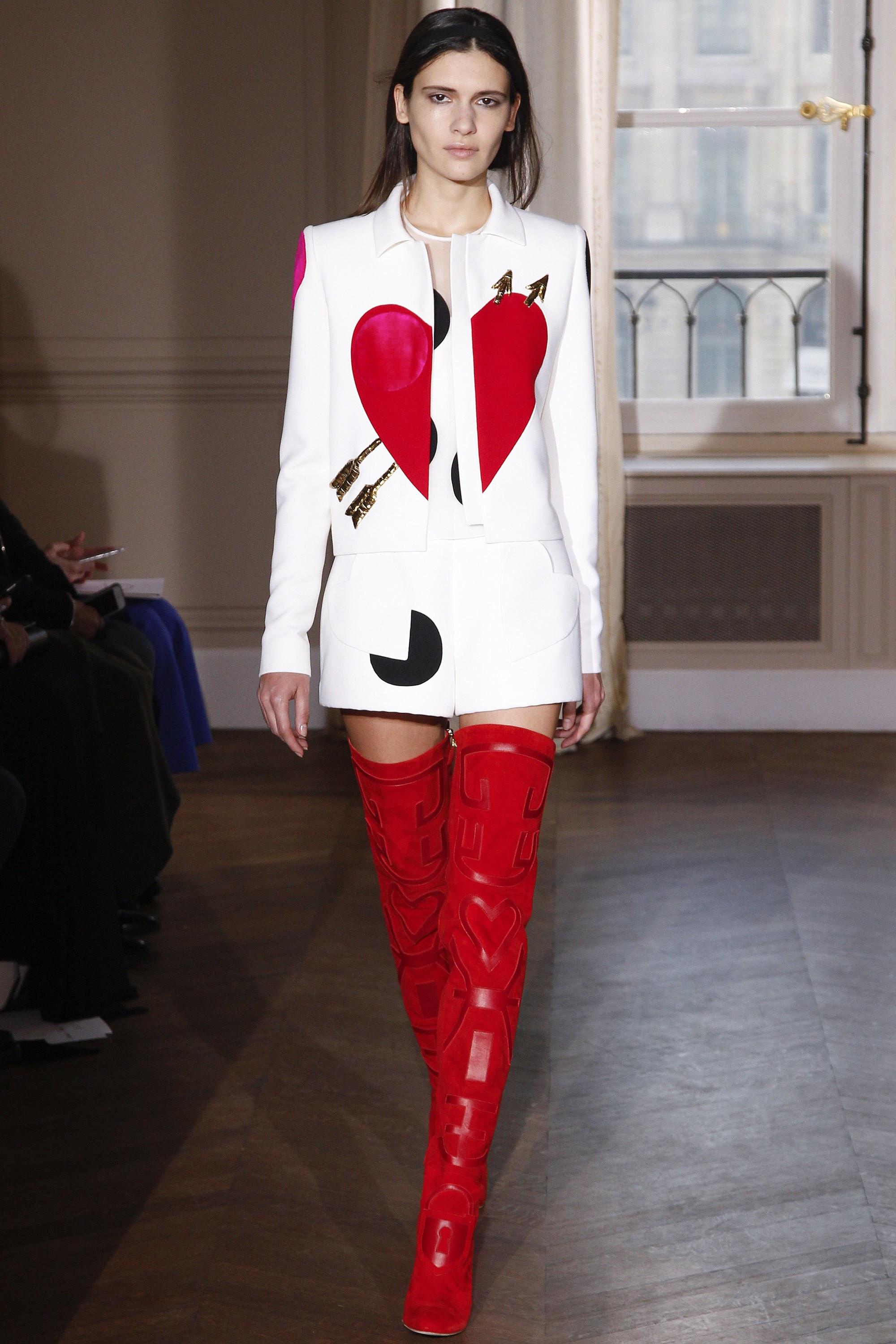
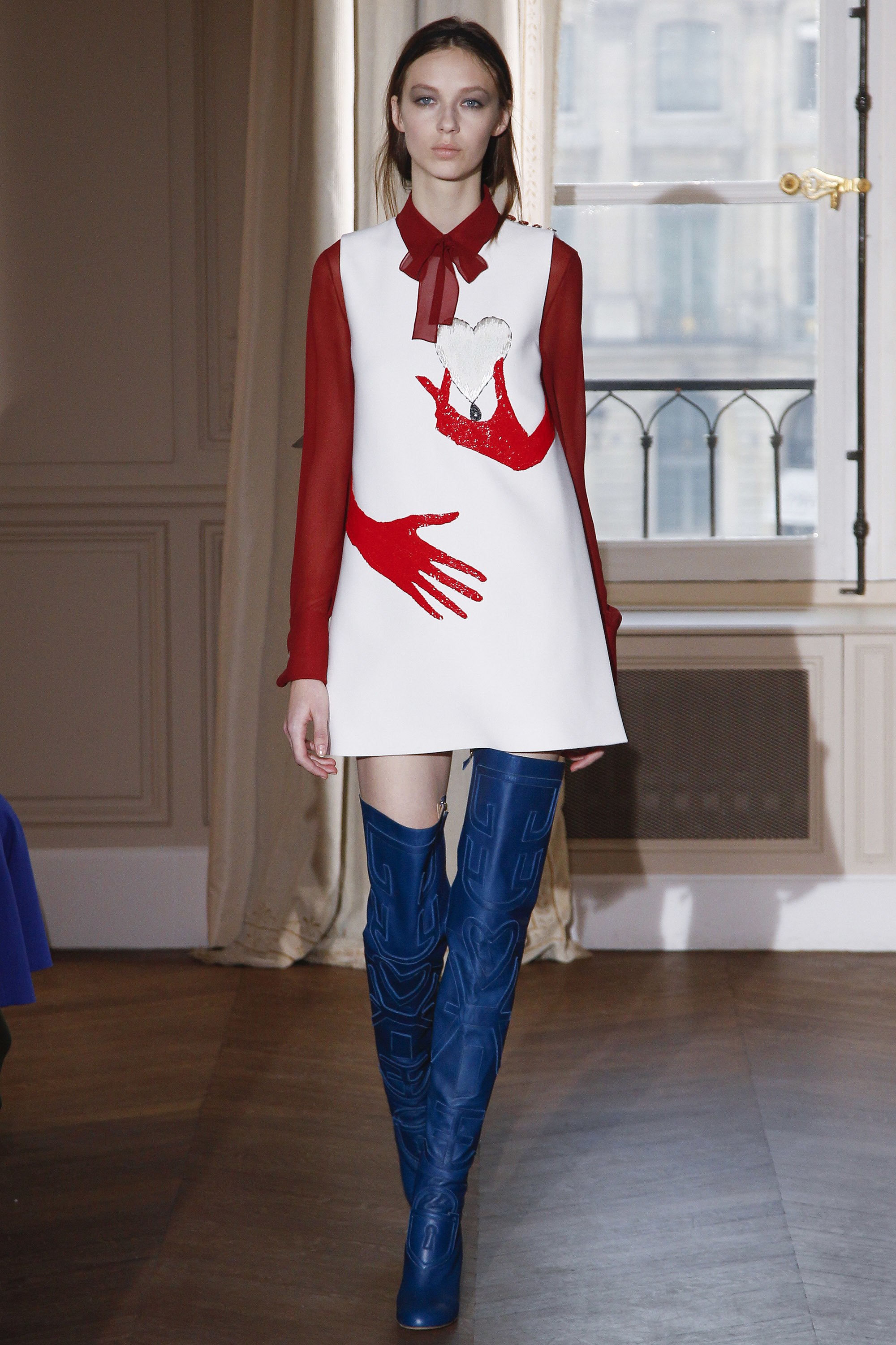
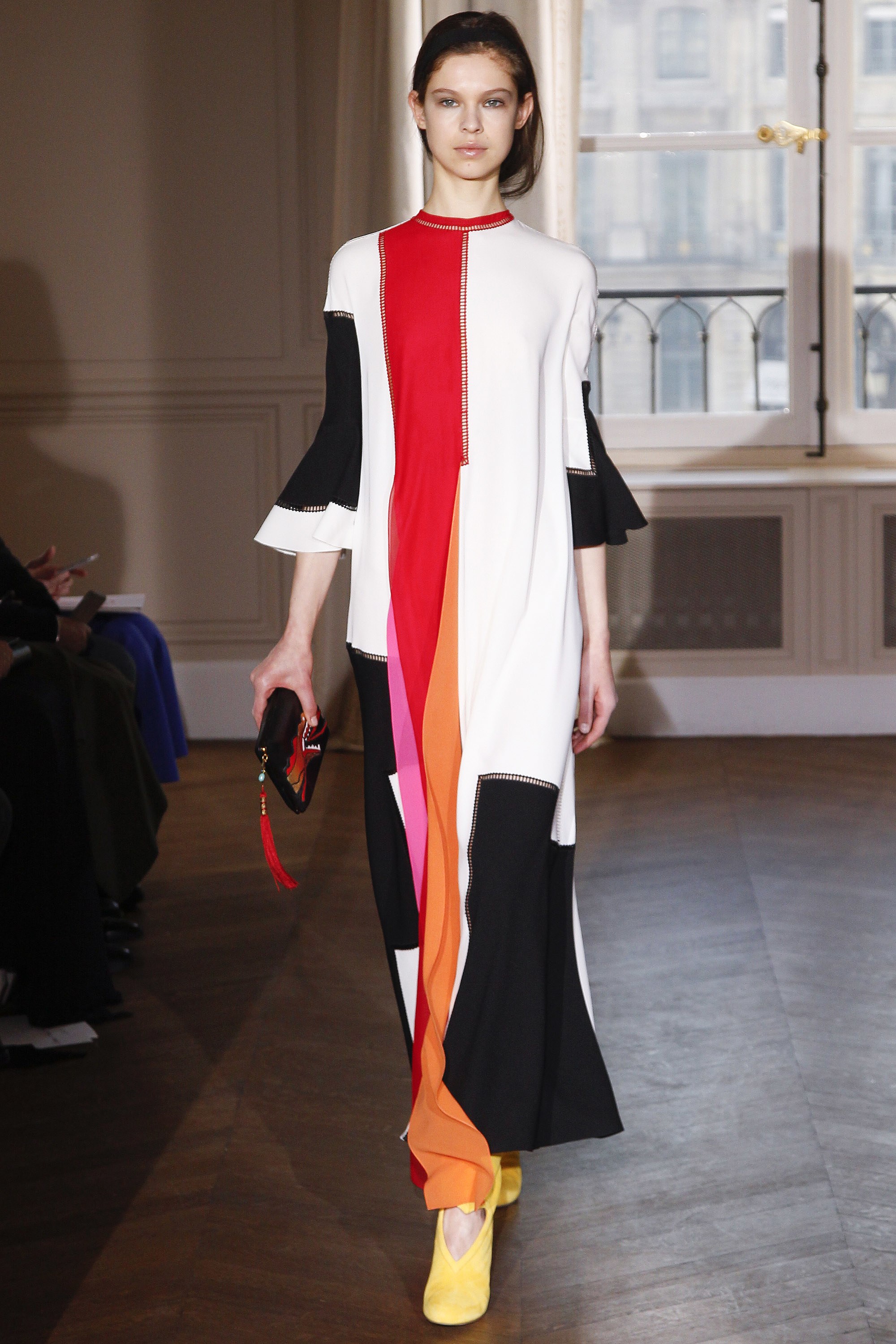
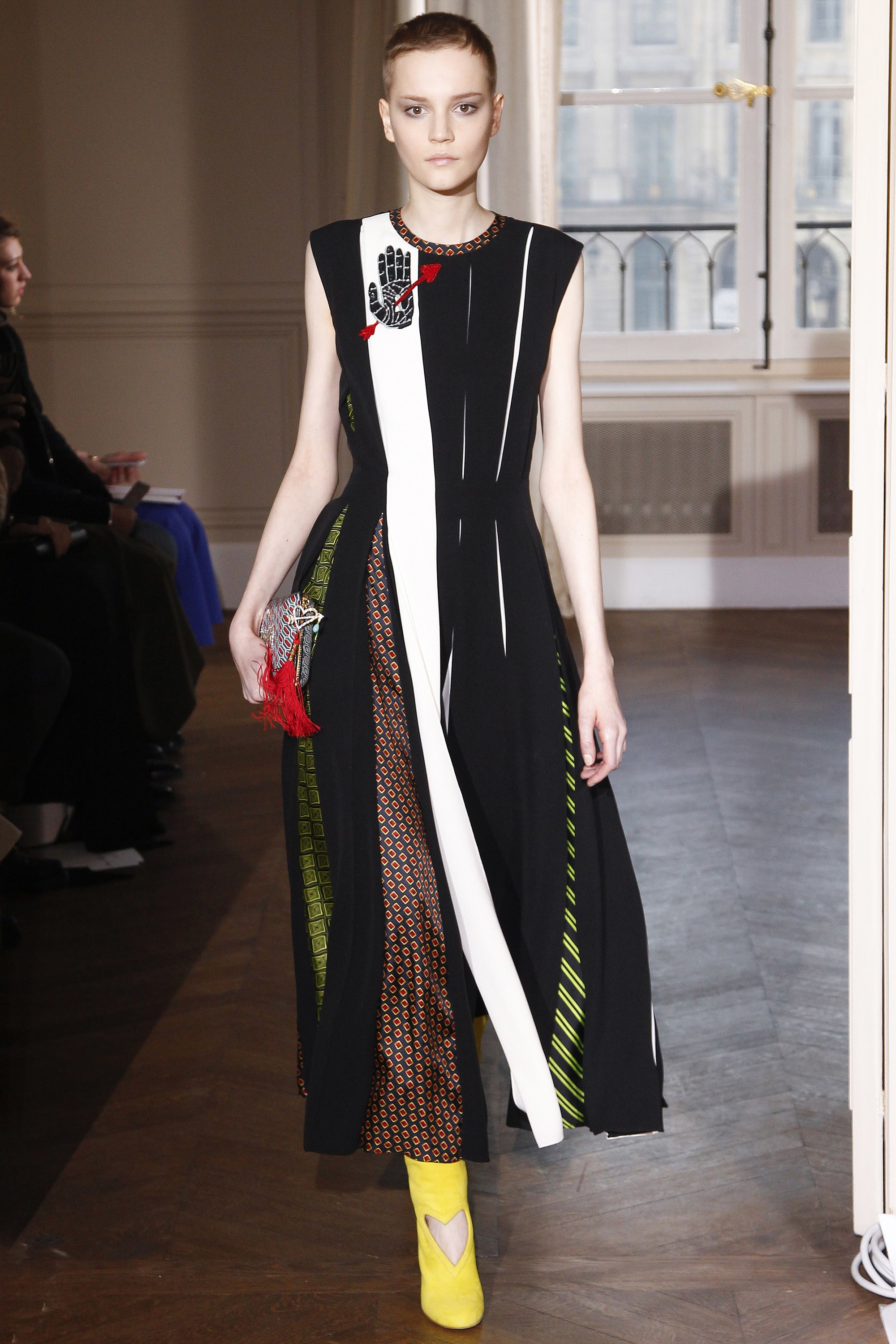
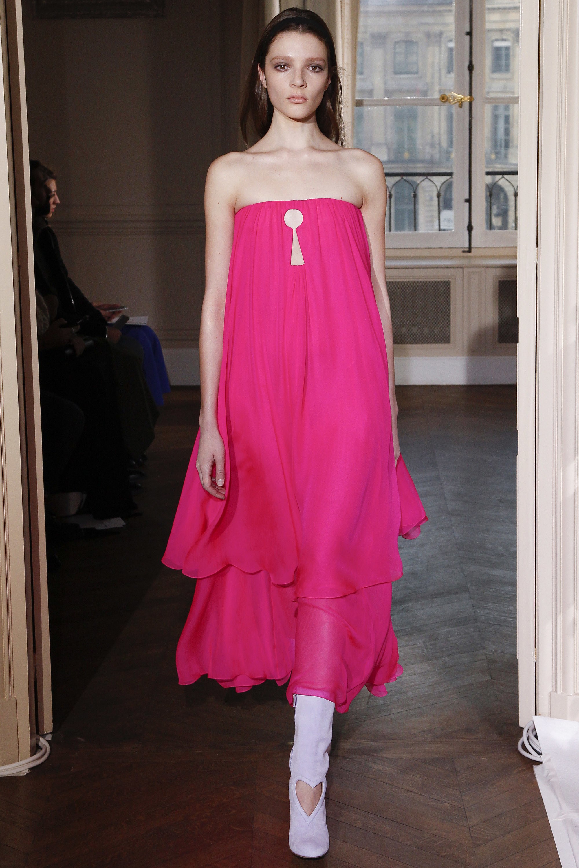
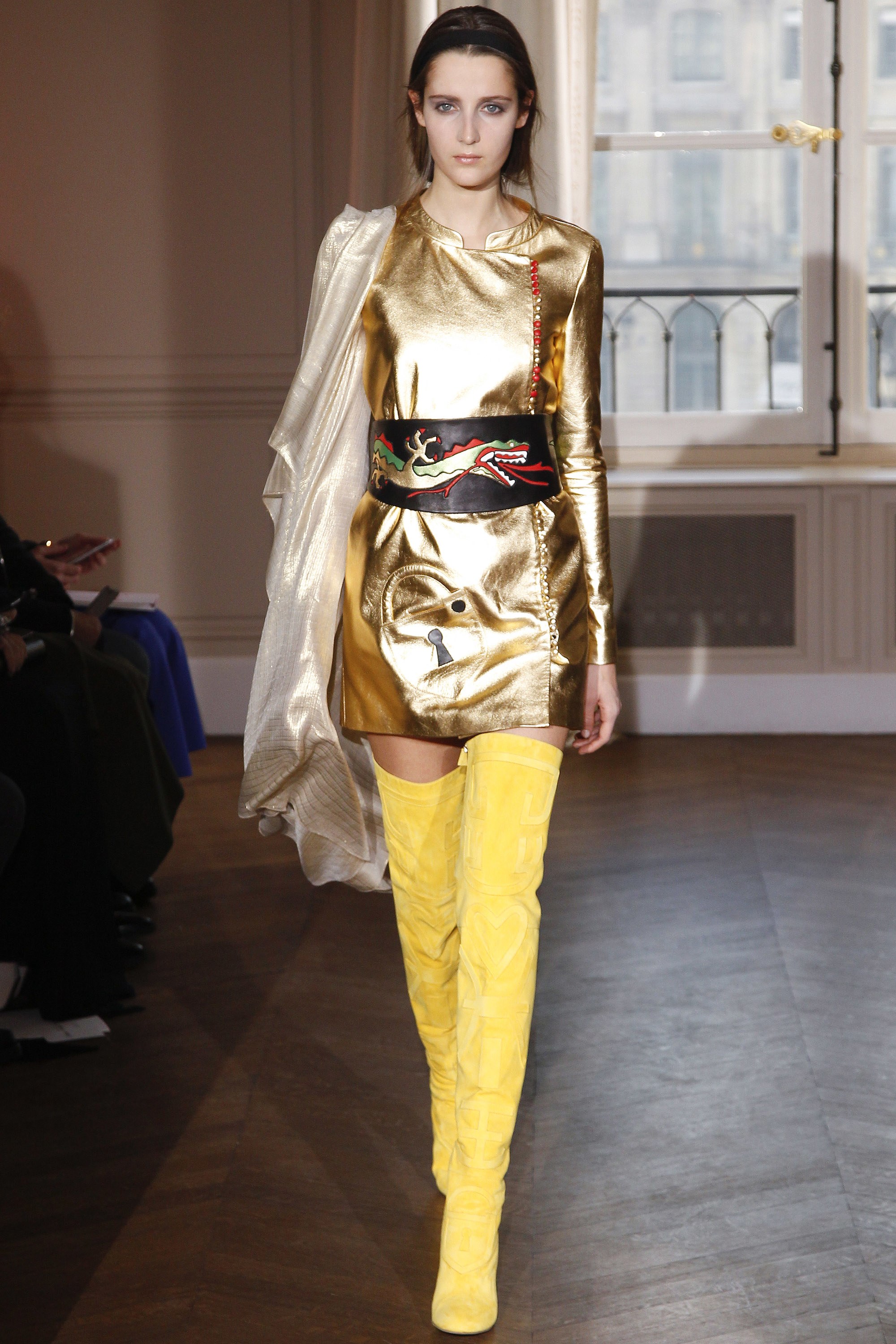
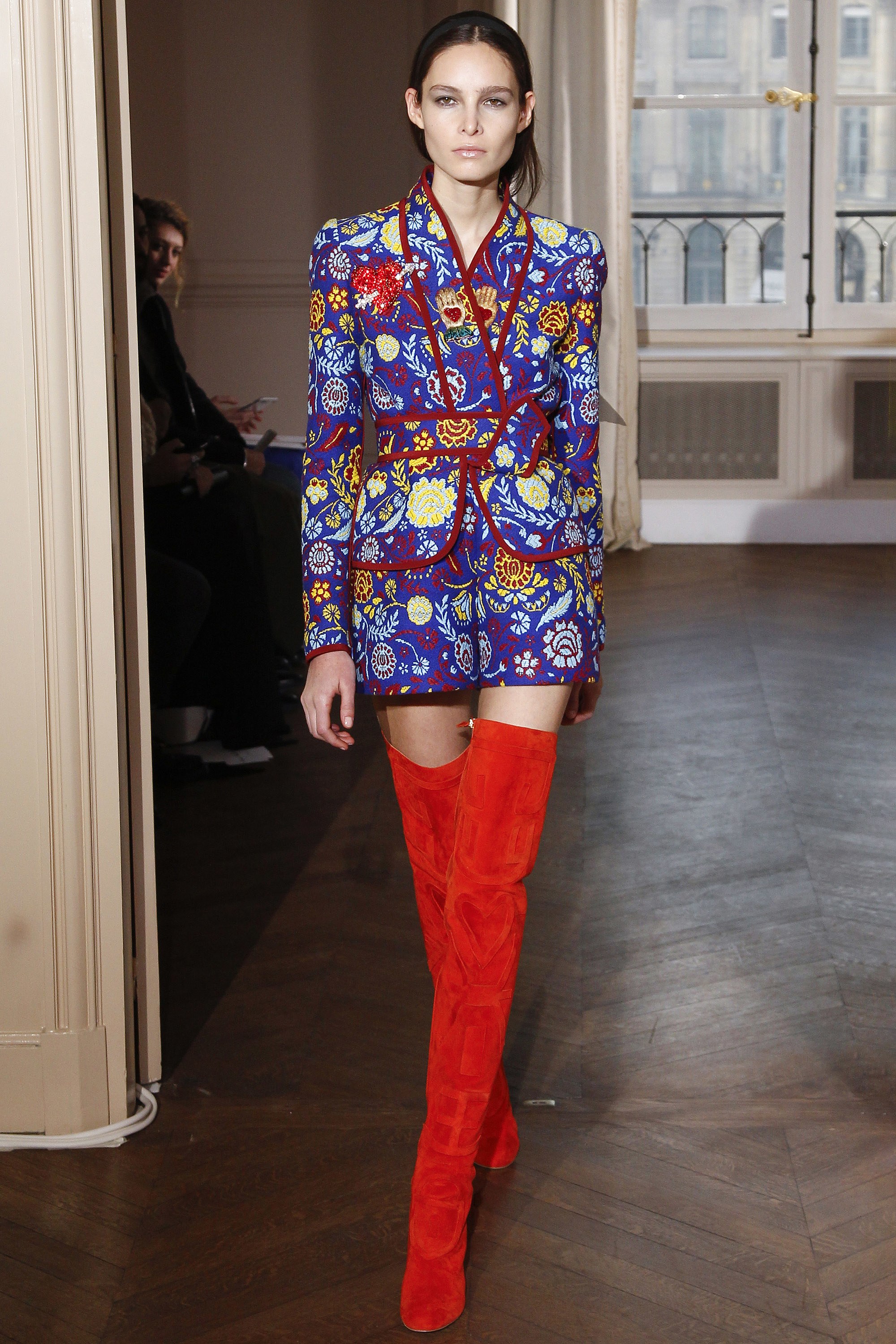
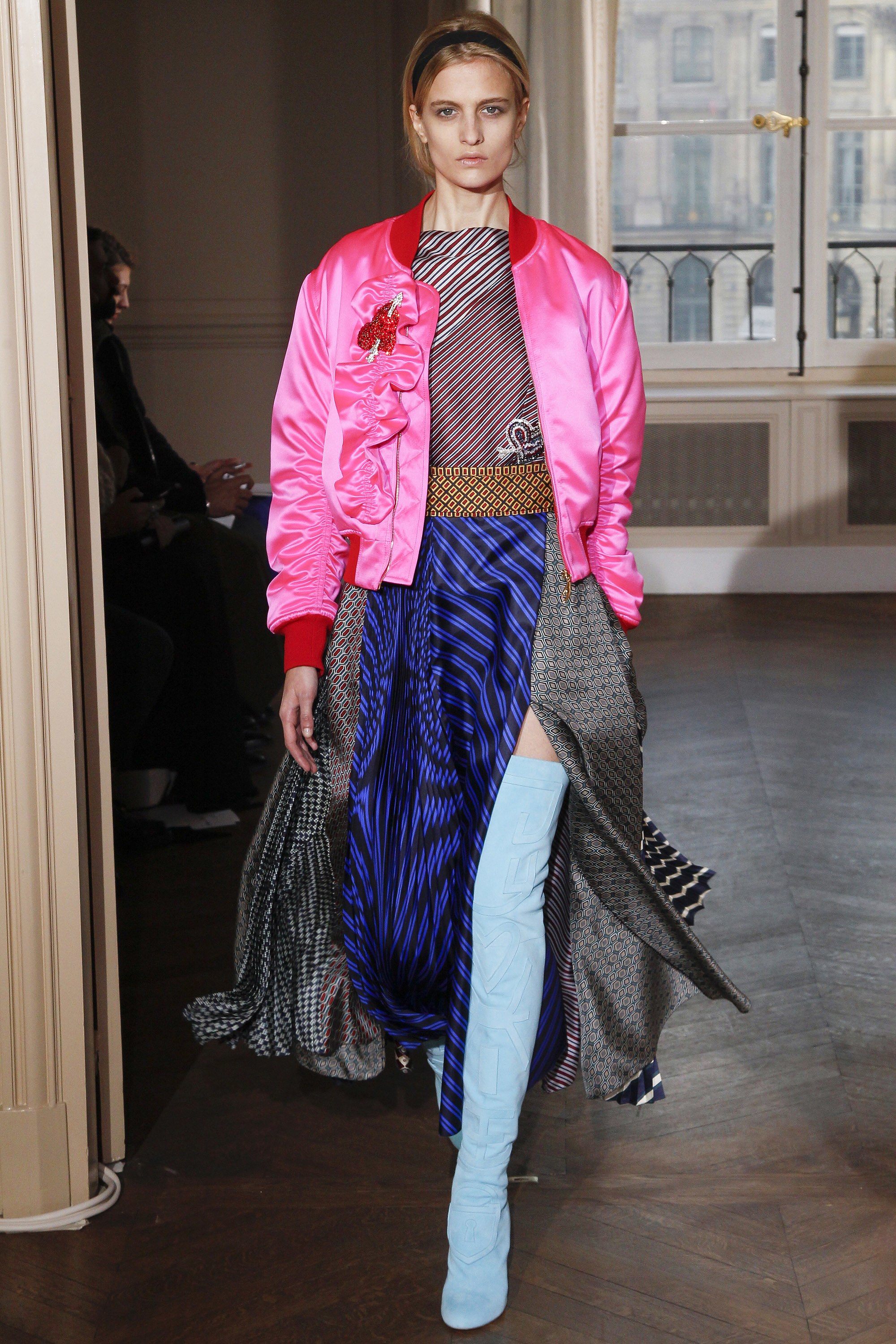
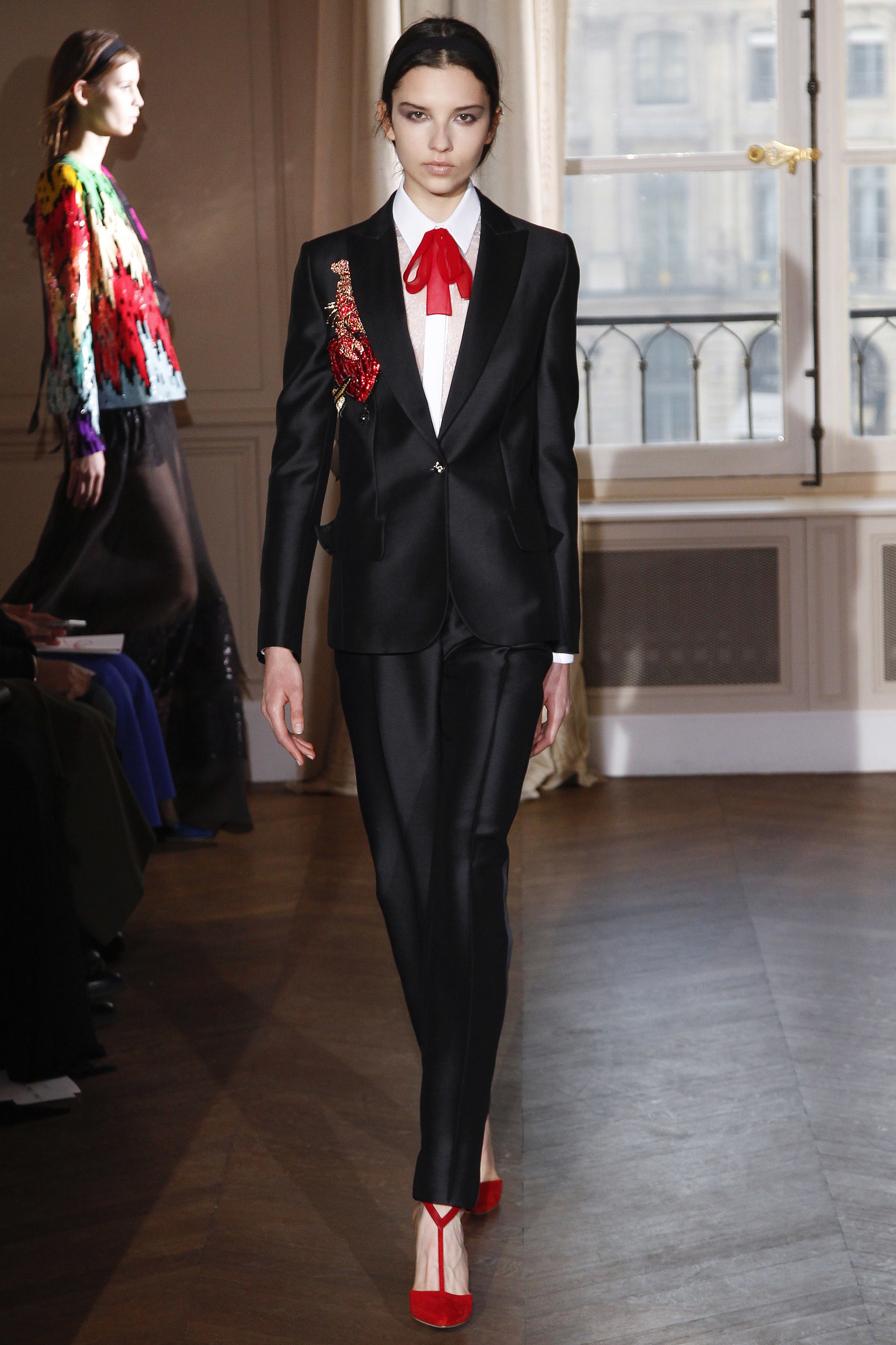
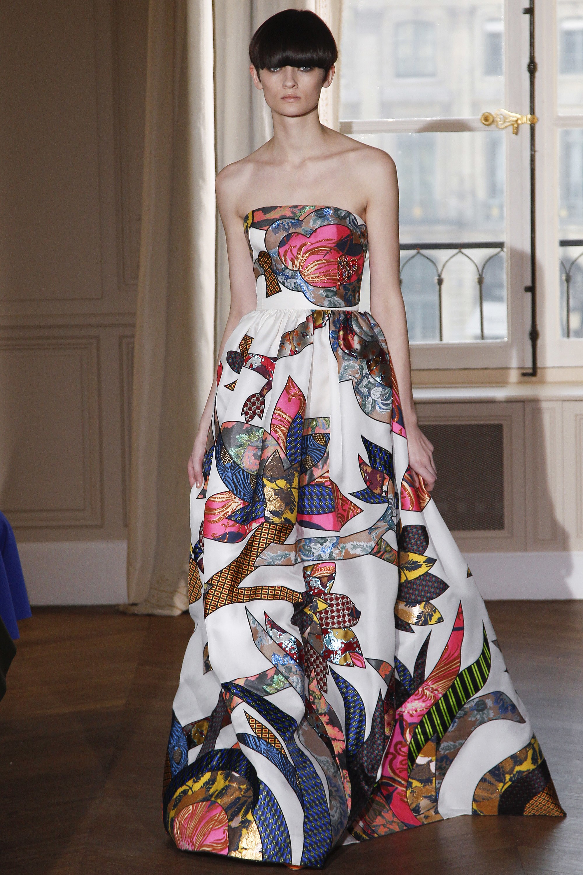
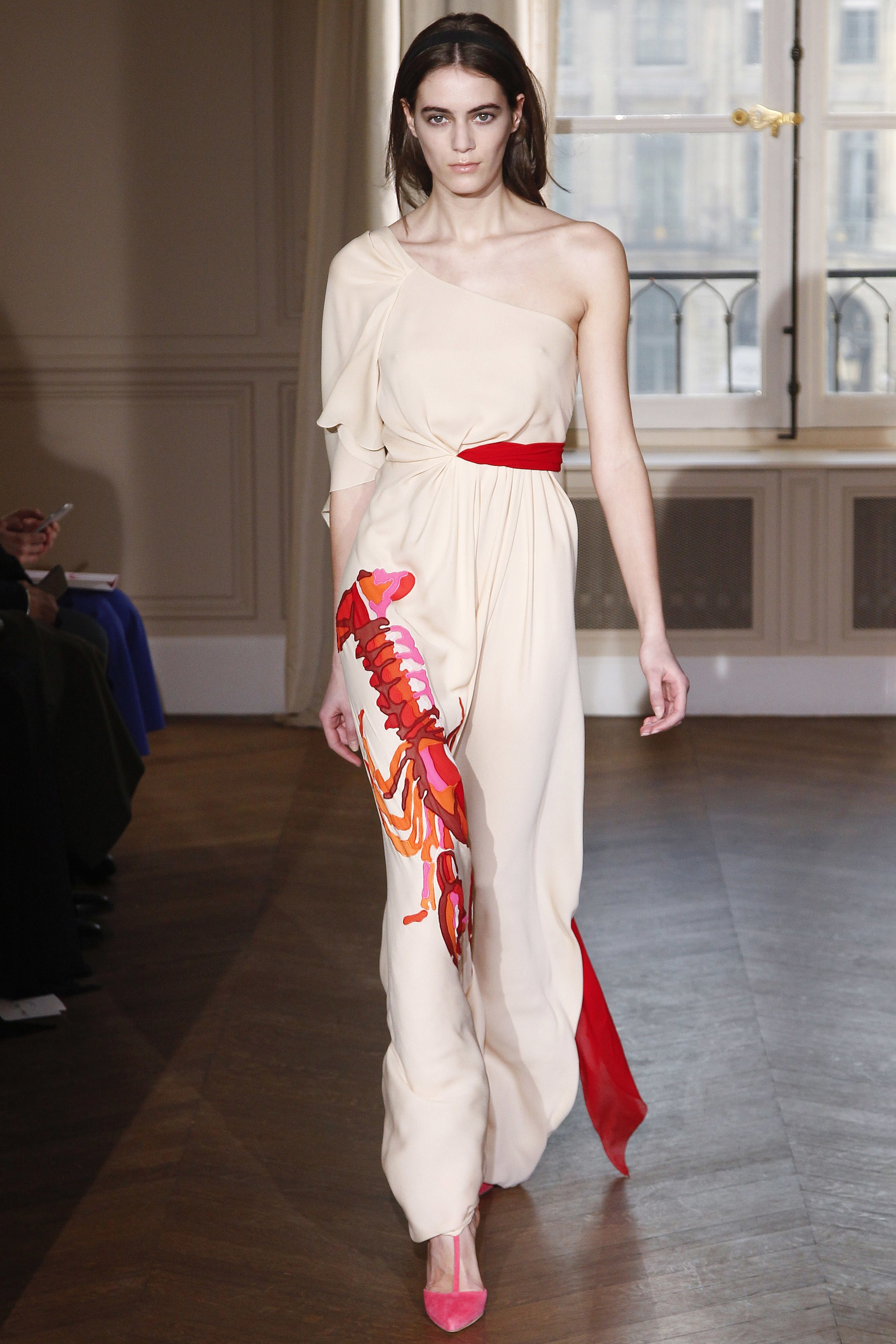
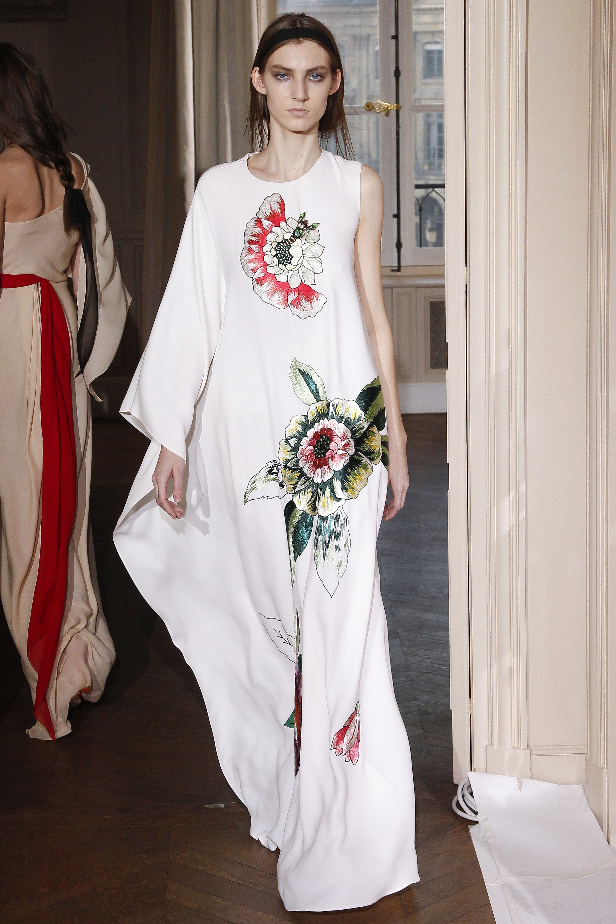
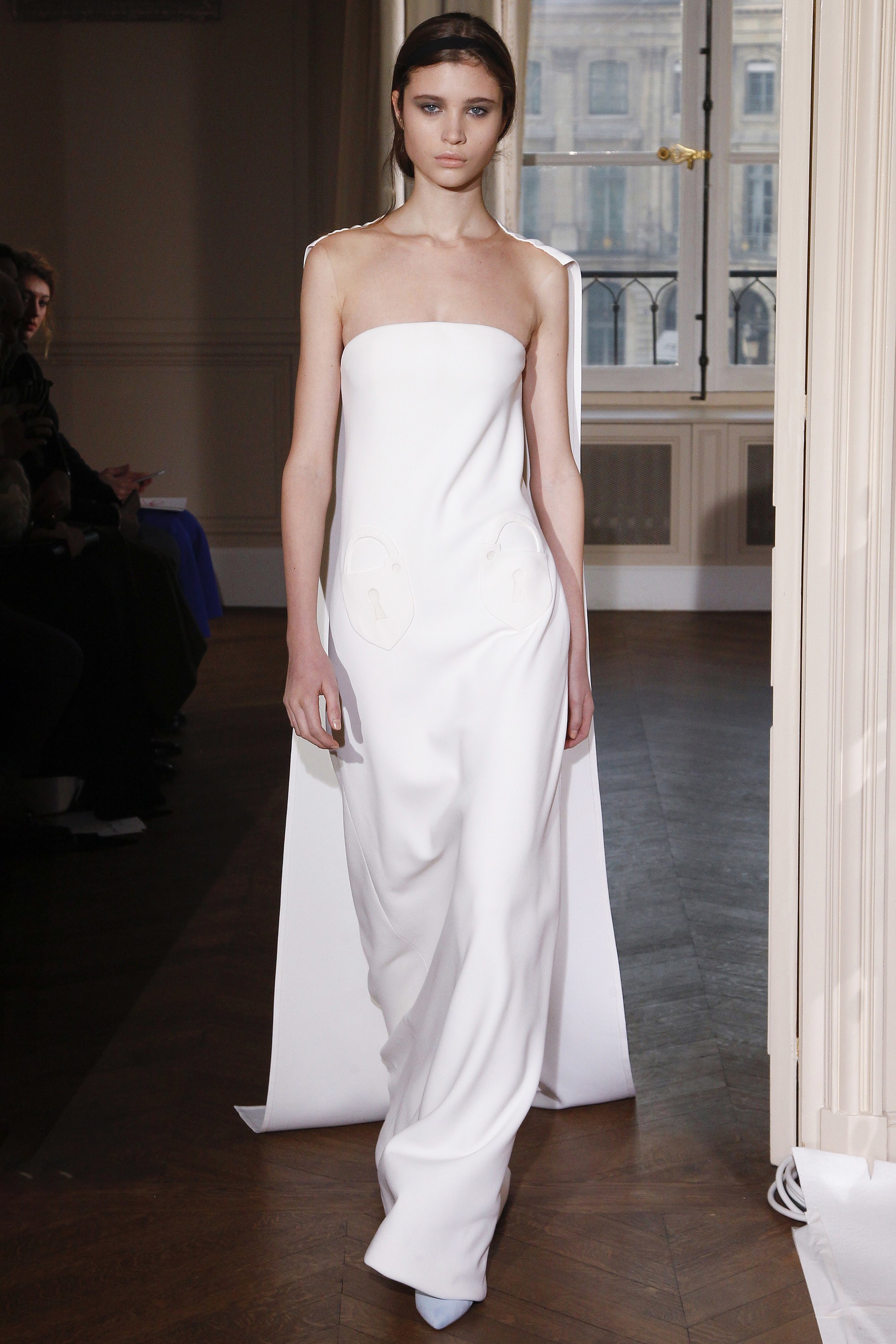
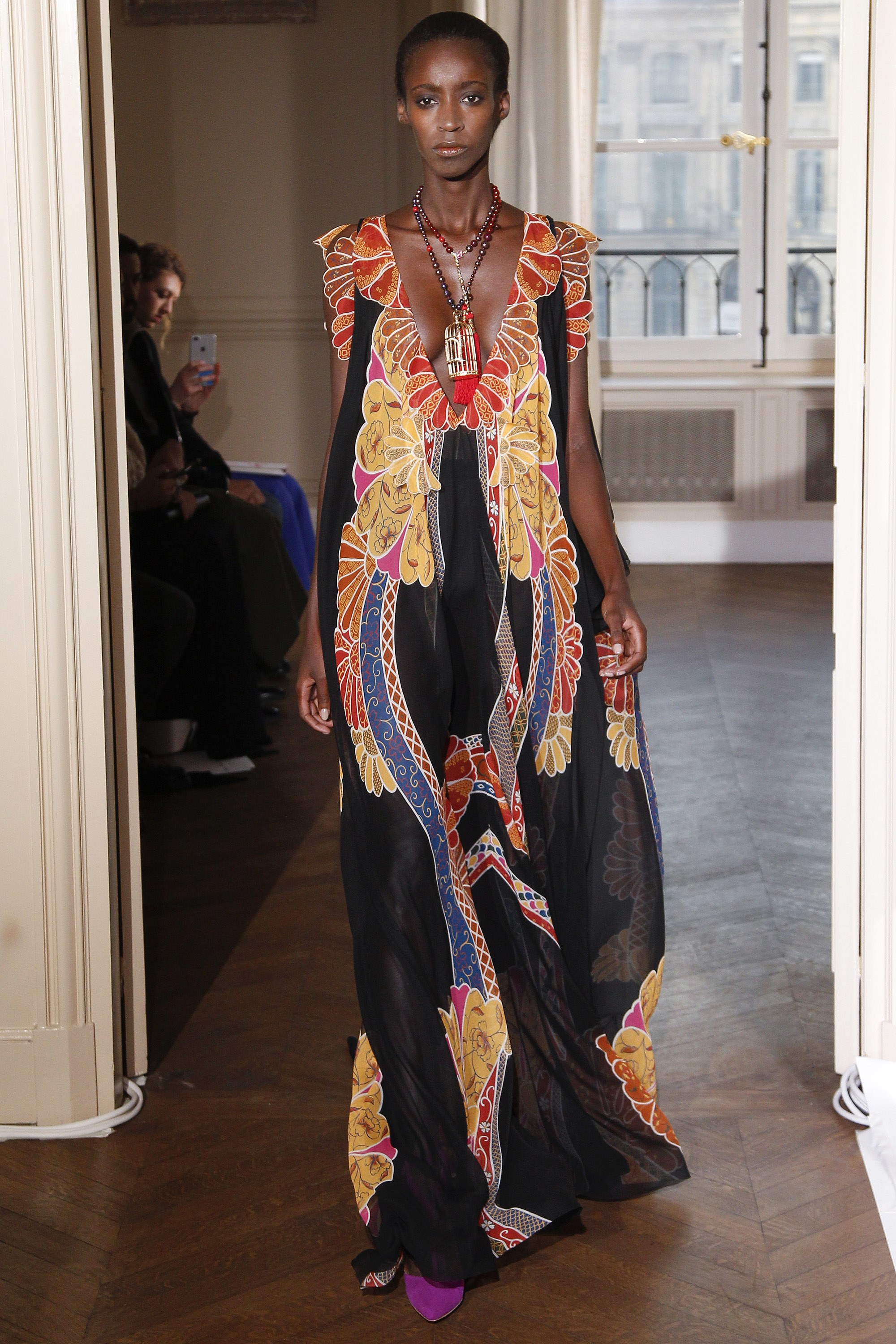
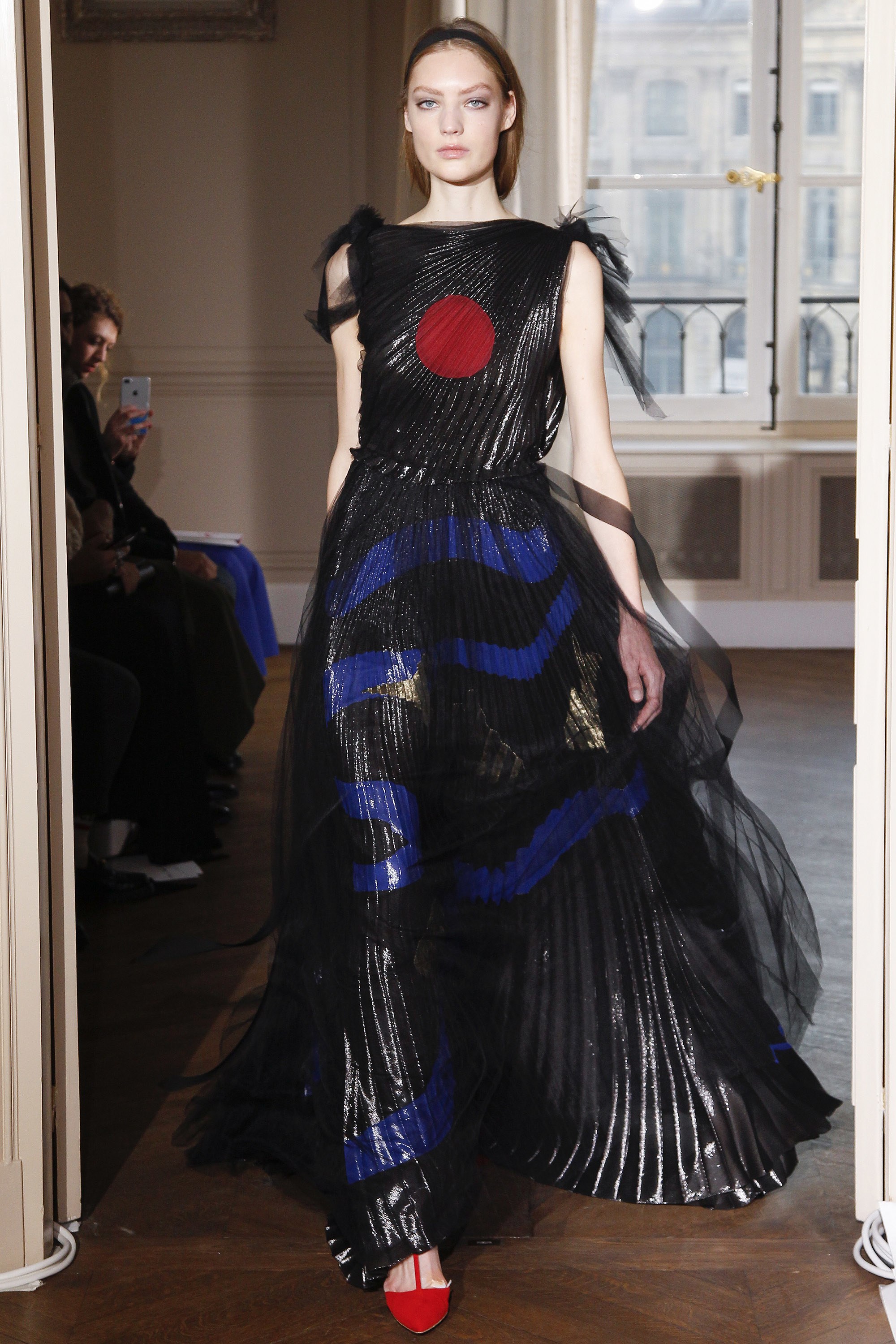
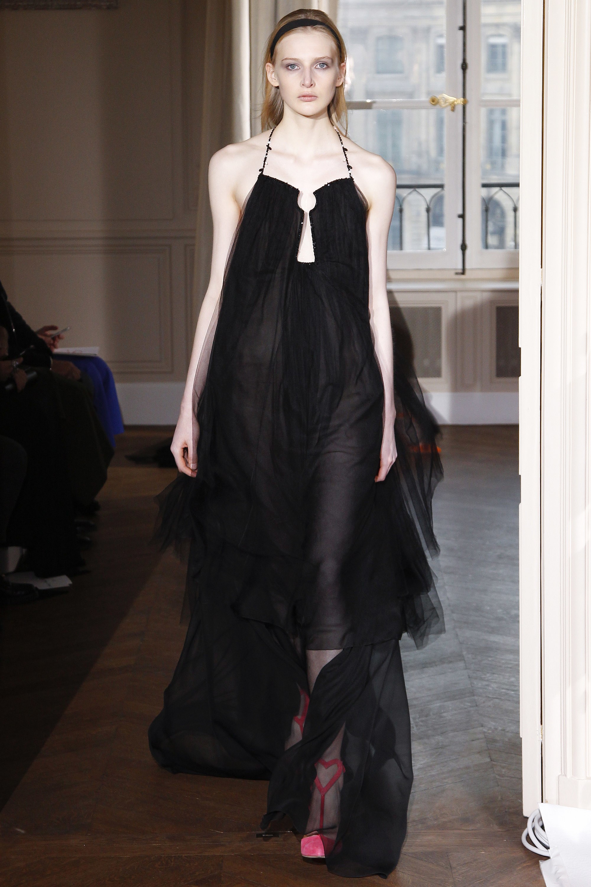
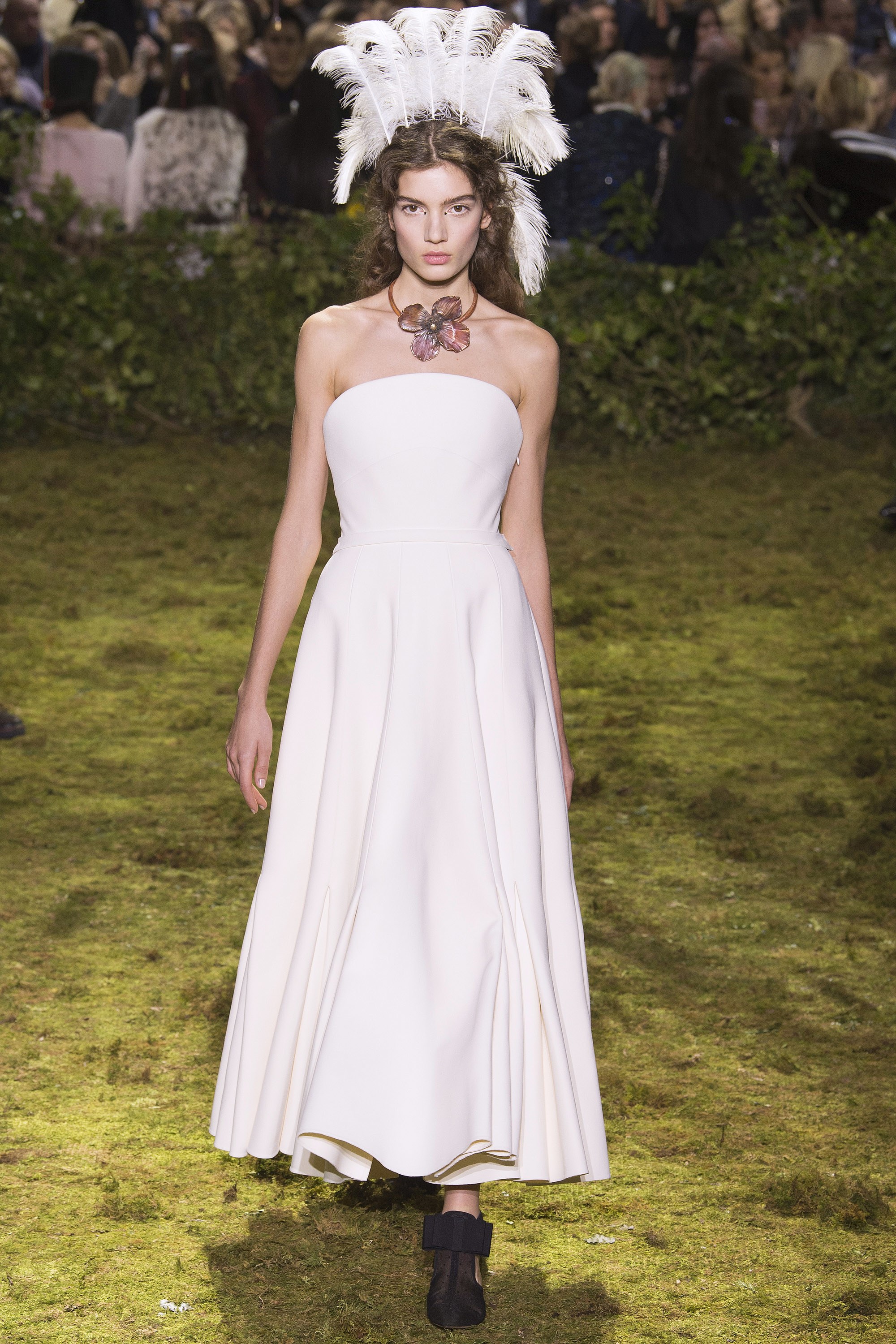
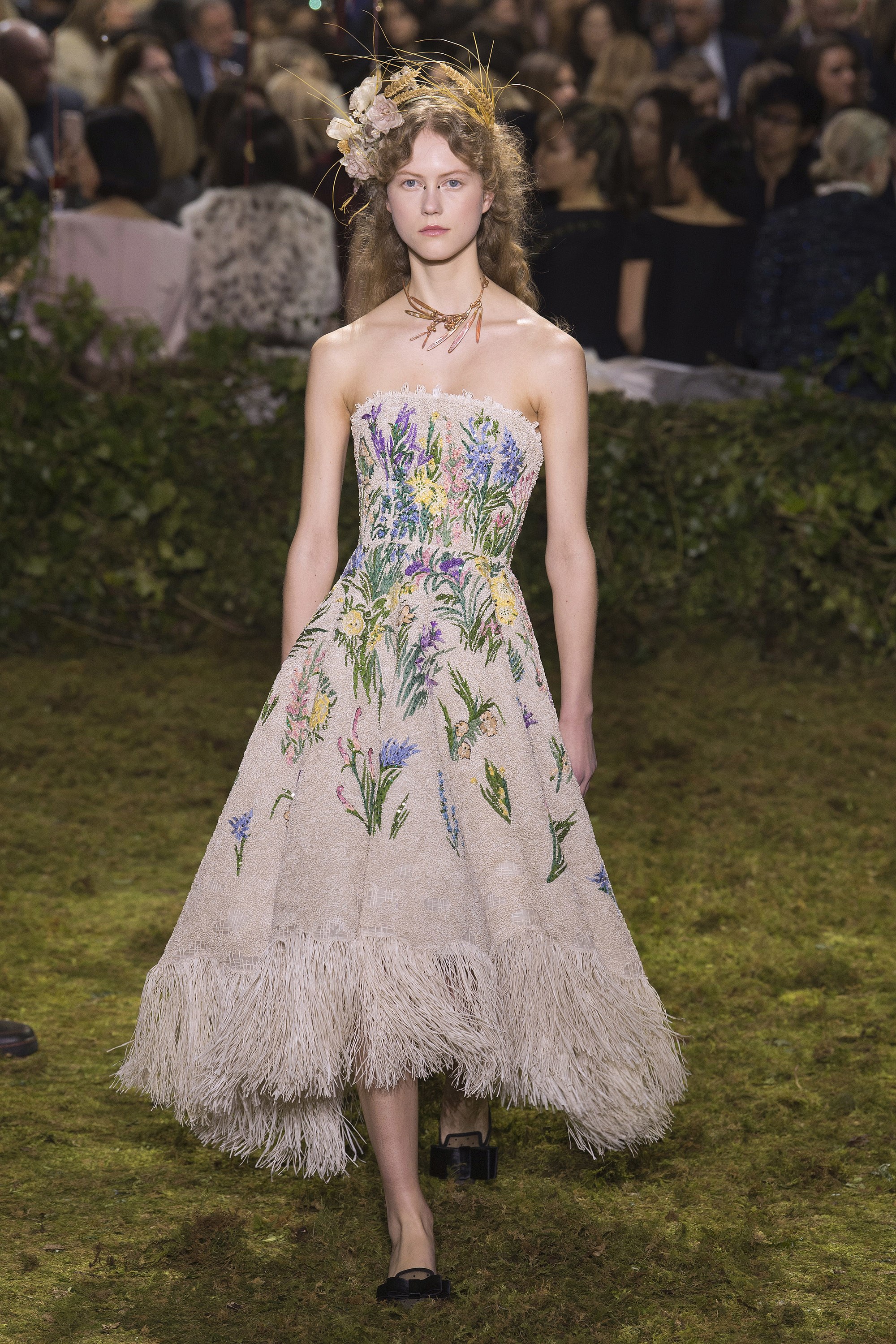
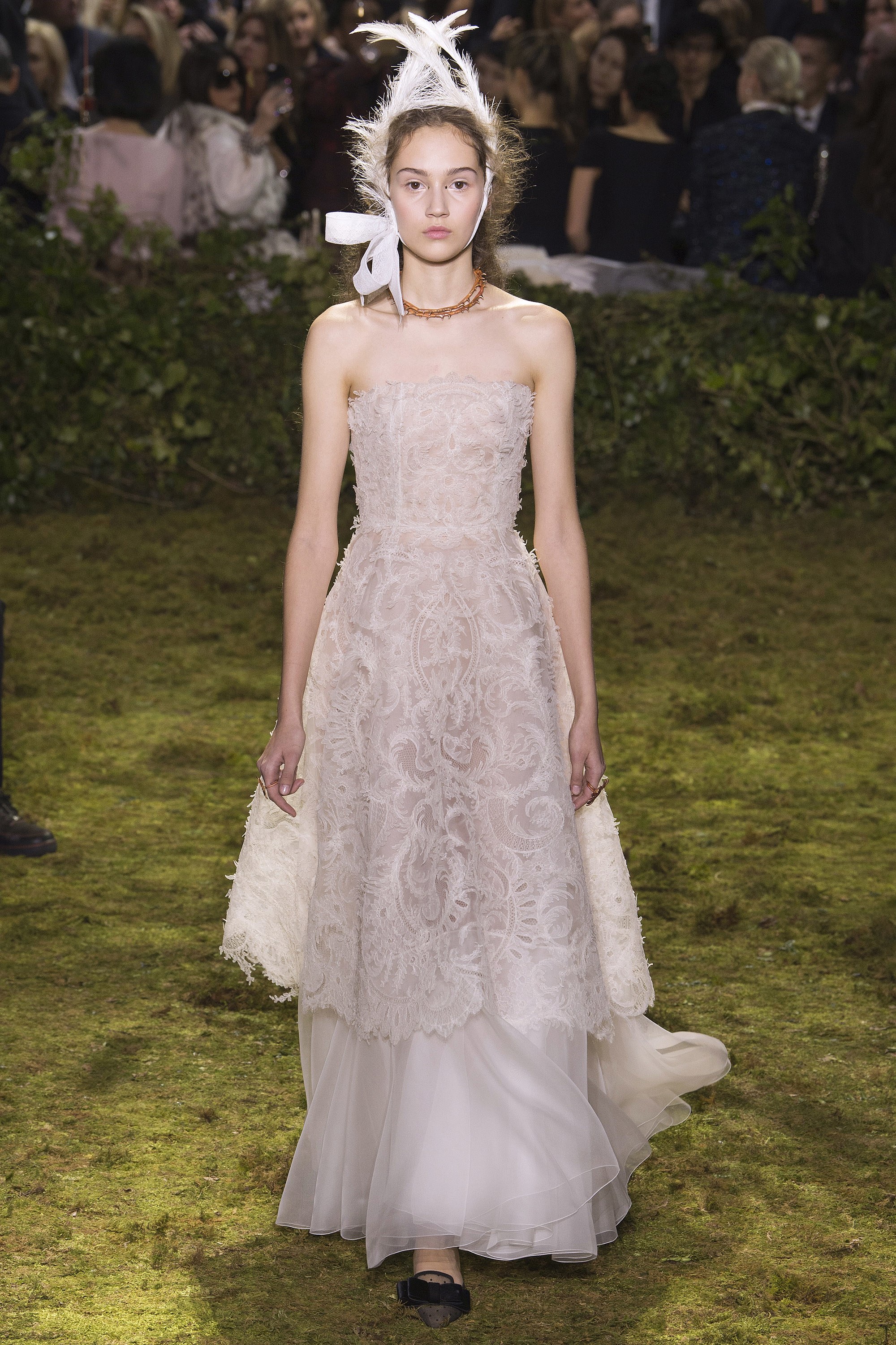
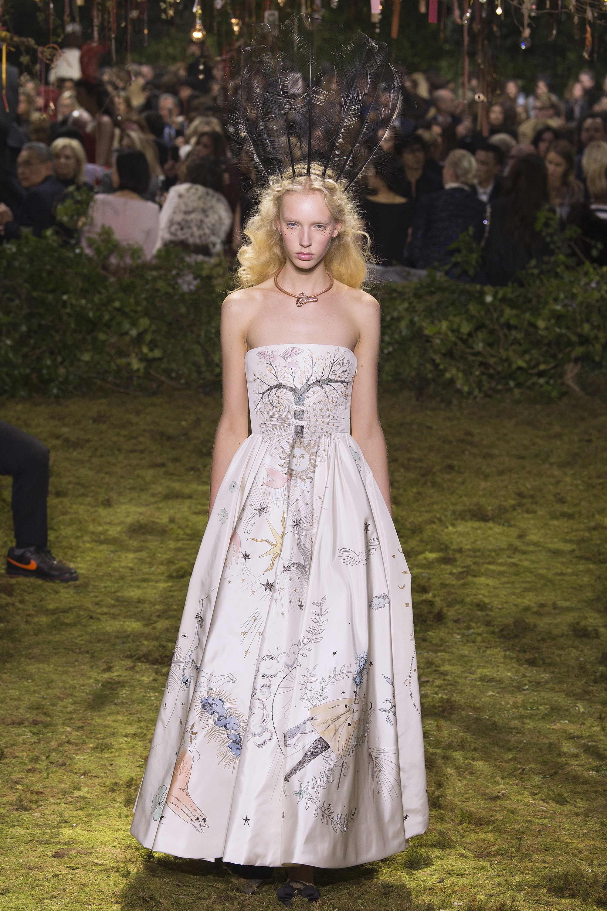
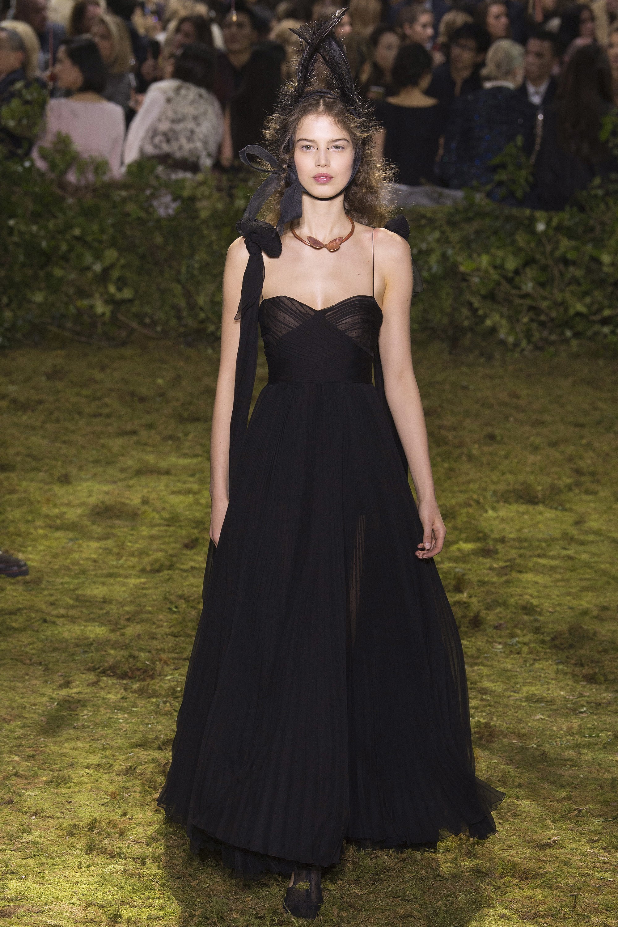
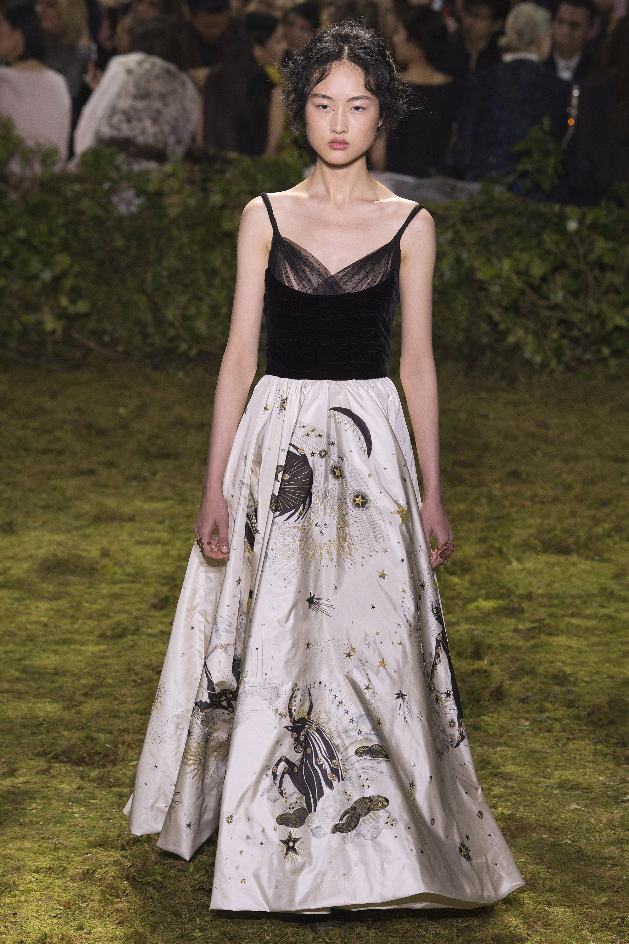
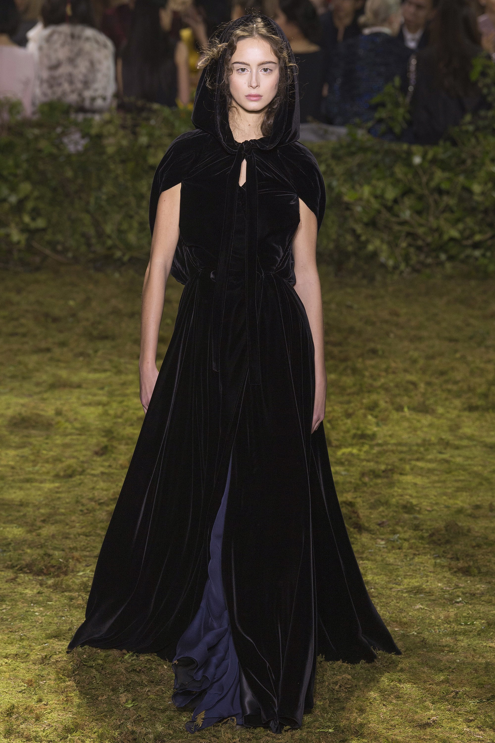
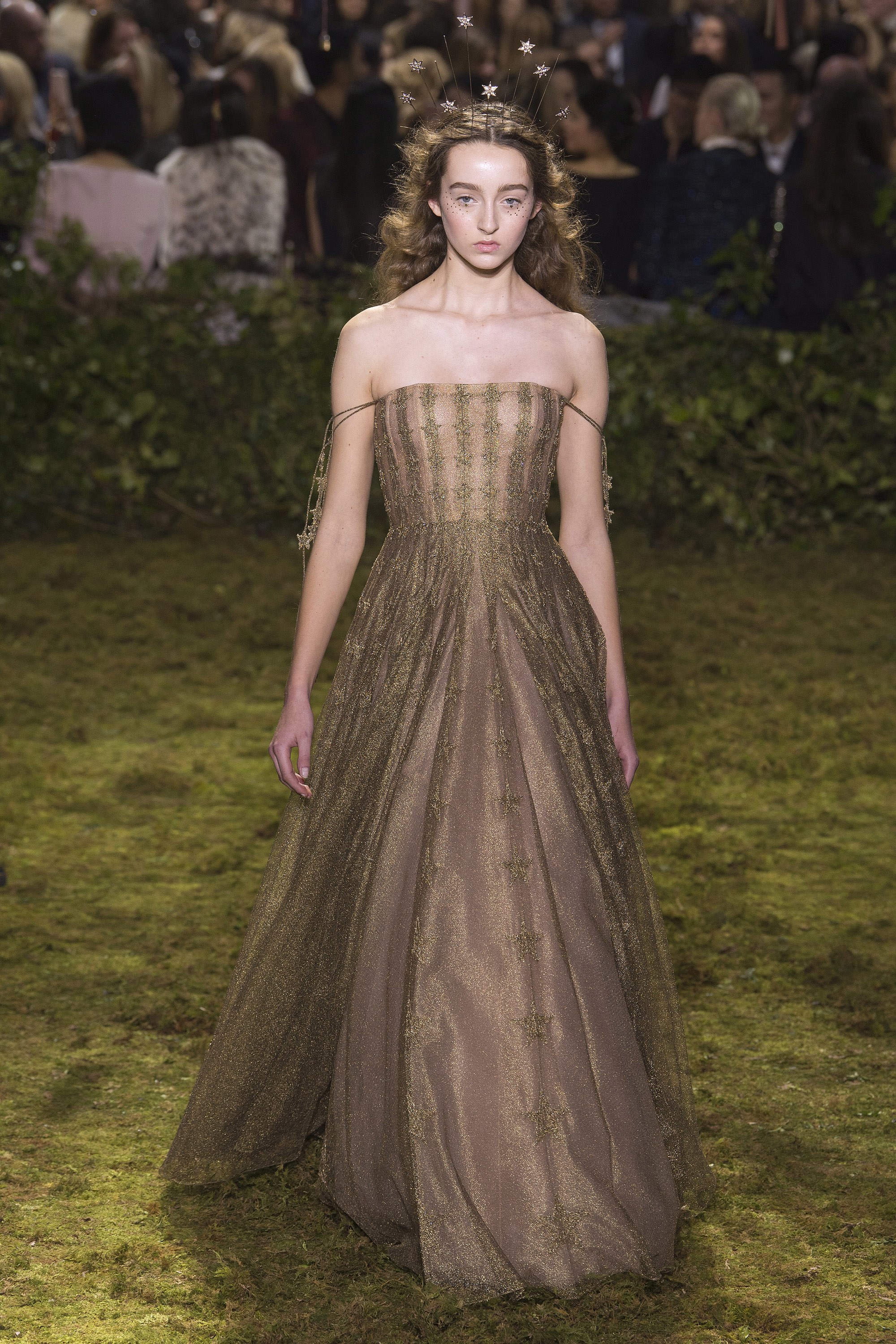
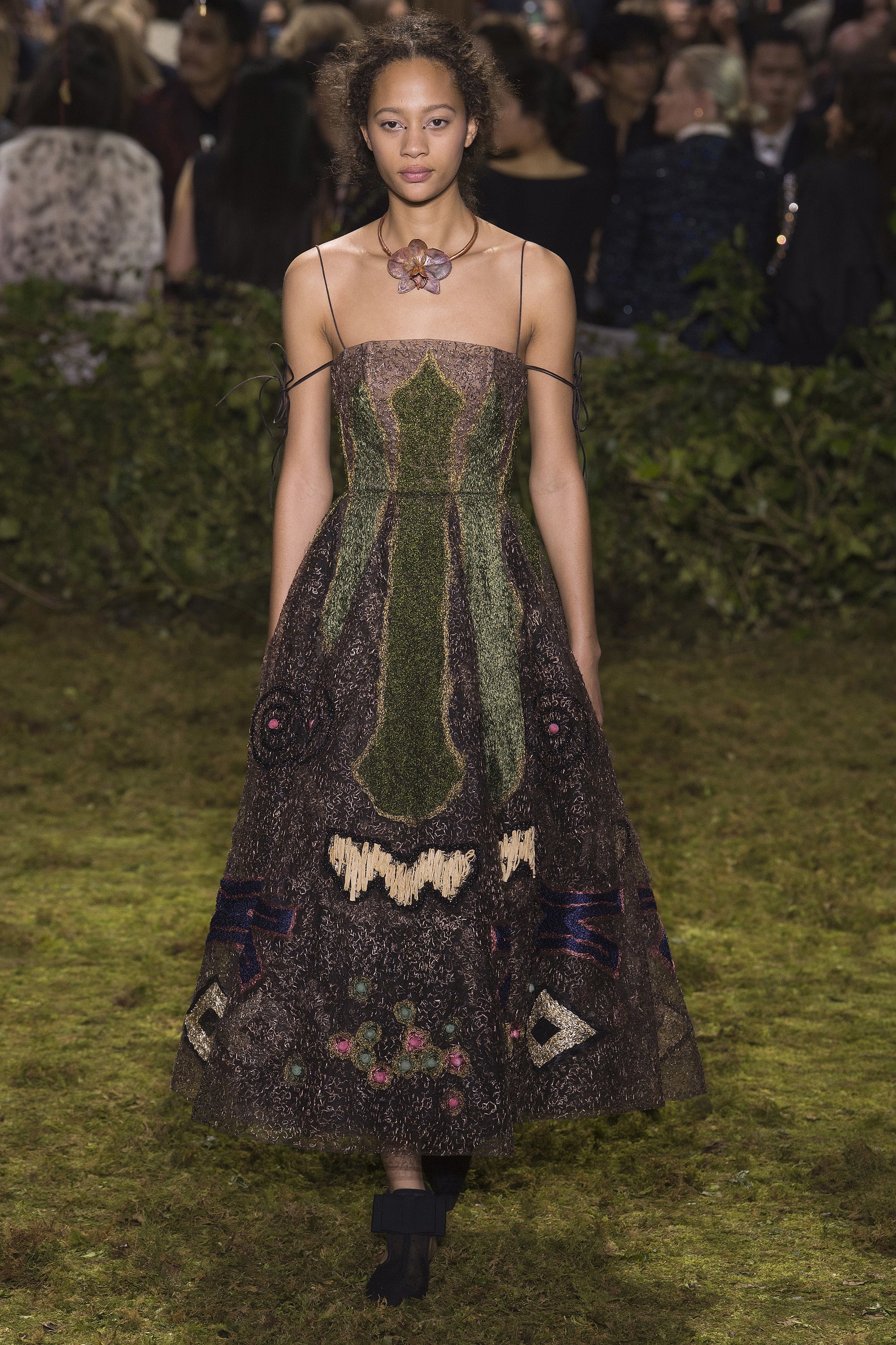
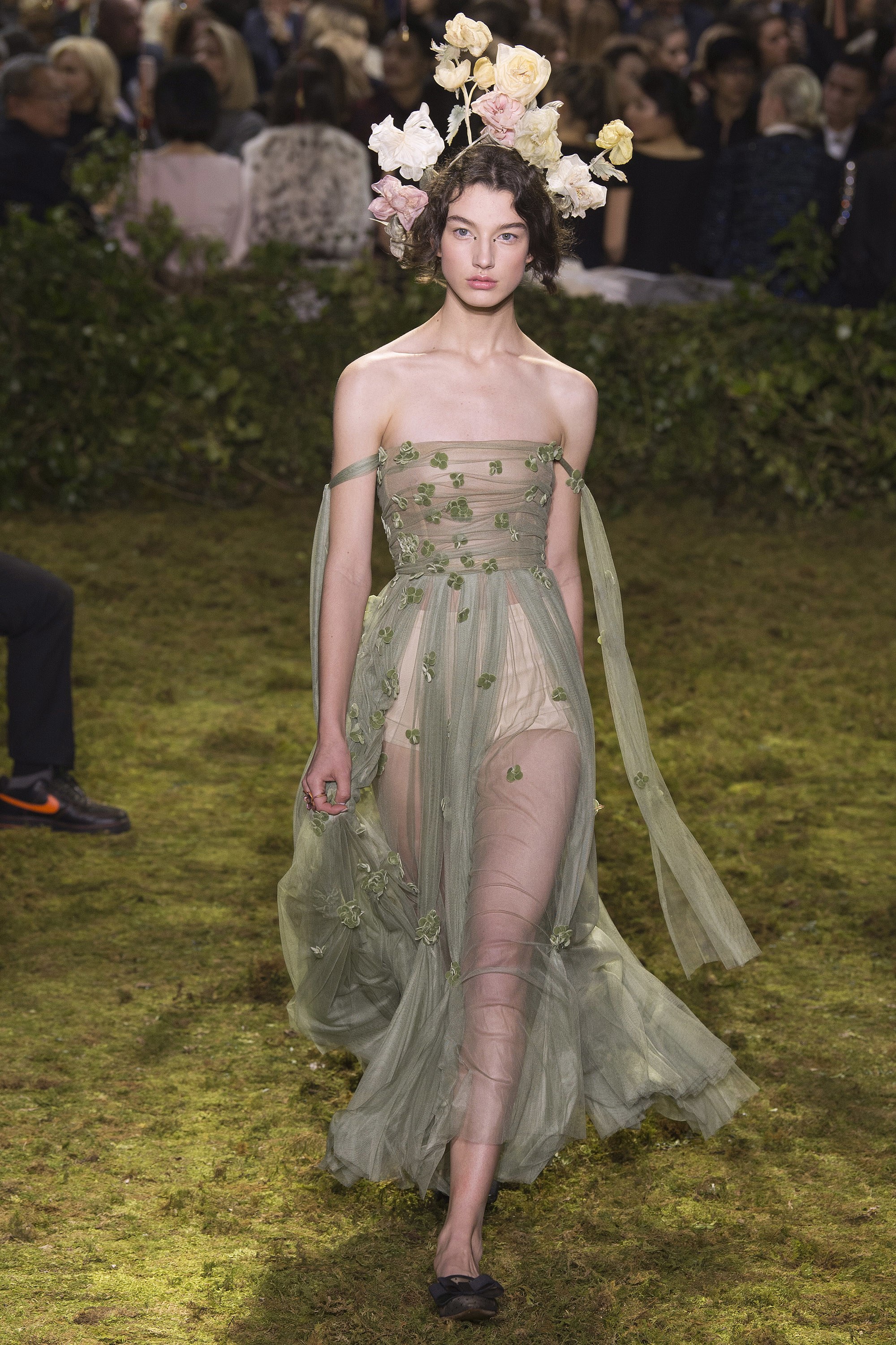
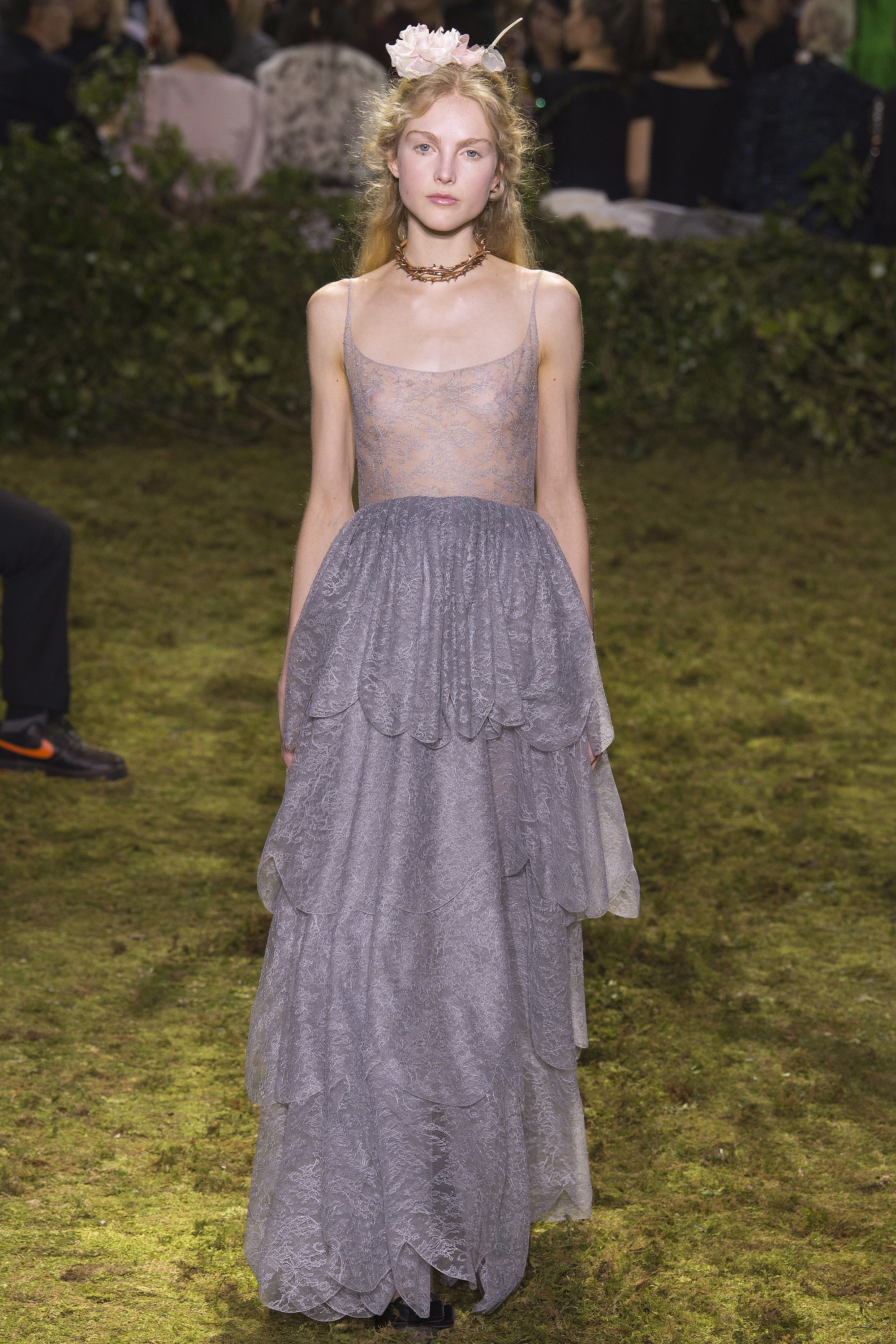
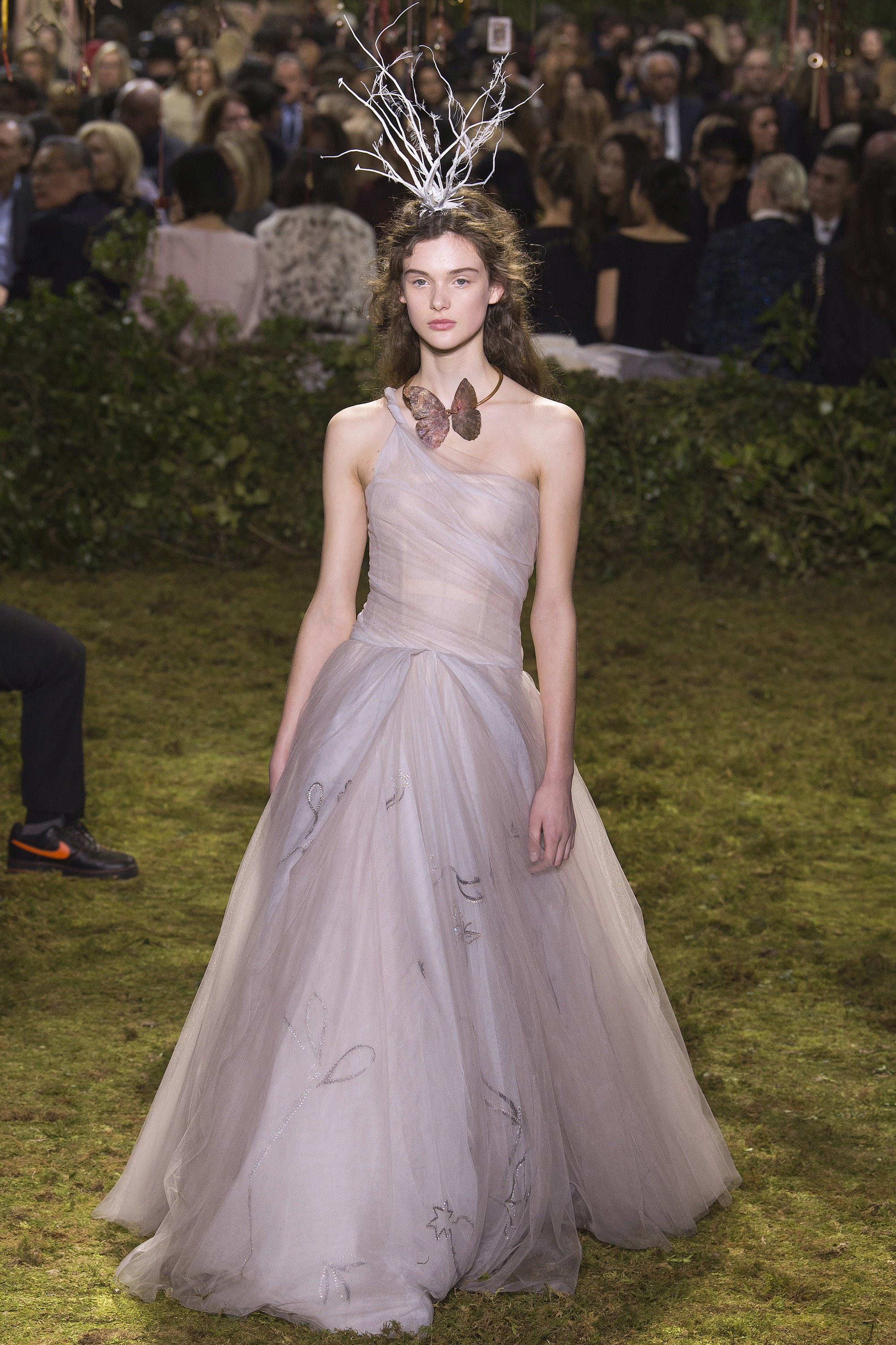
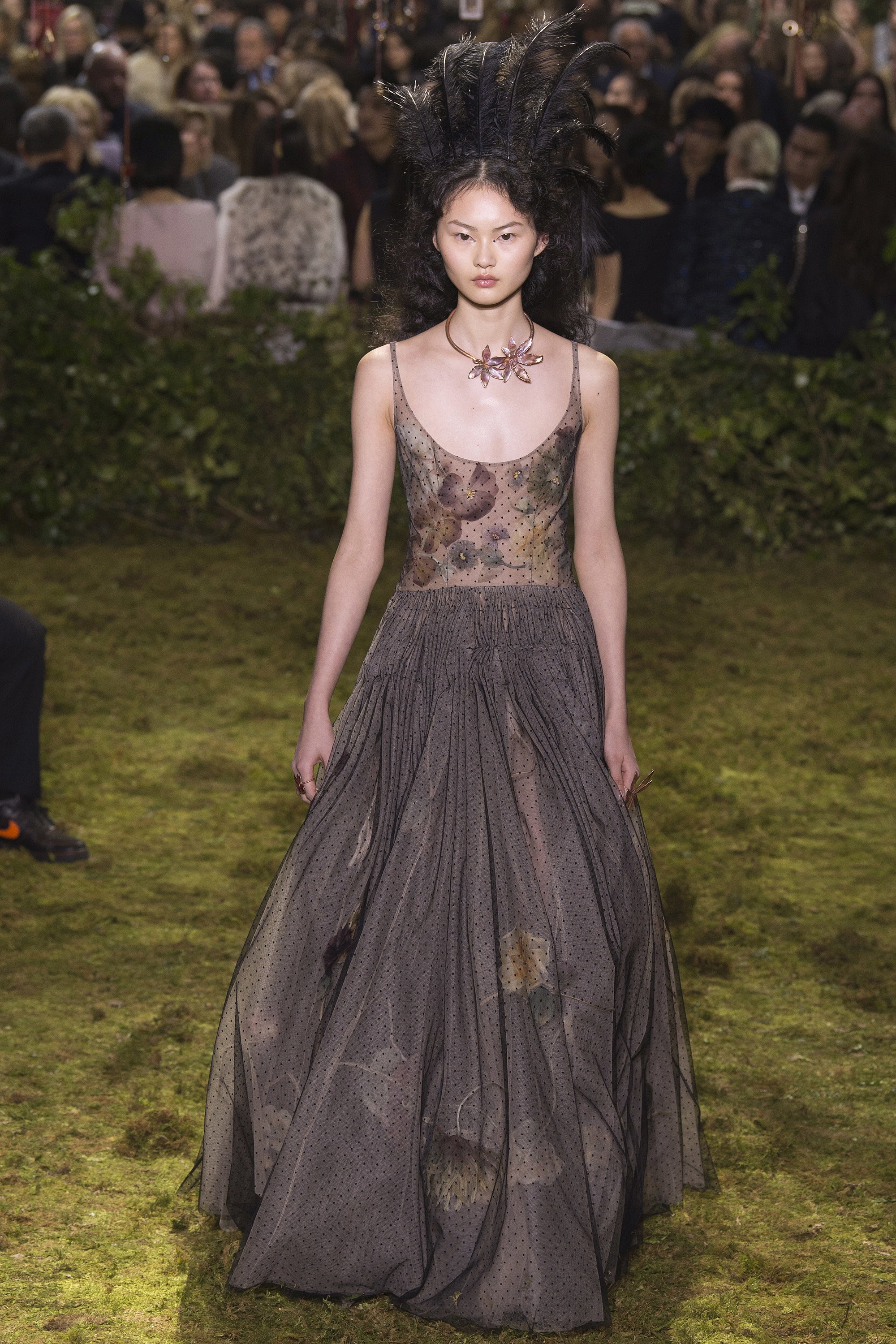
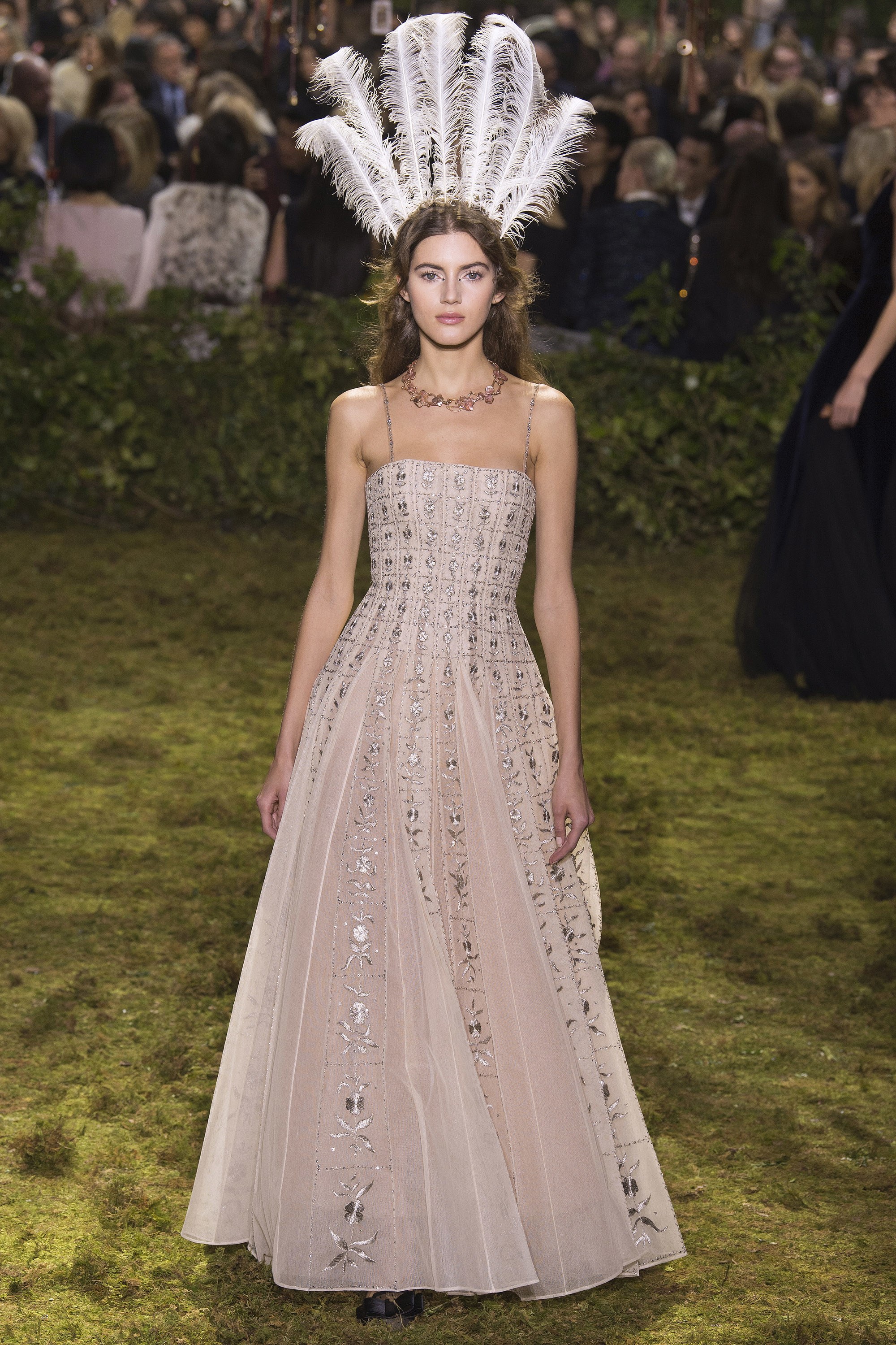
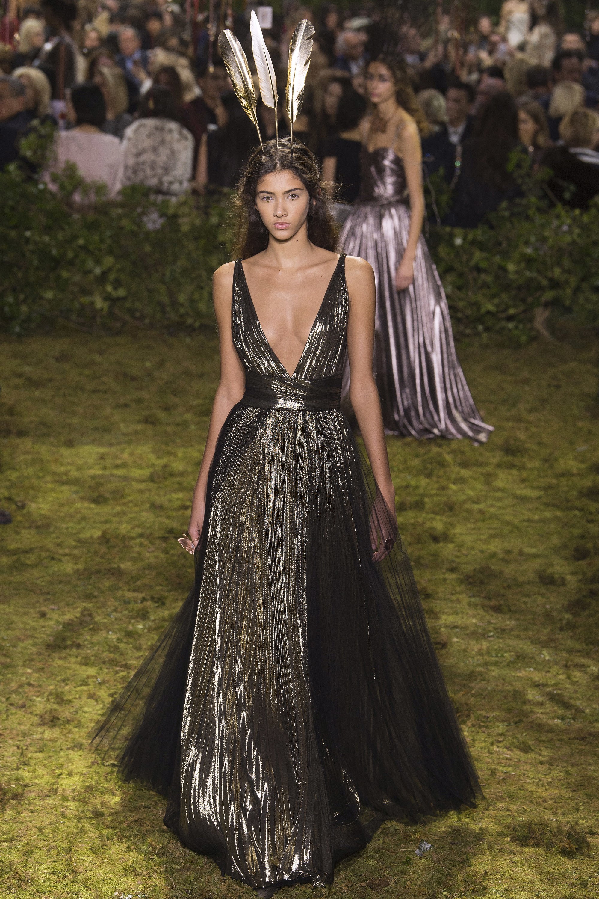
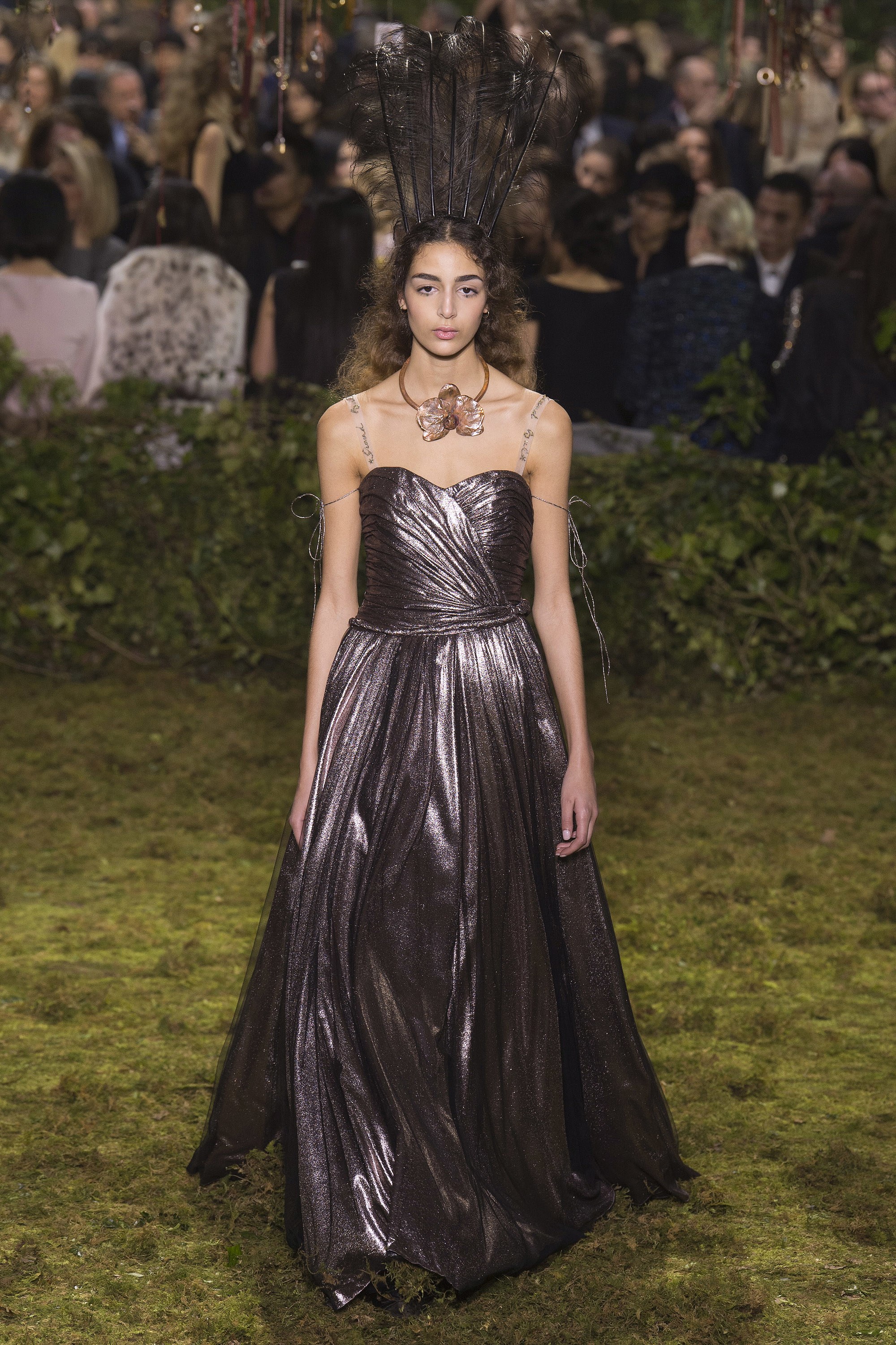
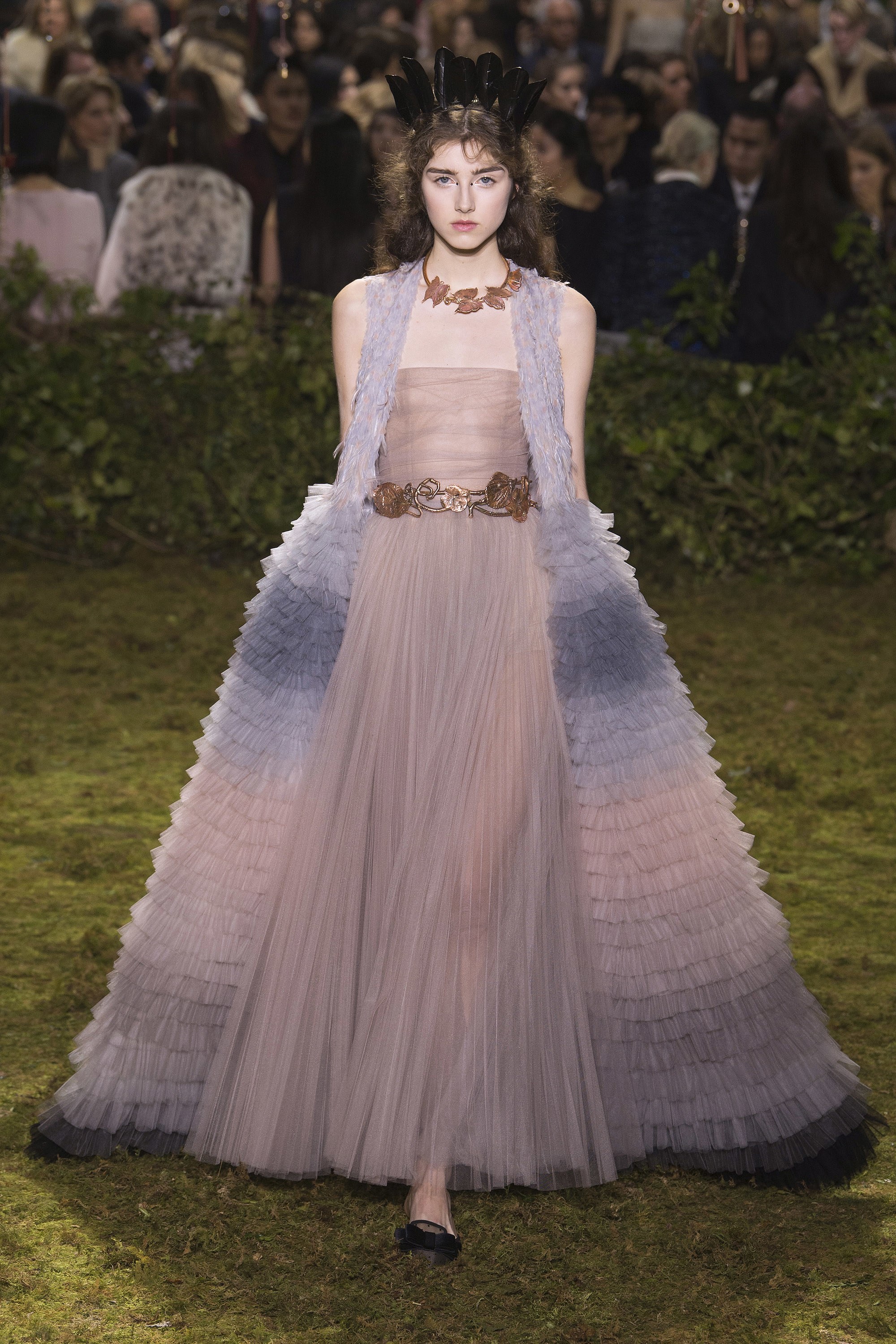
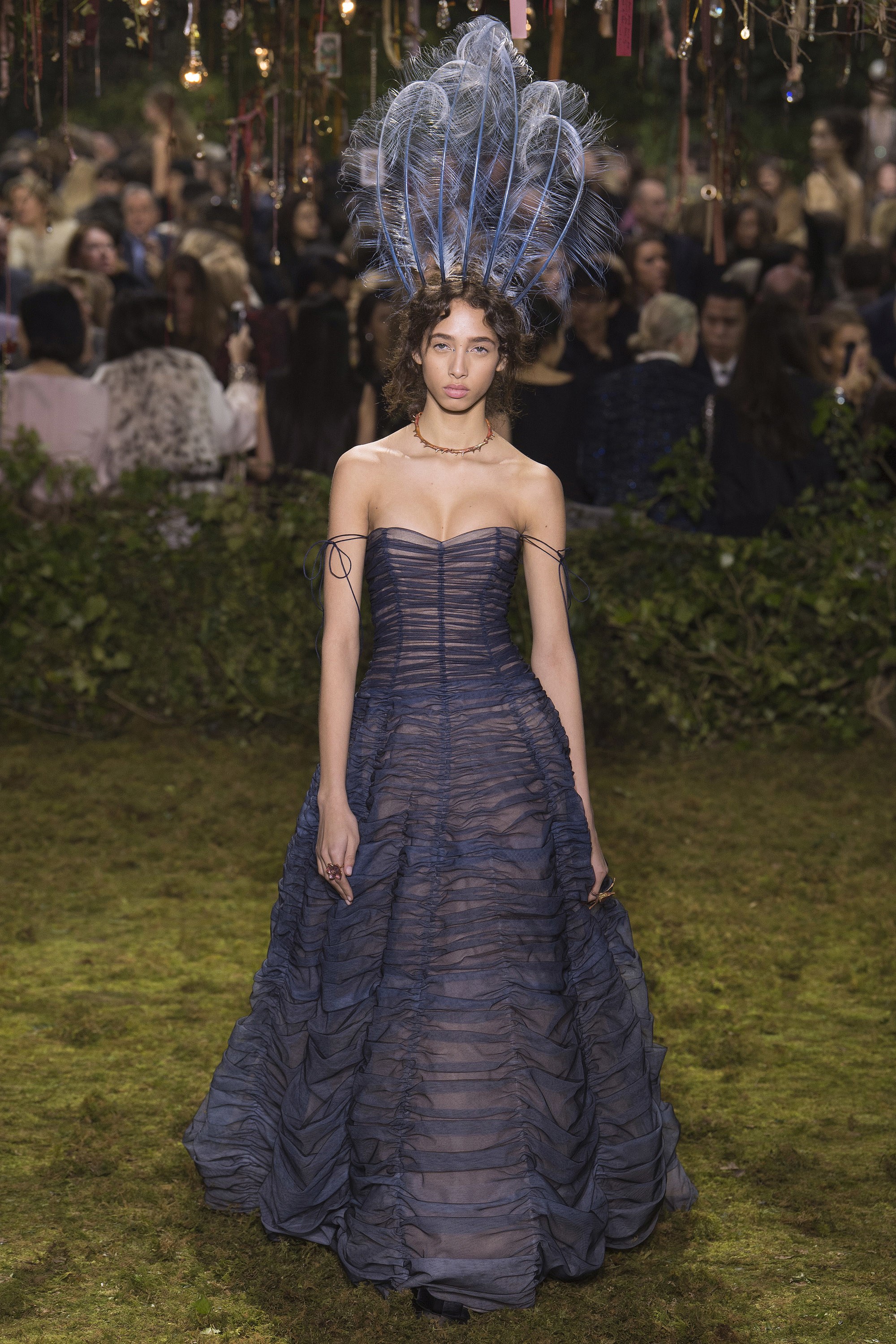
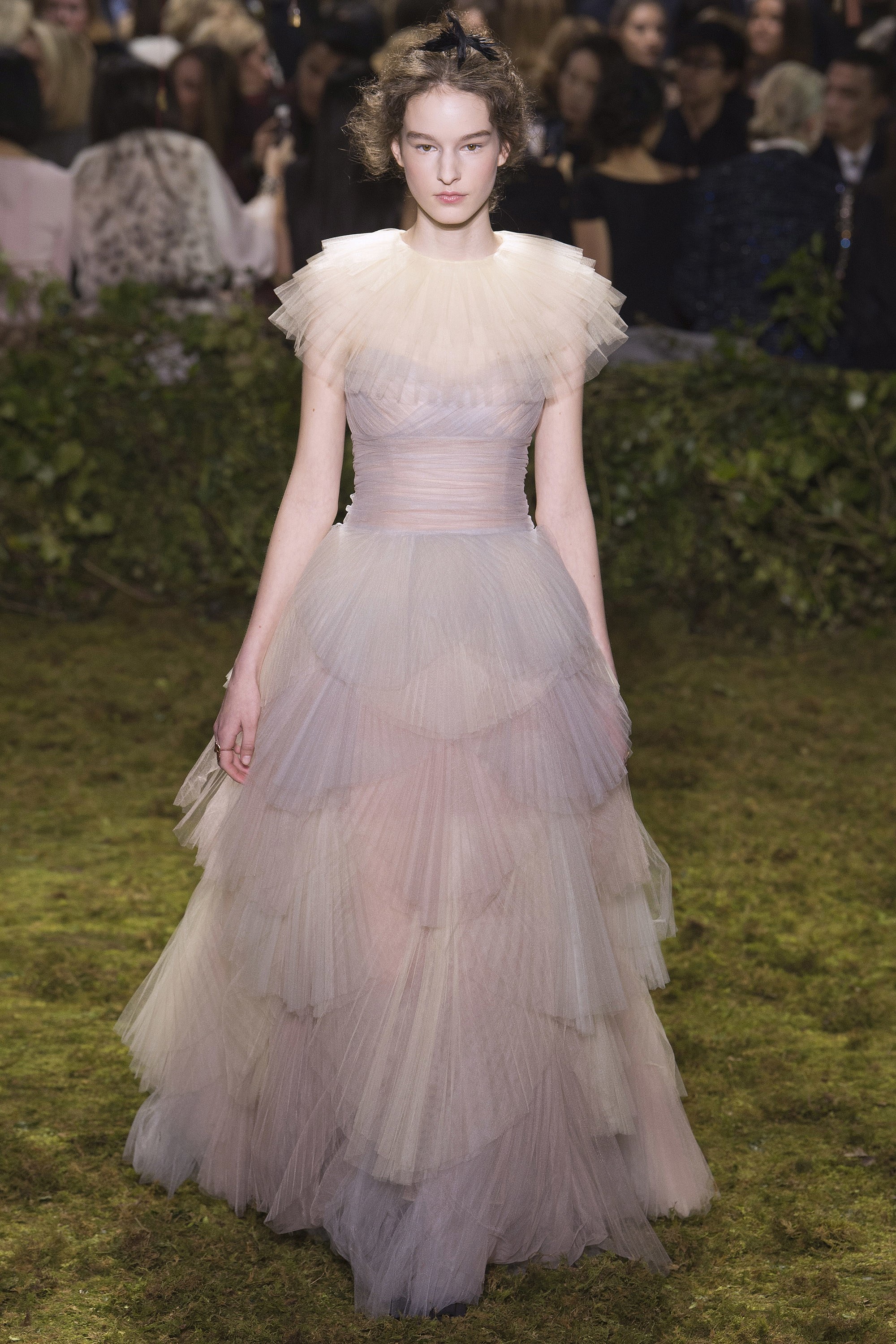
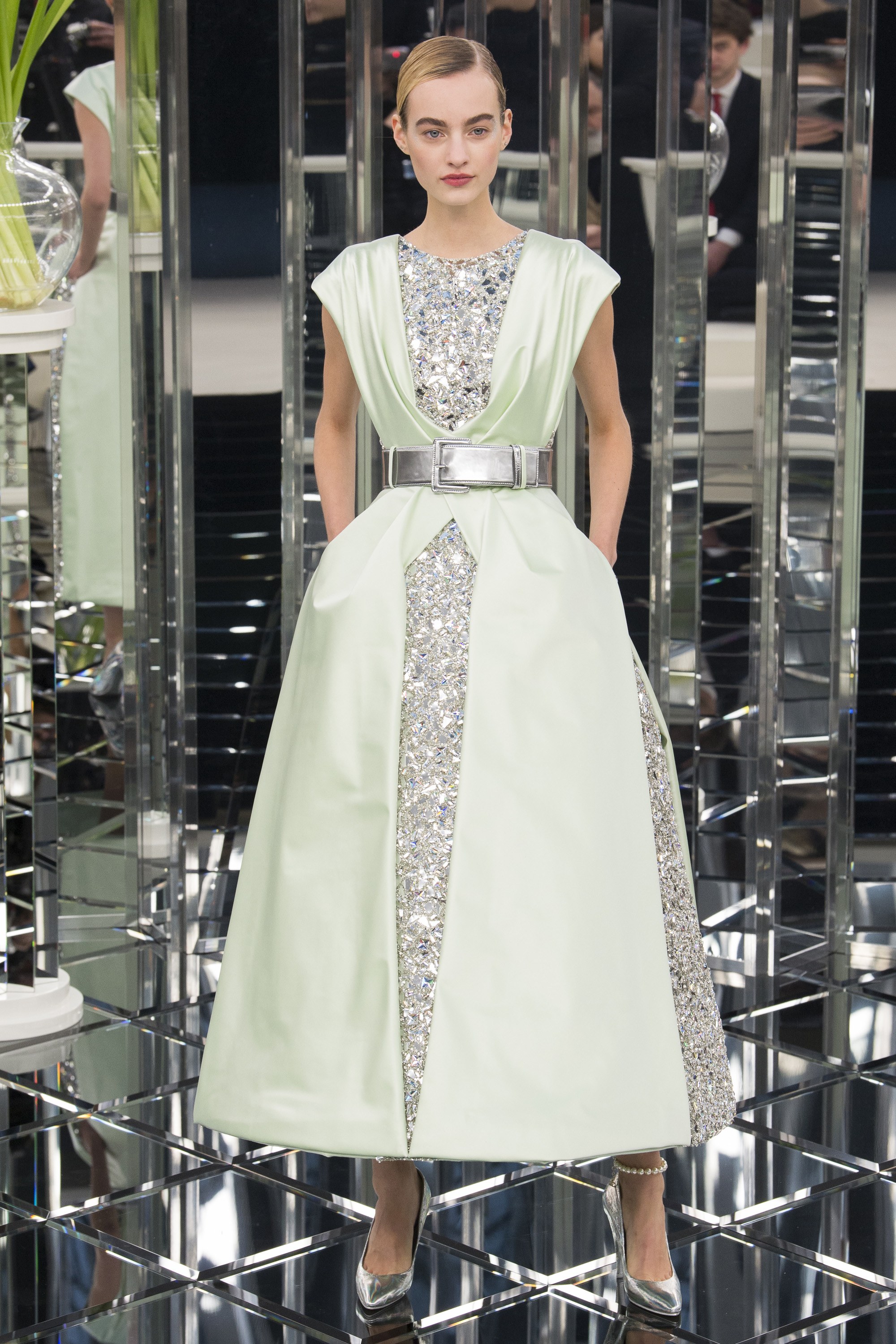
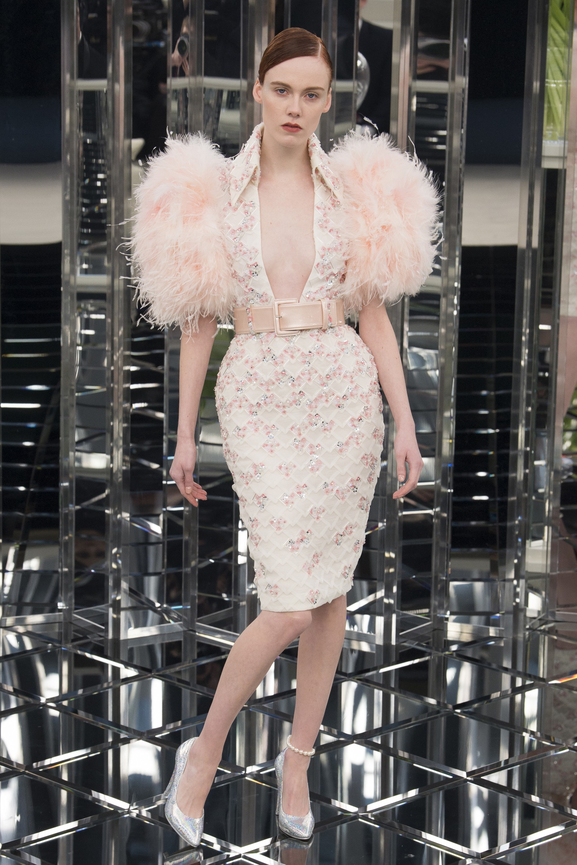
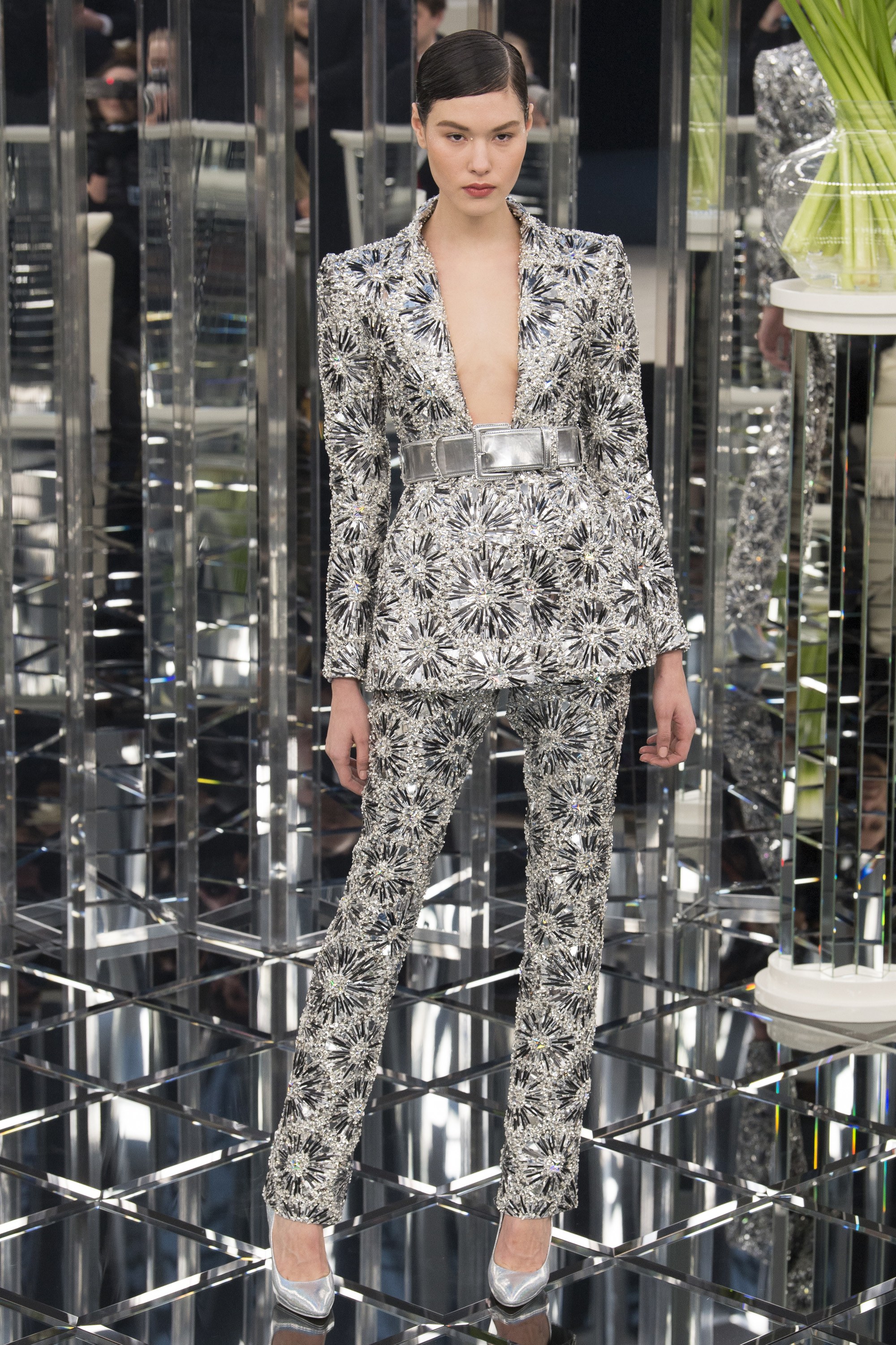
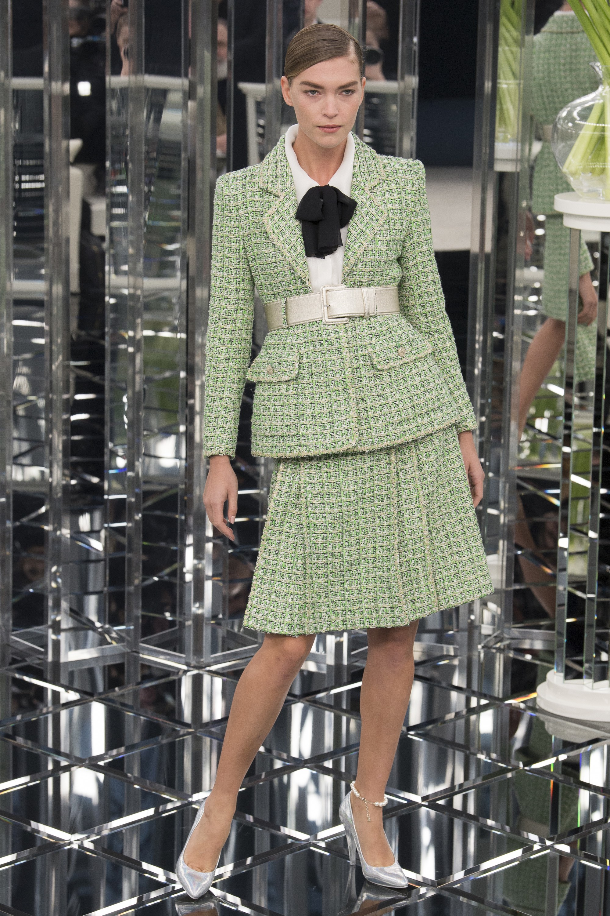
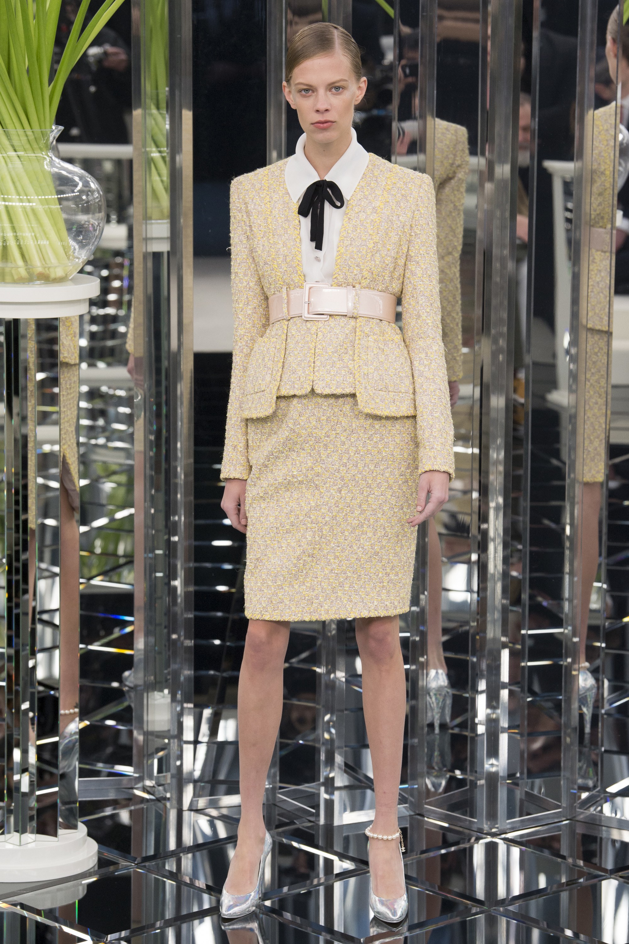
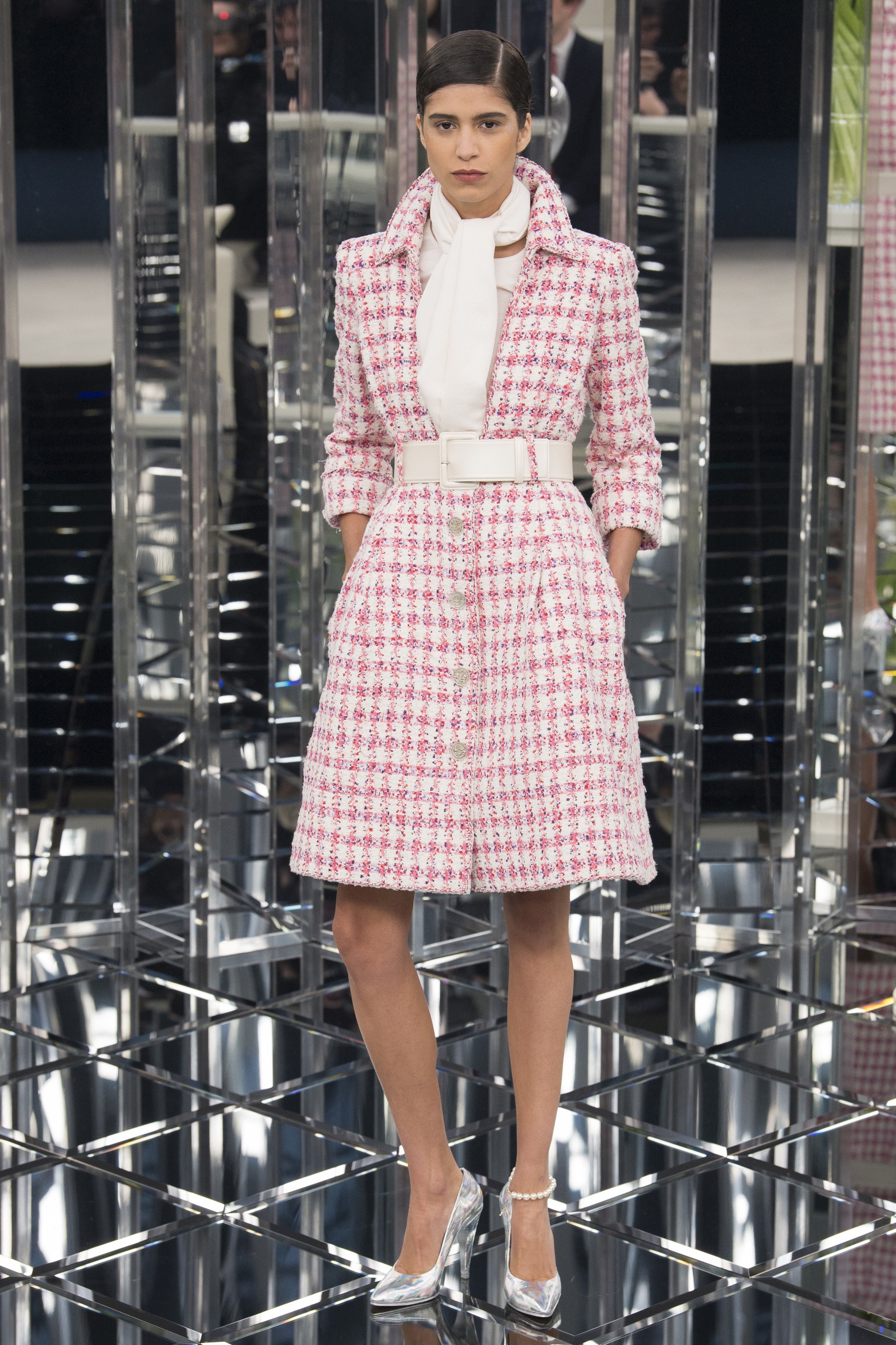
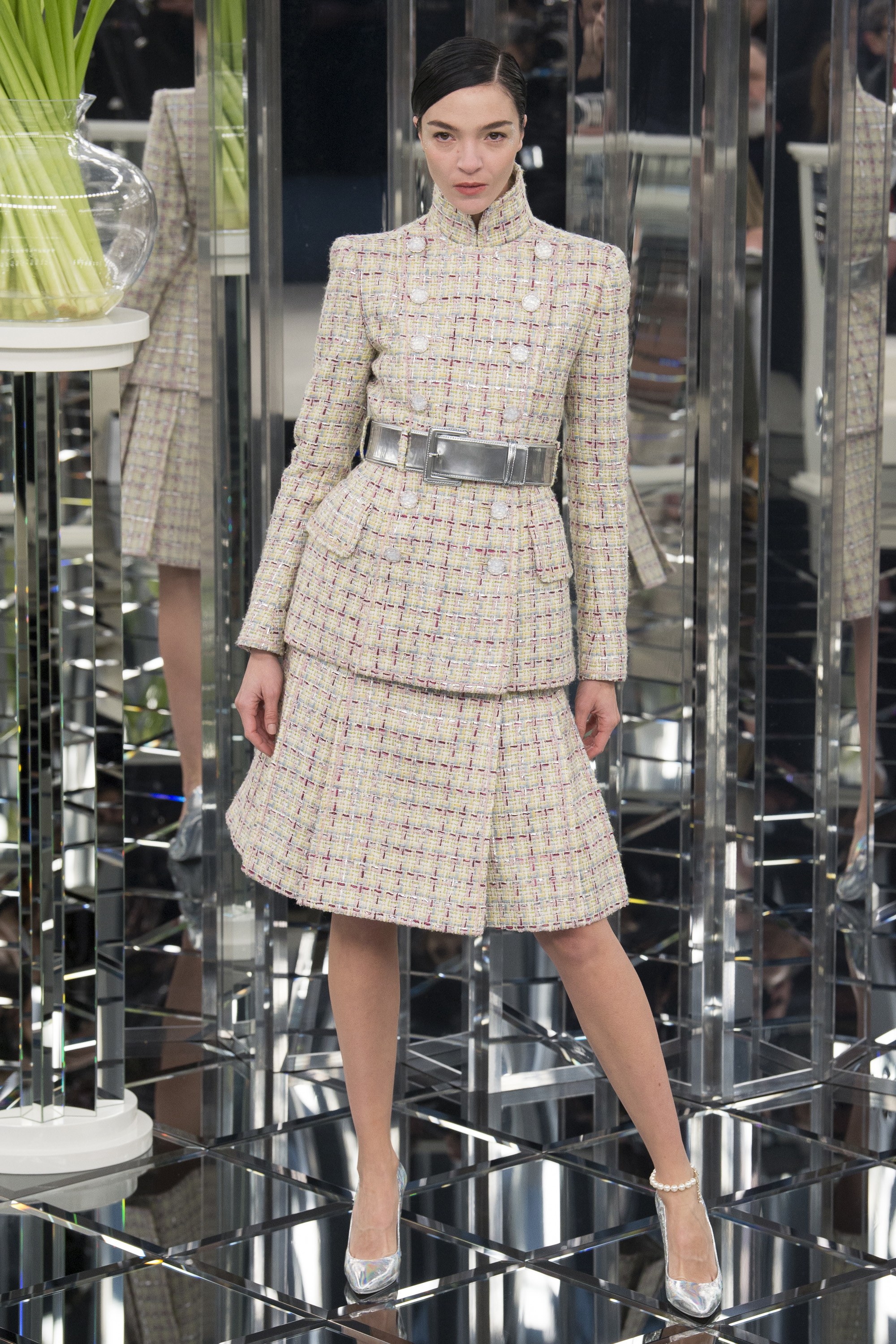
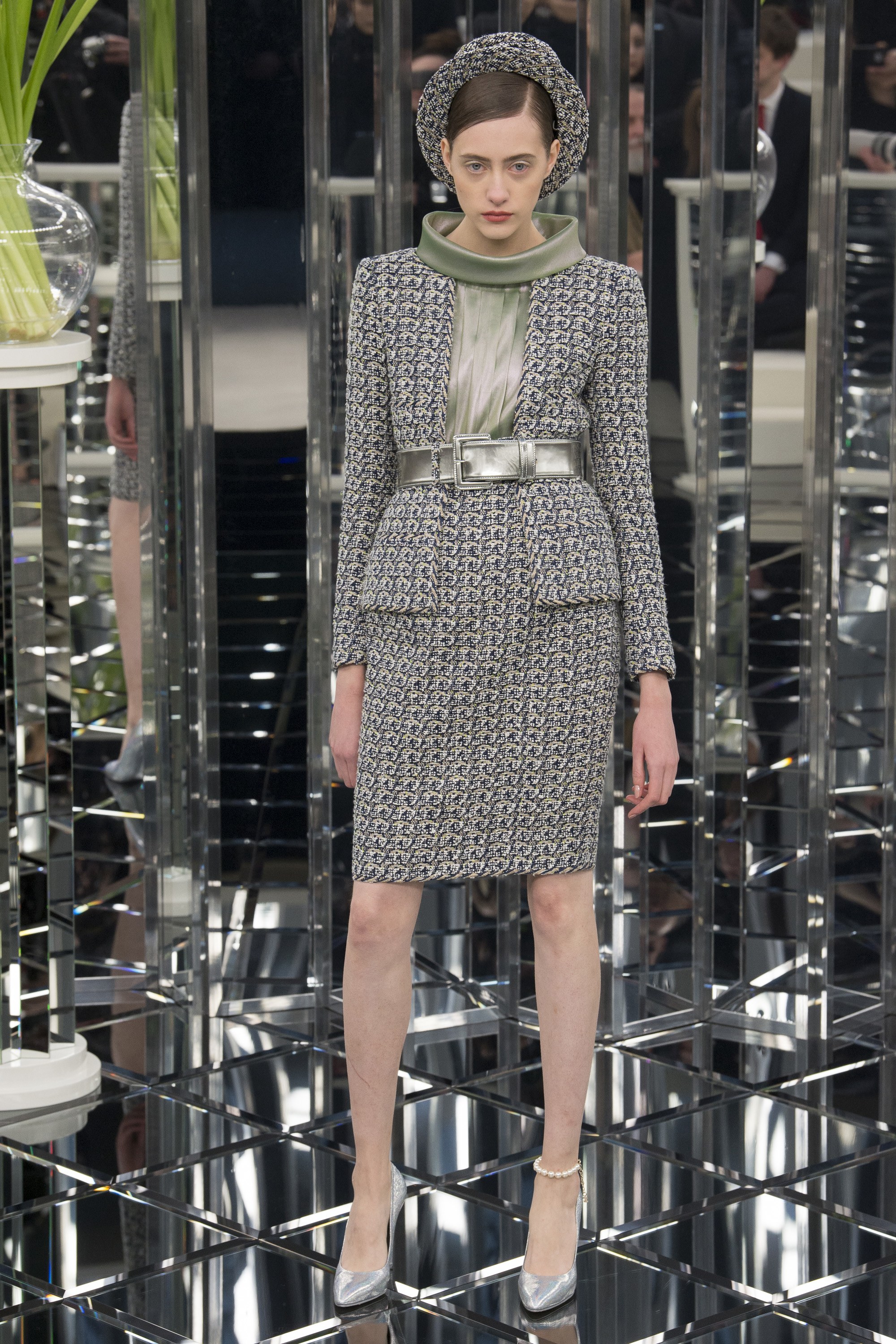
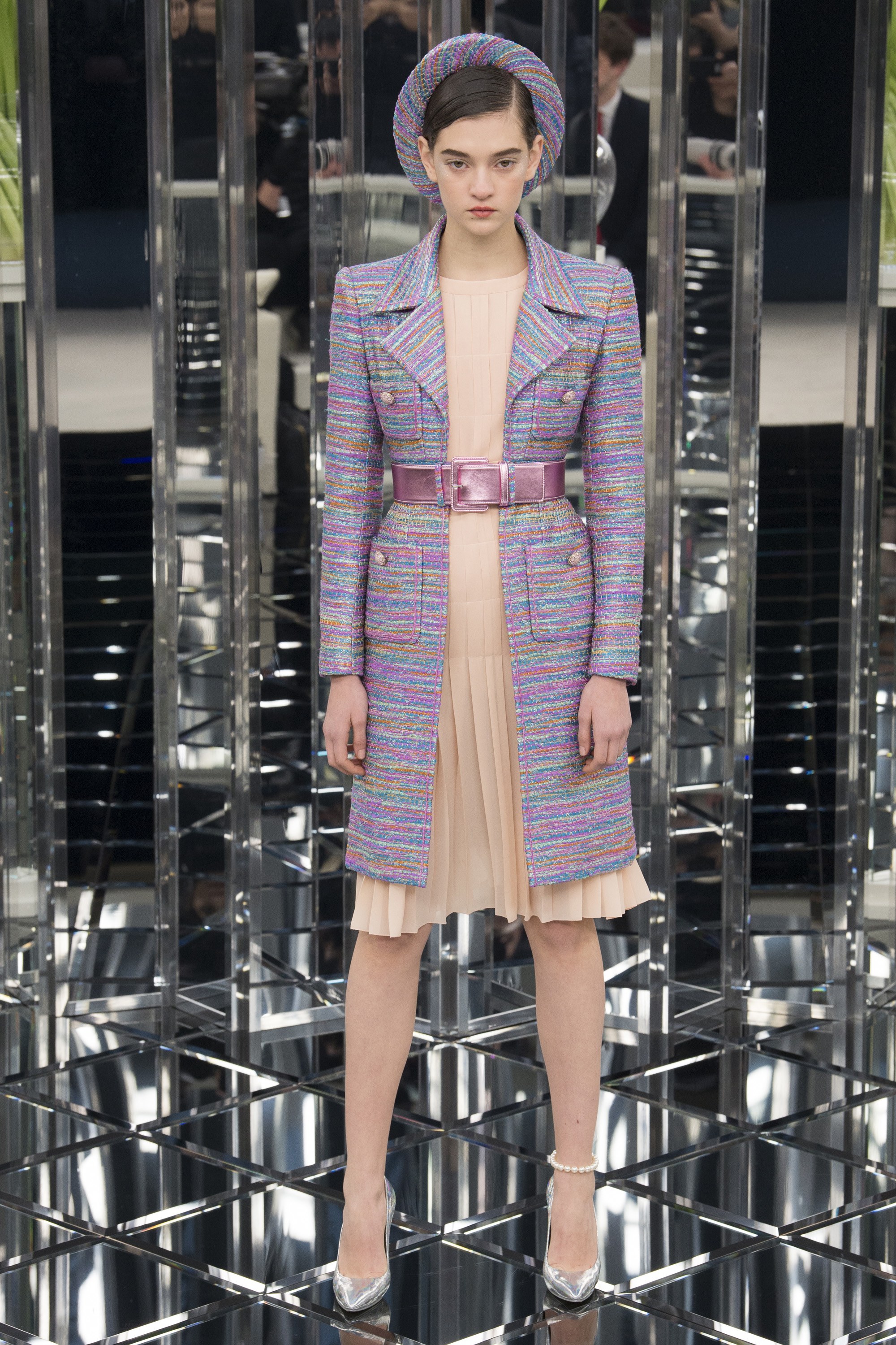
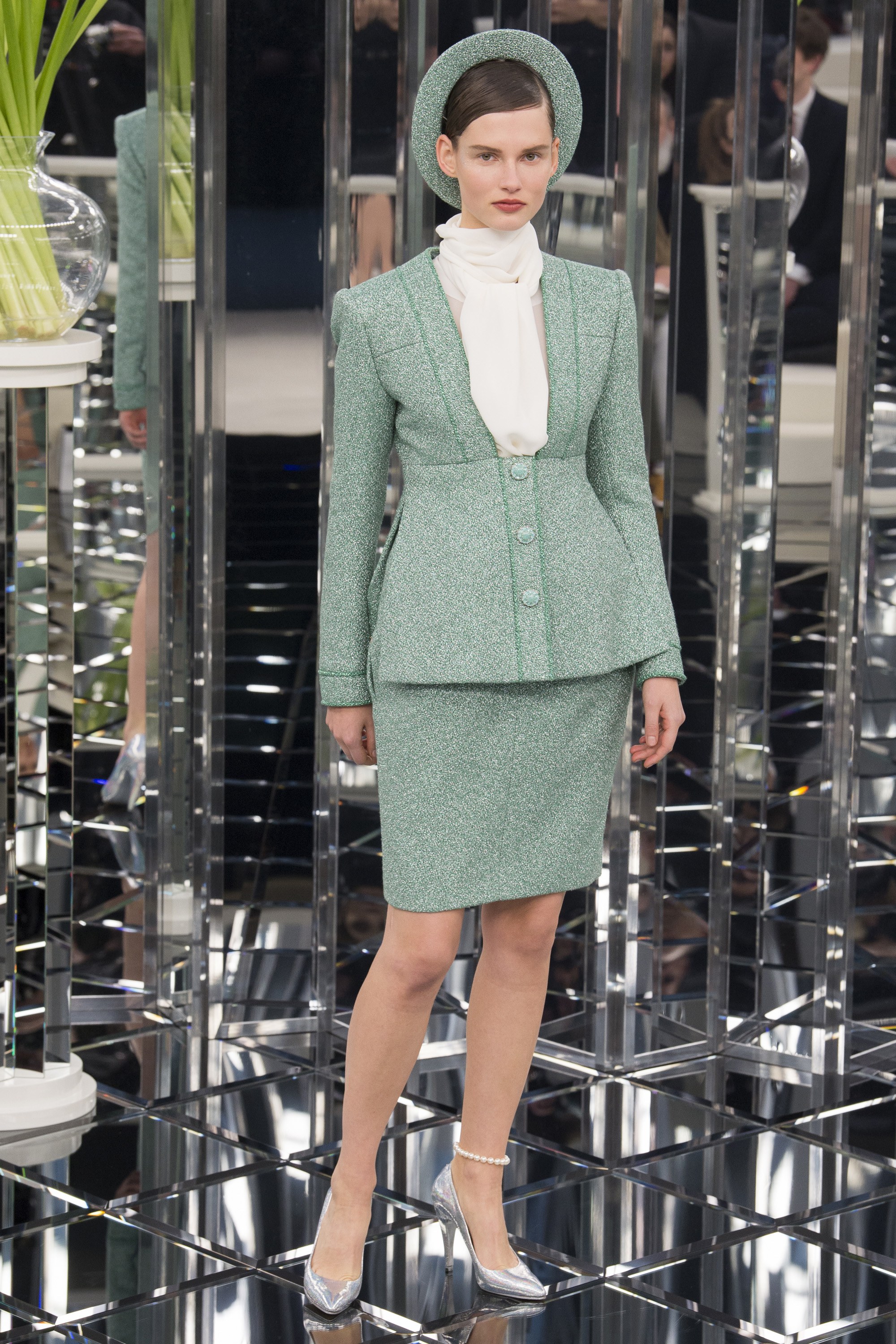
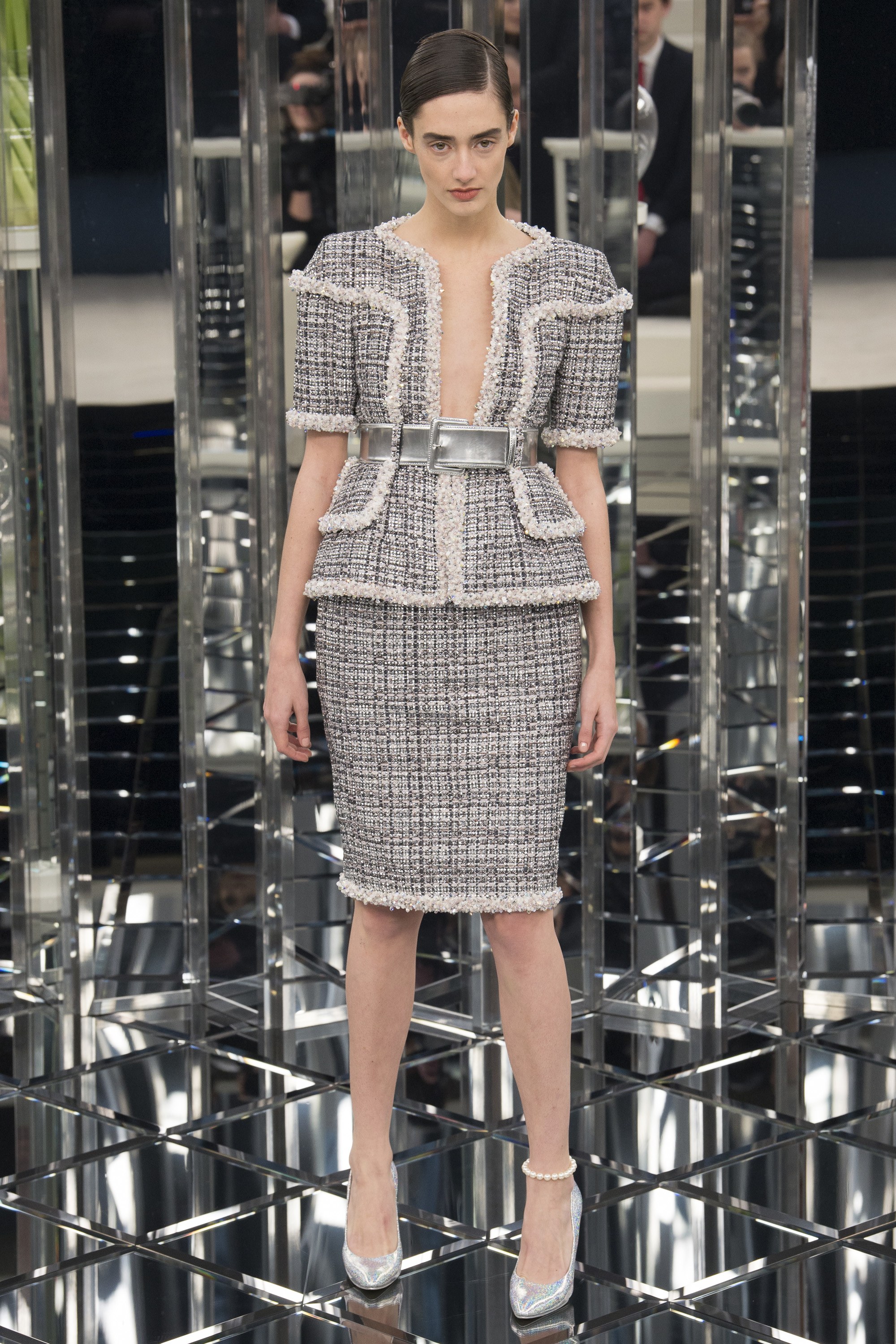
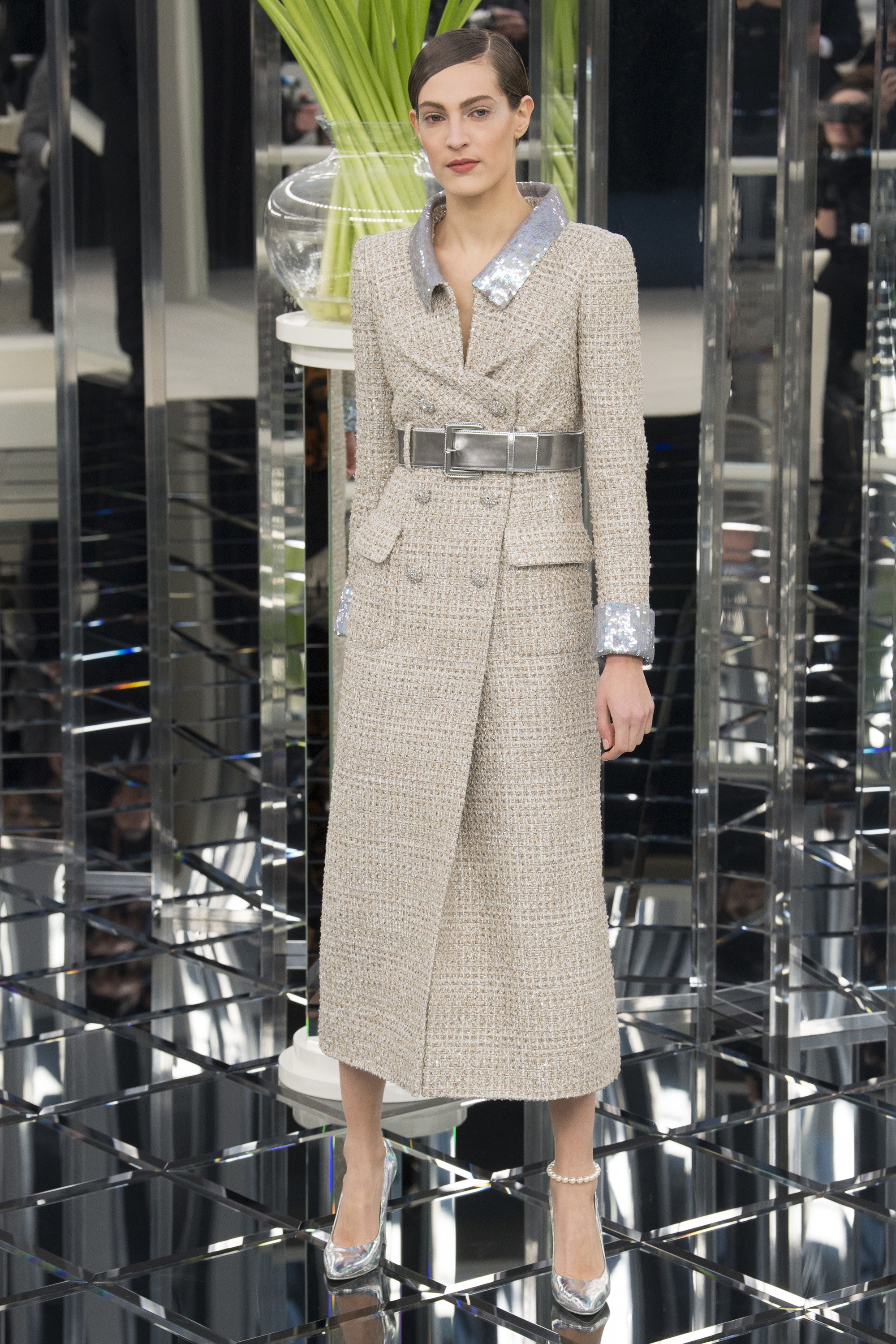
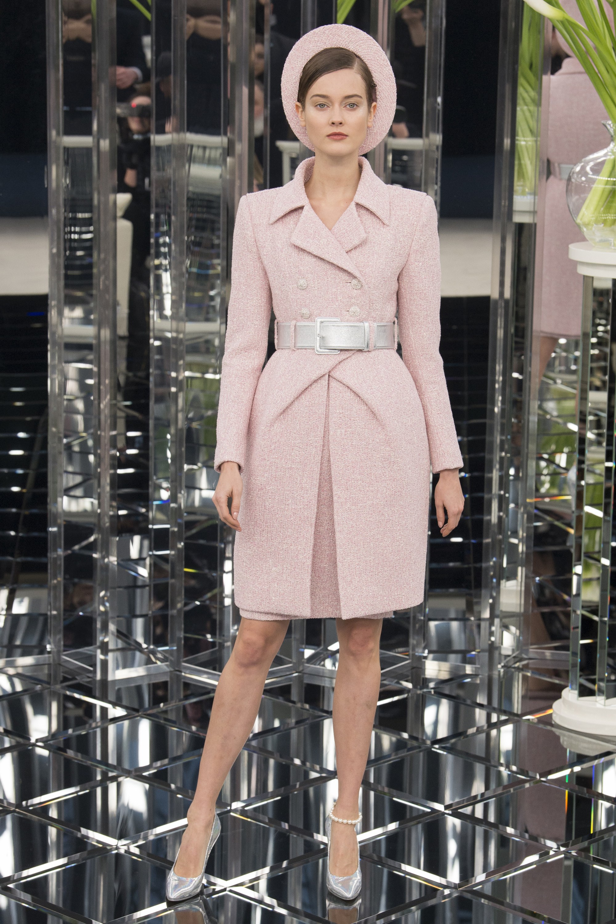
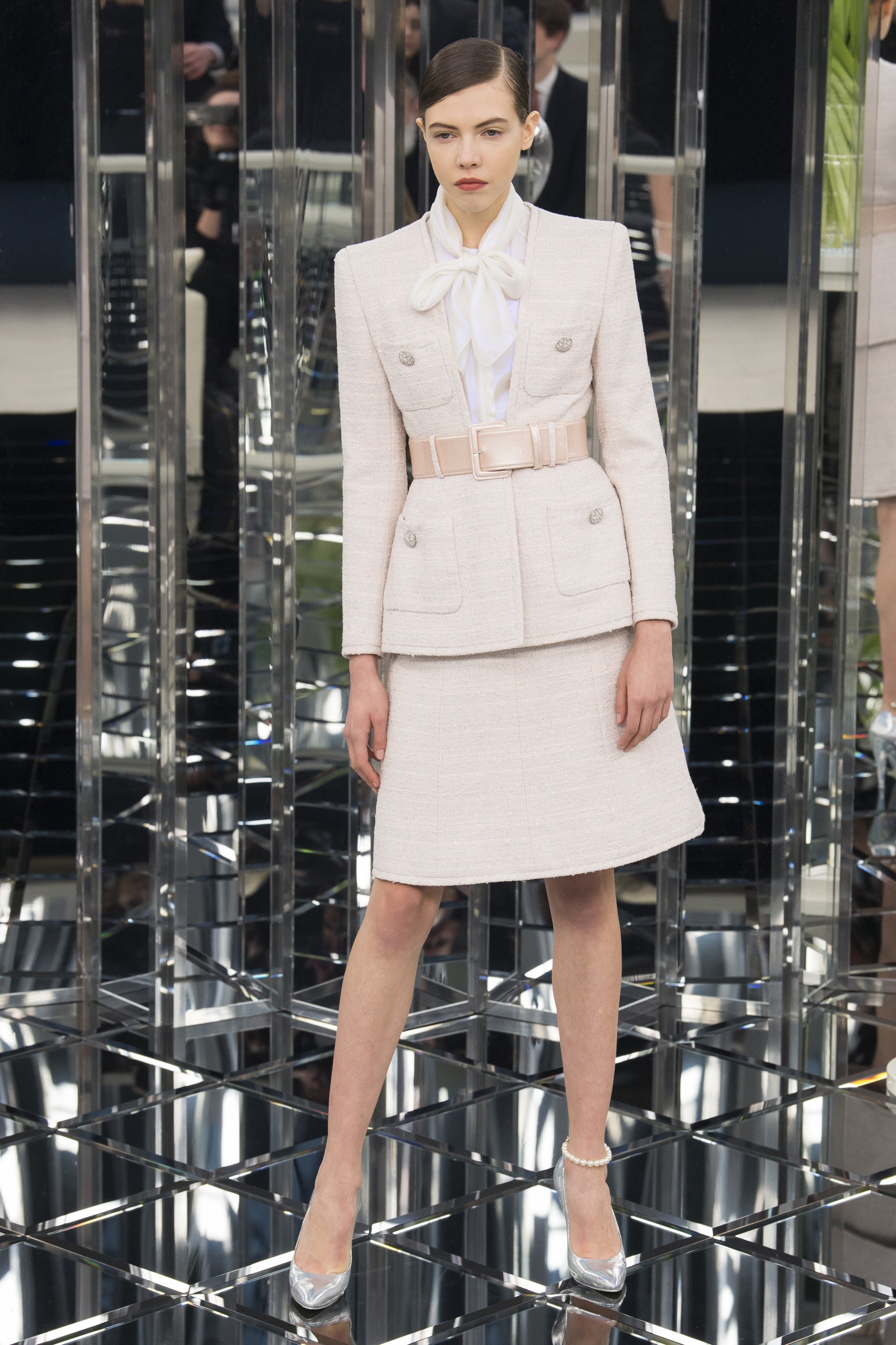
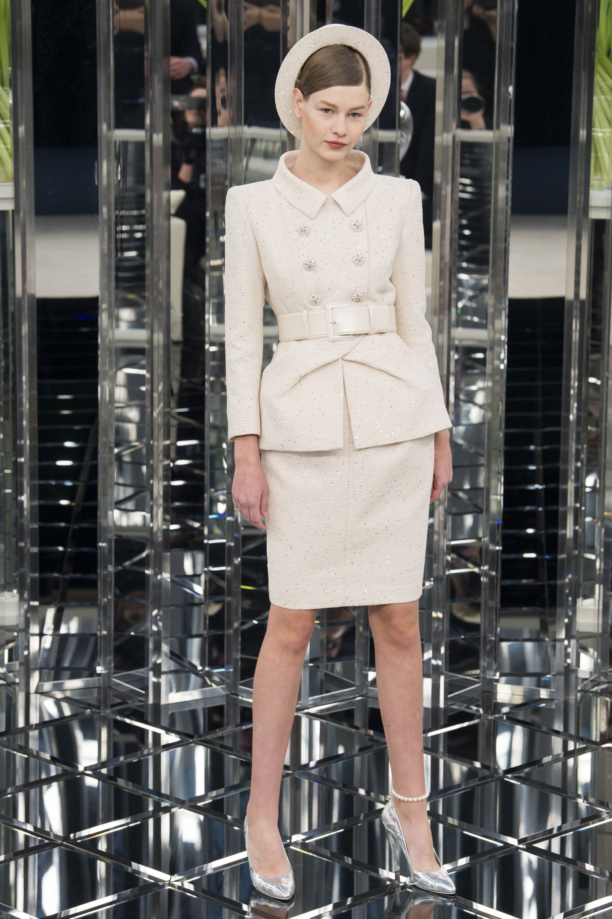
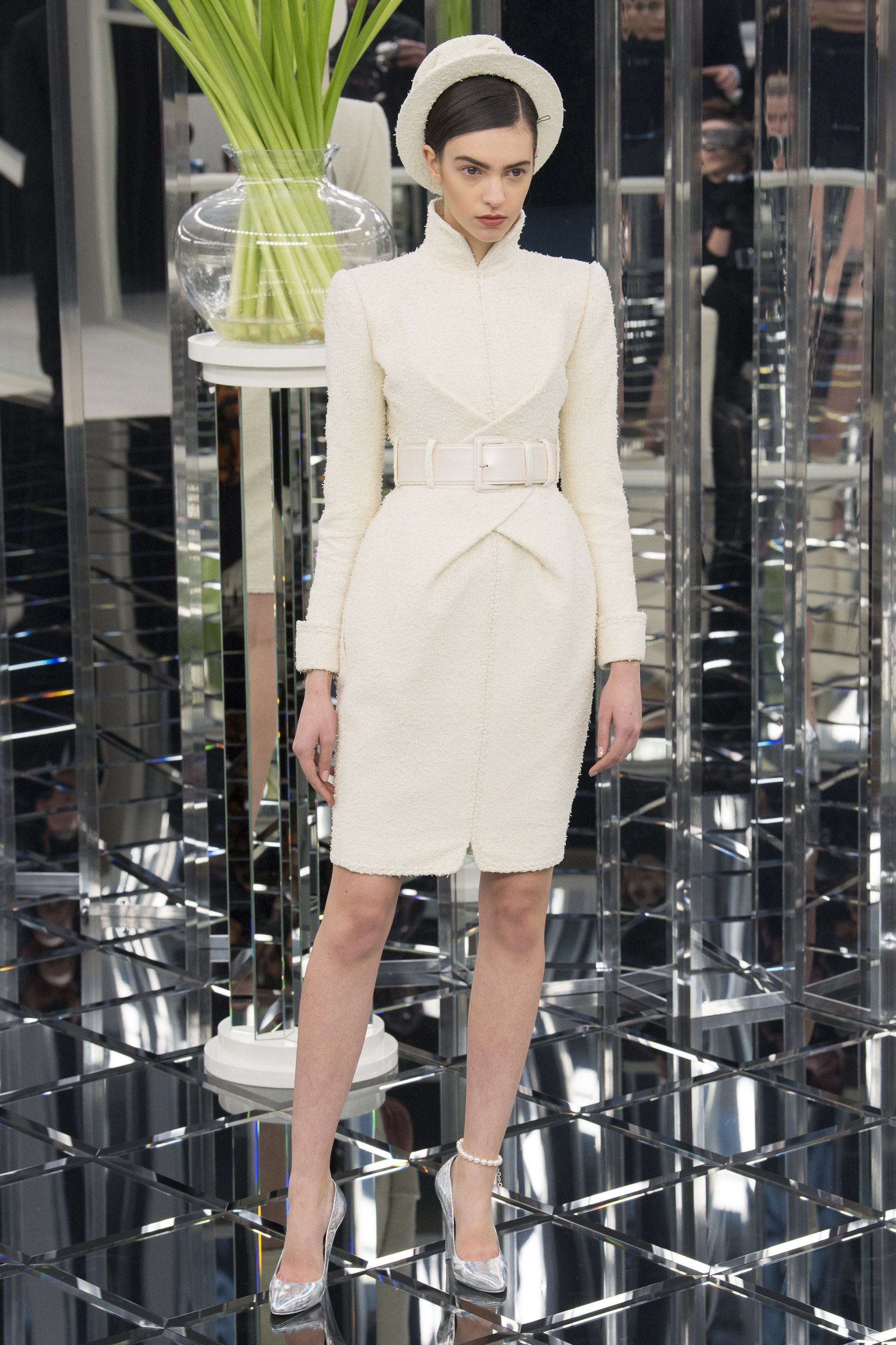
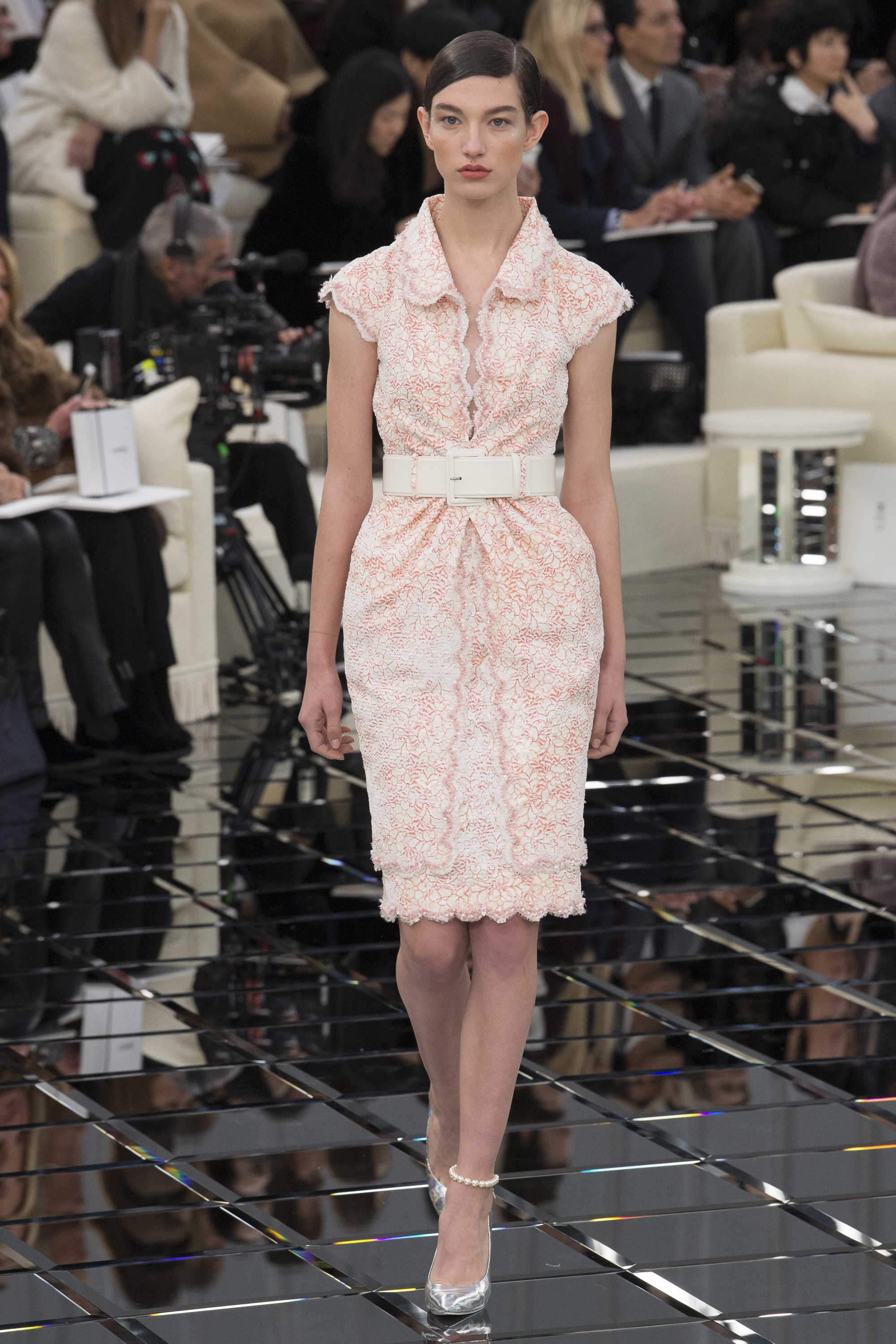
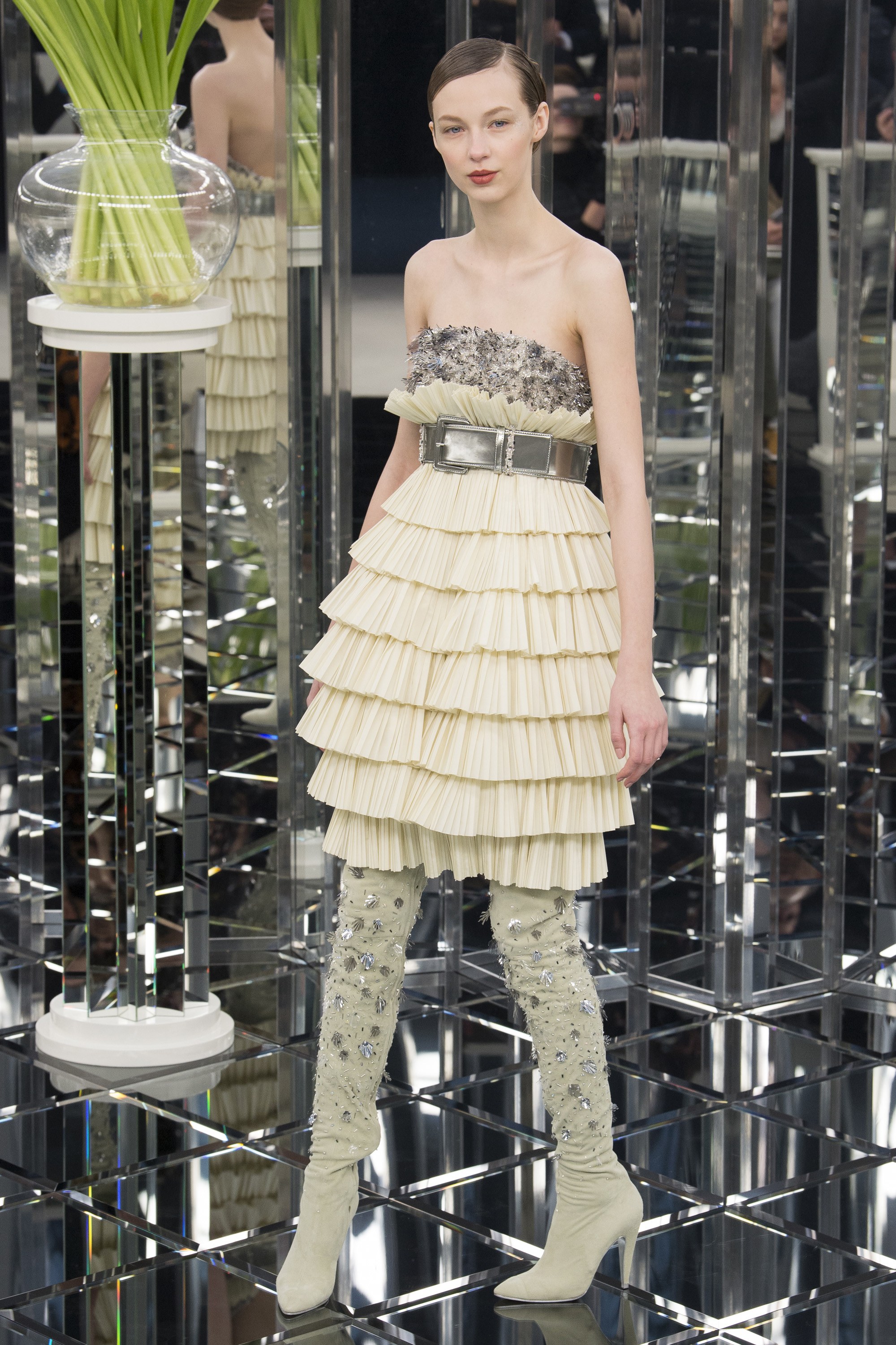
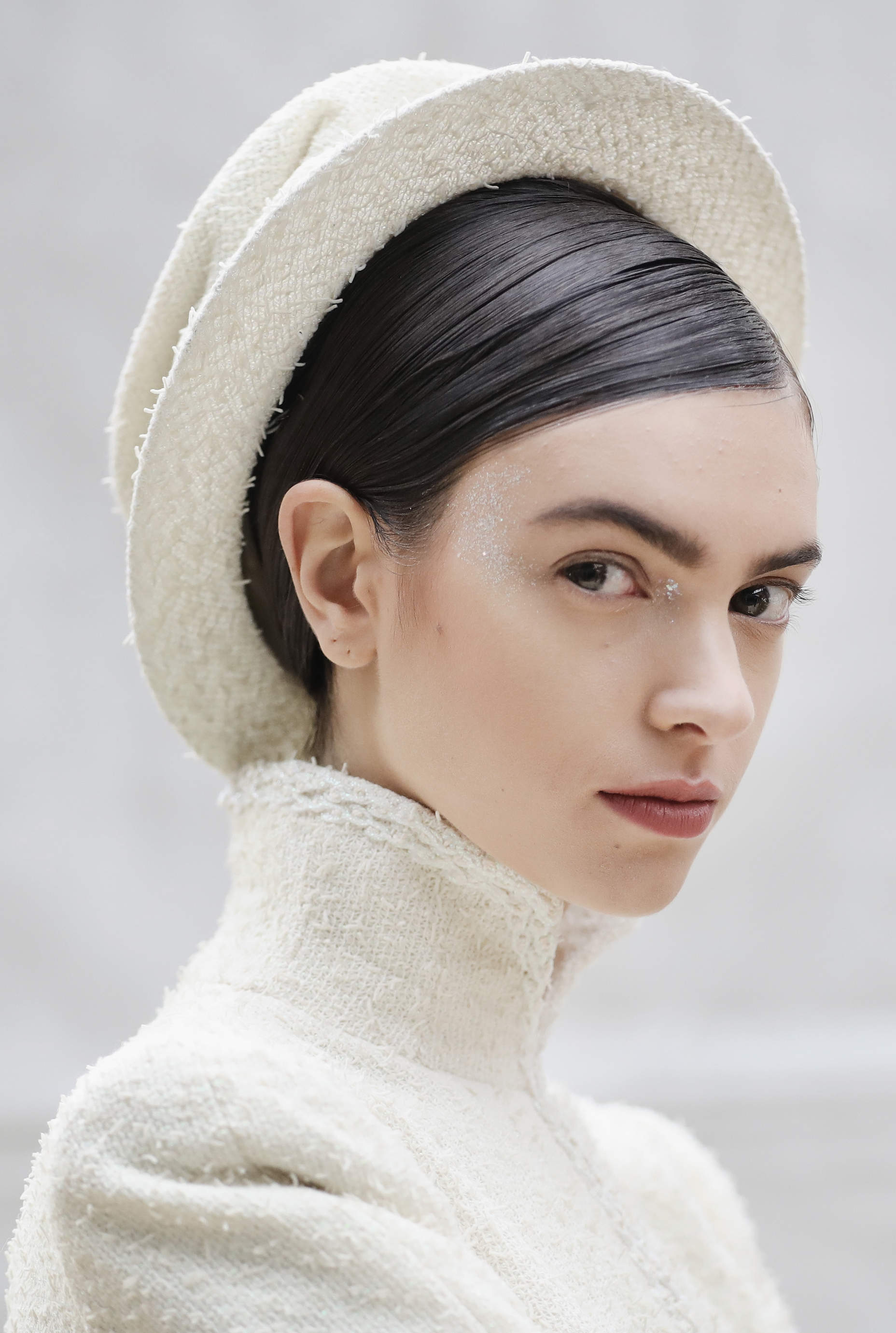
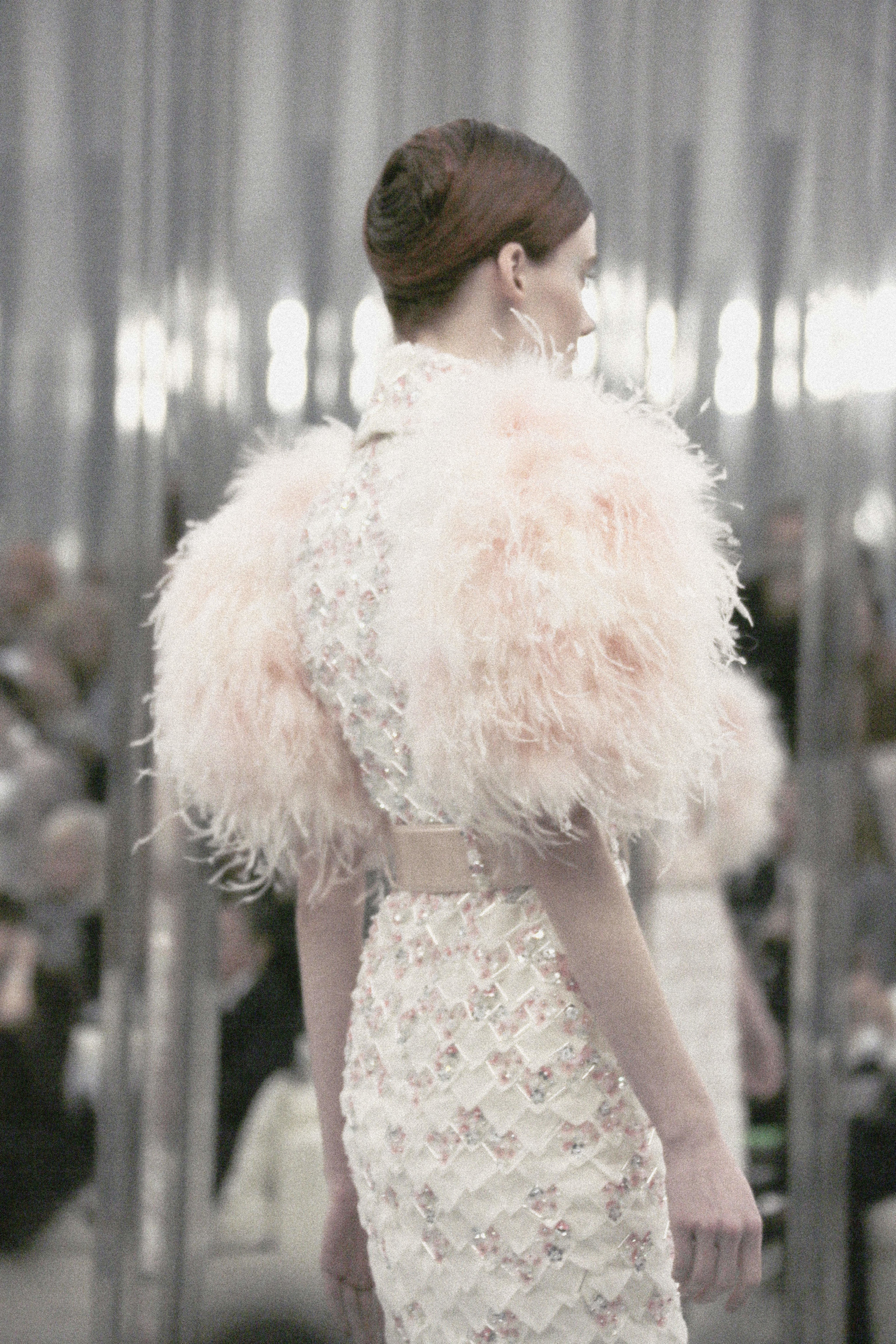
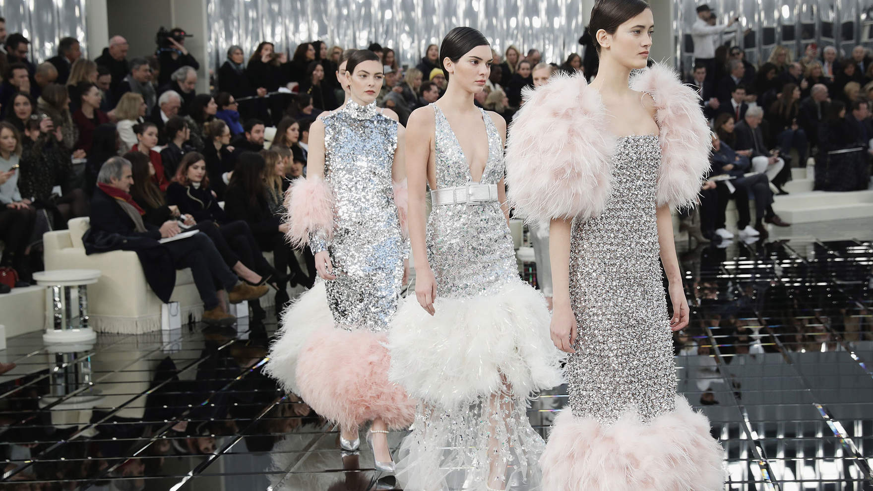
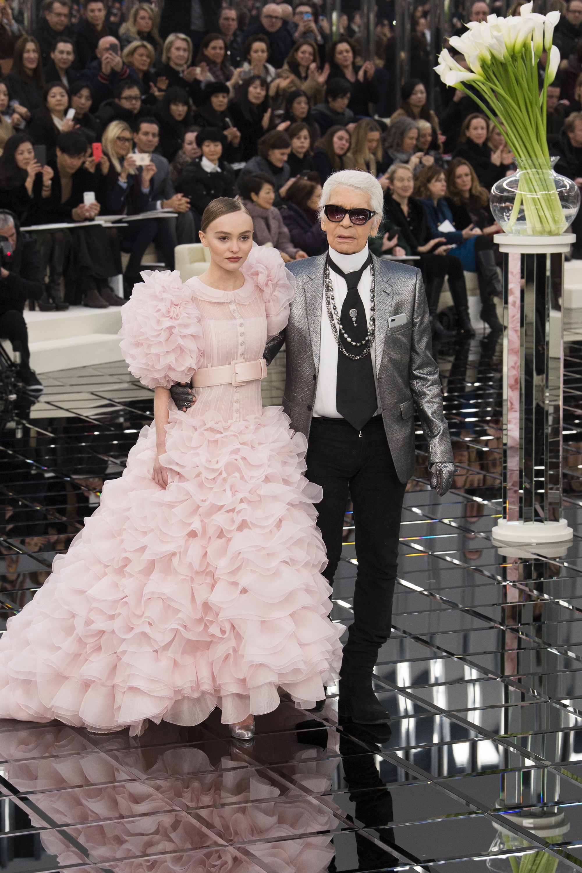
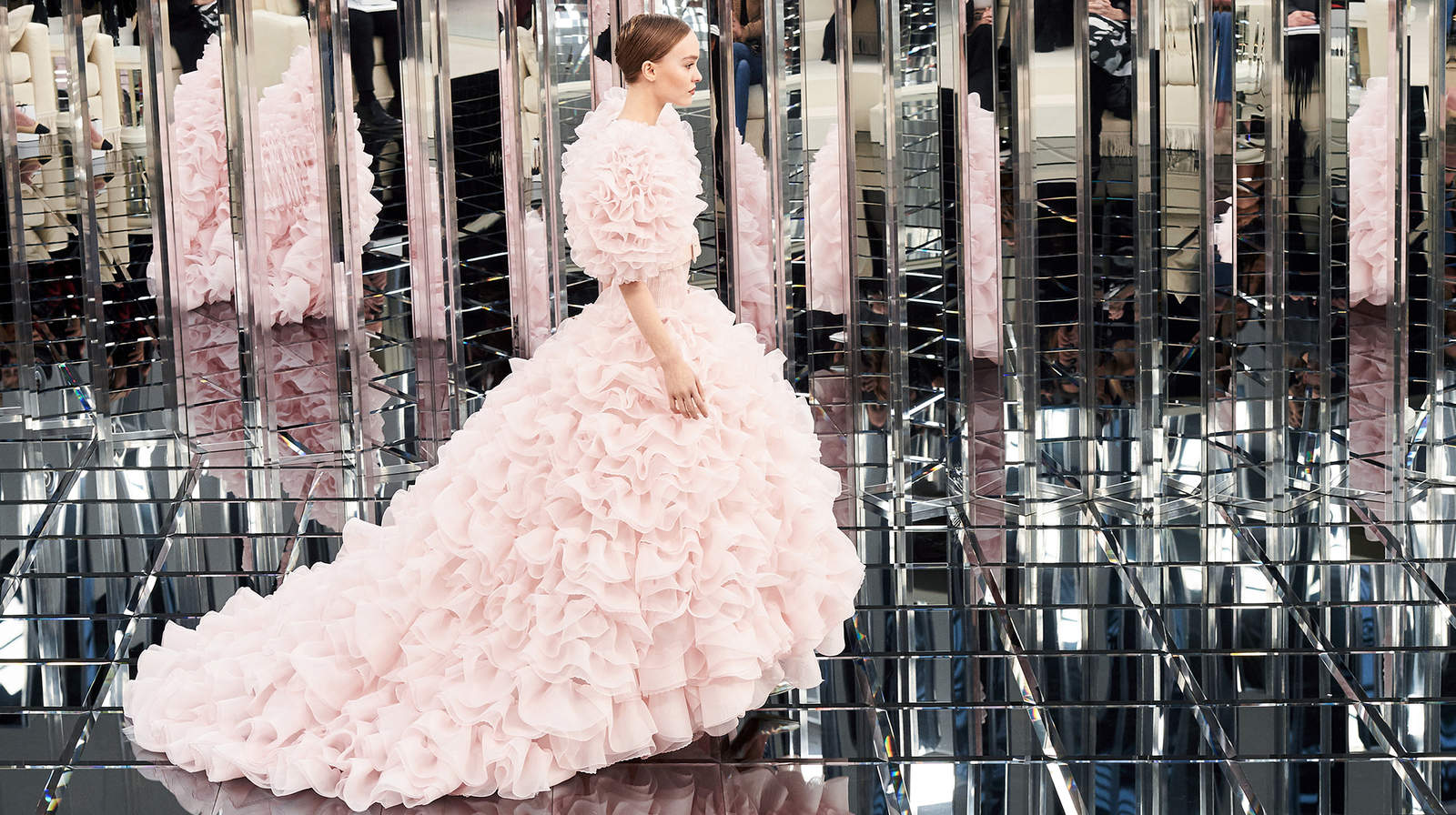
I realize it's February, but Chloé's Spring-Summer 2017 Collection has me daydreaming of springtime in Paris. The Grand Palais—one of my favorite landmarks in the city—lends such a gorgeous backdrop for these free-flowing garments and pretty florals to strut down the catwalk. And I just love the way Clare Waight Keller abandoned tradition with her sinuous setup of the runway and the audience. Enjoy the show!
new york blogger
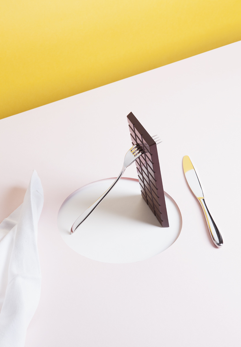
{A R T} How To Kill Yourself With Chocolate /
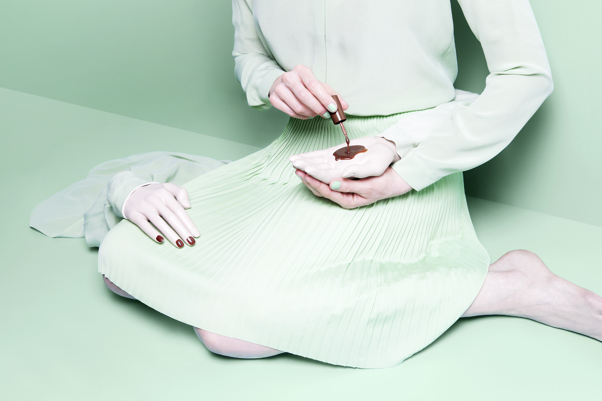
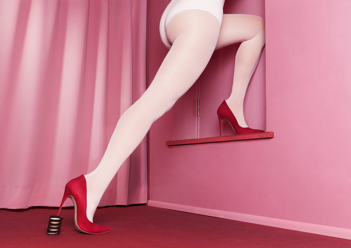
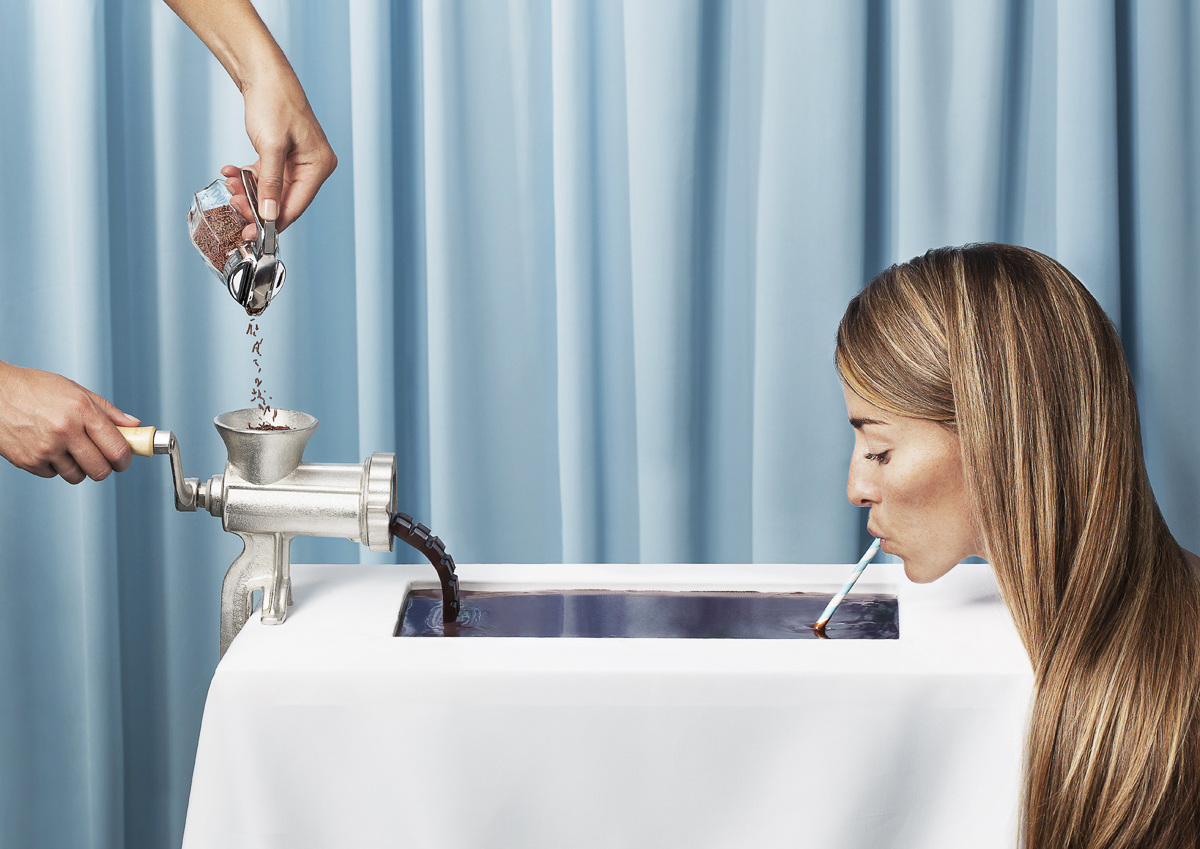
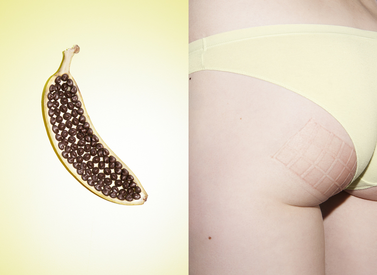
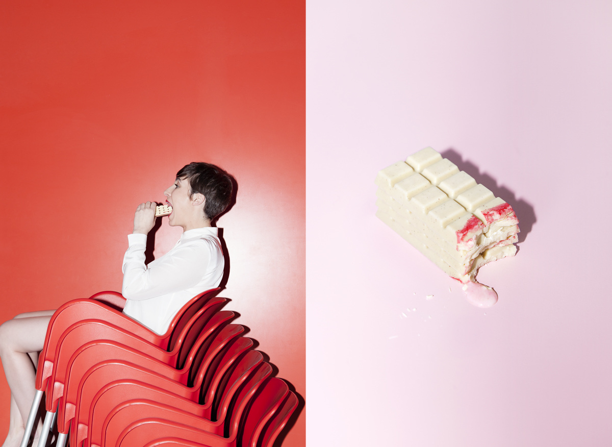
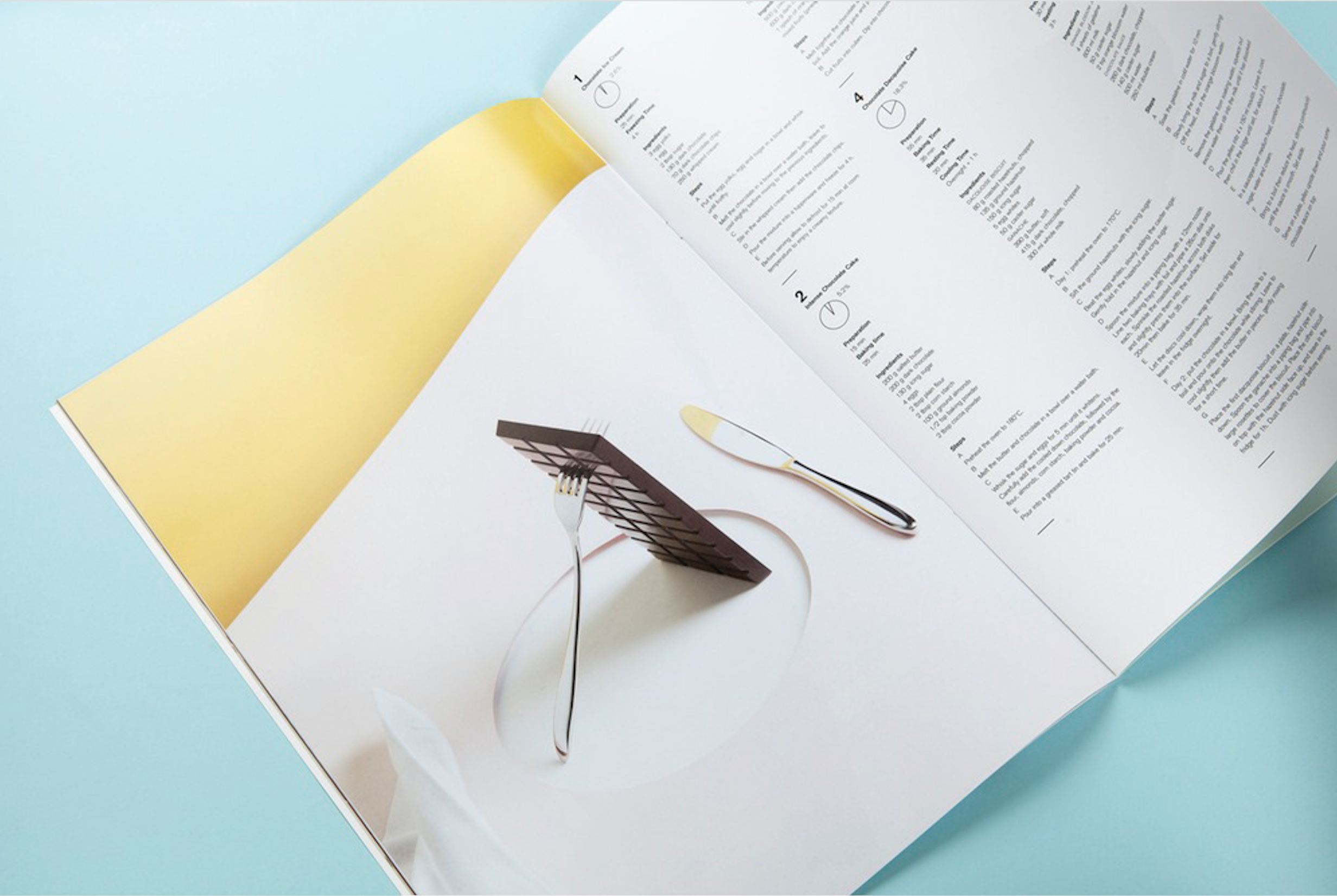
As if chocolate needed a reason to be any more alluring—now the London-based duo of photographer Martina Lang and graphic designer Valentine Ammeux have created a surreal cookbook on the subject: How To Kill Yourself With Chocolate. If the heavy-hued images and intensely striking compositions are not enough to entice you, then perhaps their findings—indulging in 7.8kg (or approx. 17lbs) of dark chocolate within 24 hours is actually a lethal dose—will catch your attention.
I don't know about you, but I'm still willing to take the risk!
Purchase your copy here.
{F A S H I O N} Haute Couture Week 2017 in Paris /
Image via CHANEL
It's hard to believe that Paris could get any more beautiful than it already is, but during Haute Couture Fashion Week the city appears to get an extra dose of effervescence. I look forward to this show every year—the dreamy collections are packed with more inspiration than I know what to do with. I find myself tacking up dozens of looks onto my inspiration board and filling piles of manila folders.
So, why are the haute couture shows so invigorating? I want to experience fashion that excites me and makes my heart race—like hearing a powerful song for the first time or a new taste you can't get enough of. And, that's exactly what these runway shows do. Each of the following collections are emotional. They're about perception and visual fantasies. I hope you'll get as lost in them and as endlessly inspired as I do.
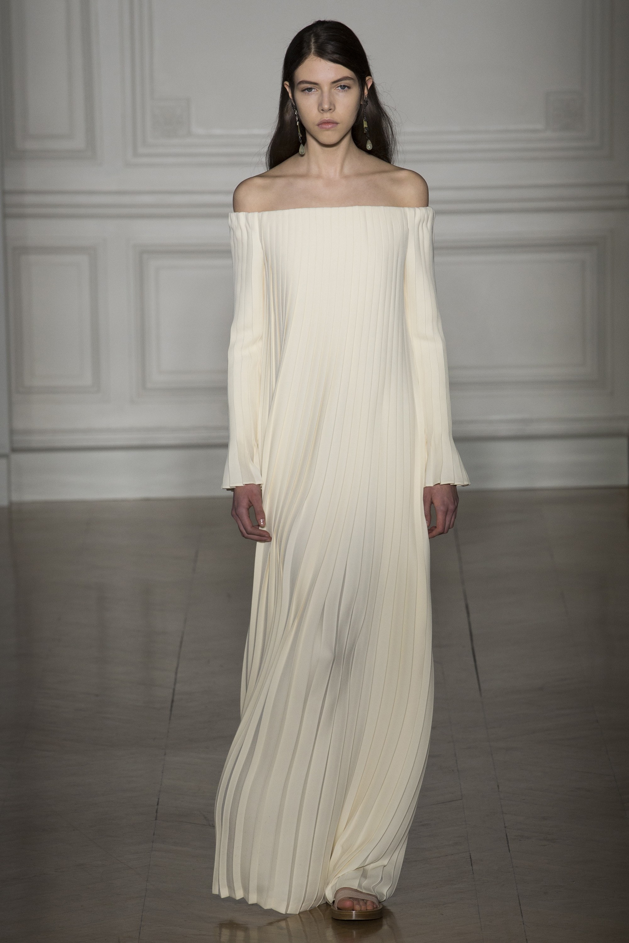
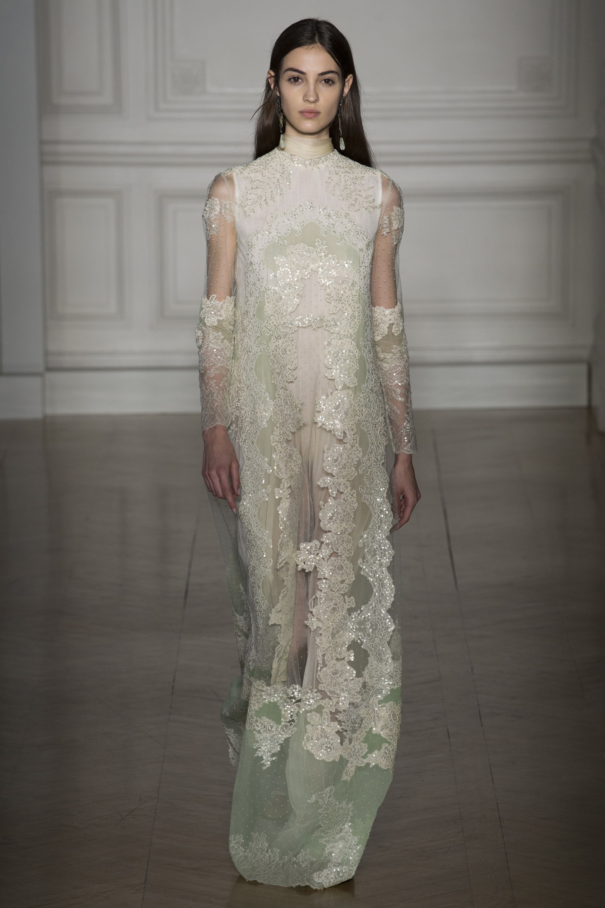
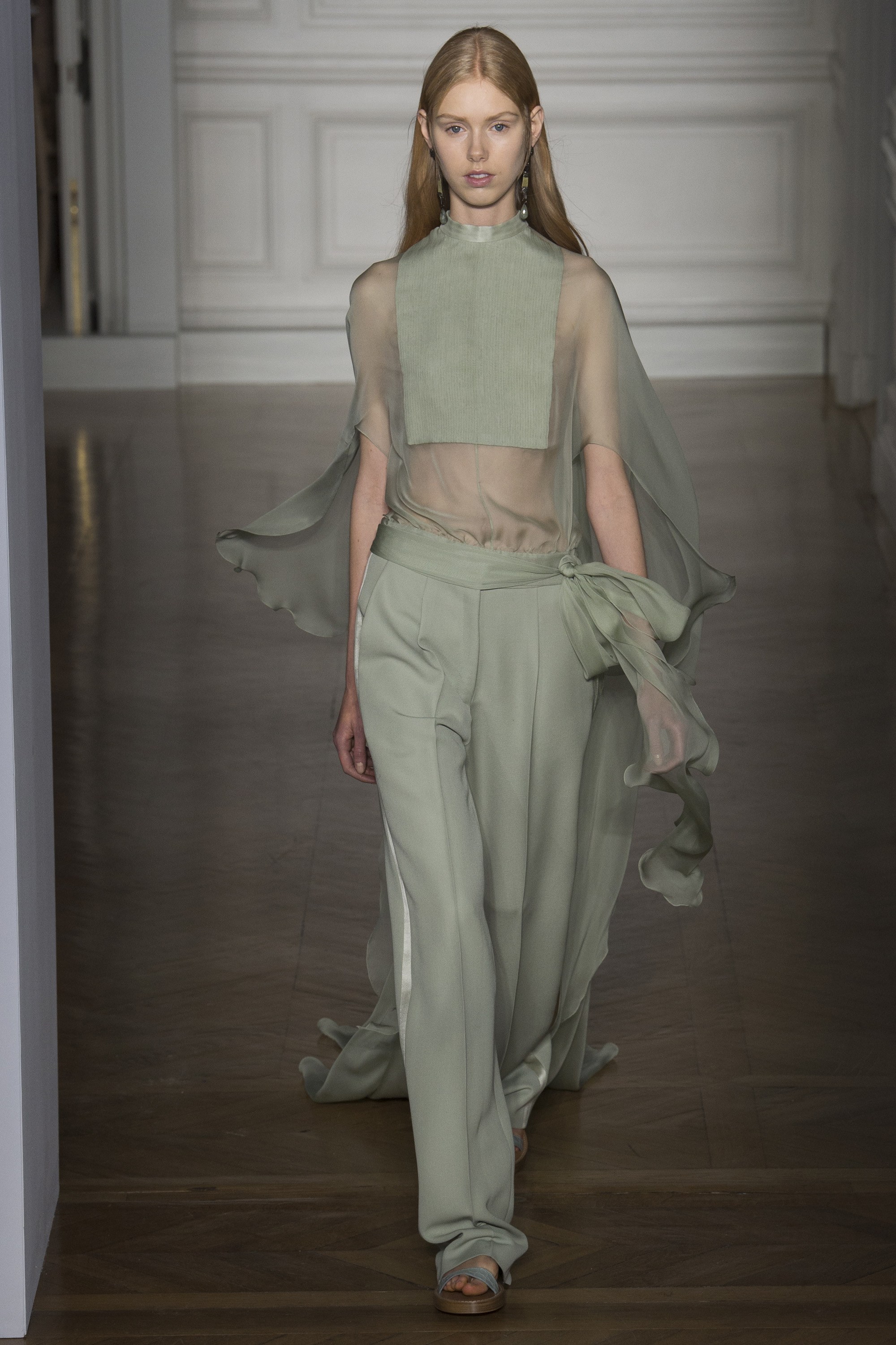
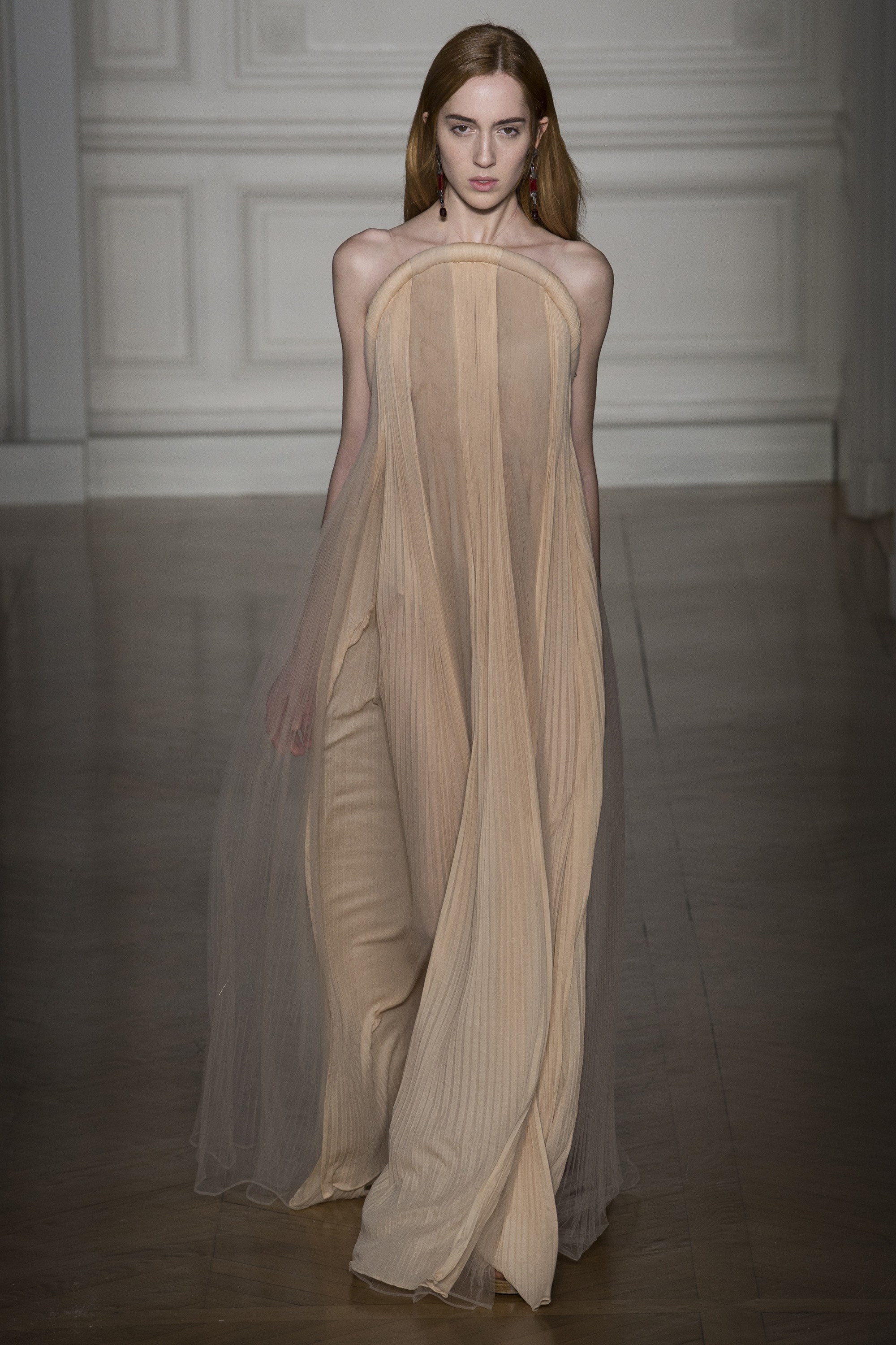
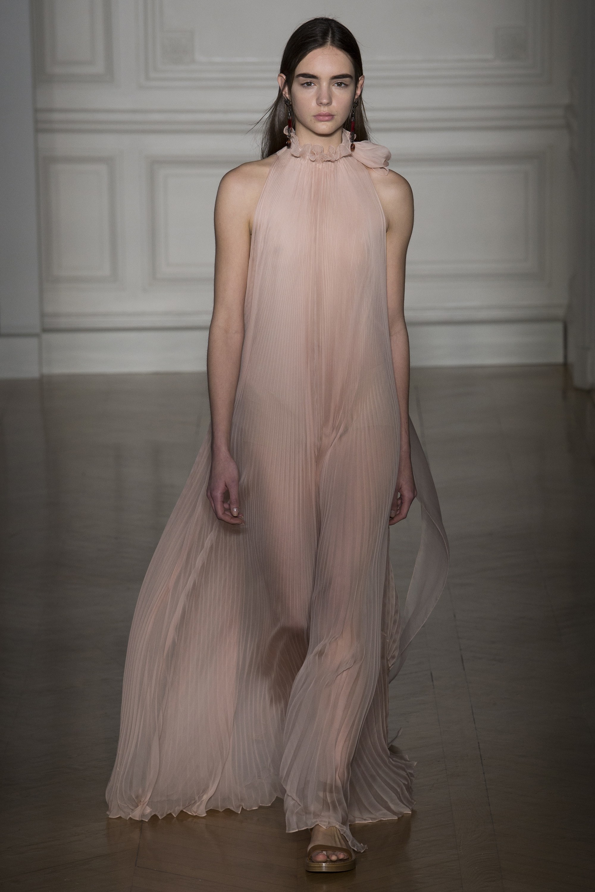
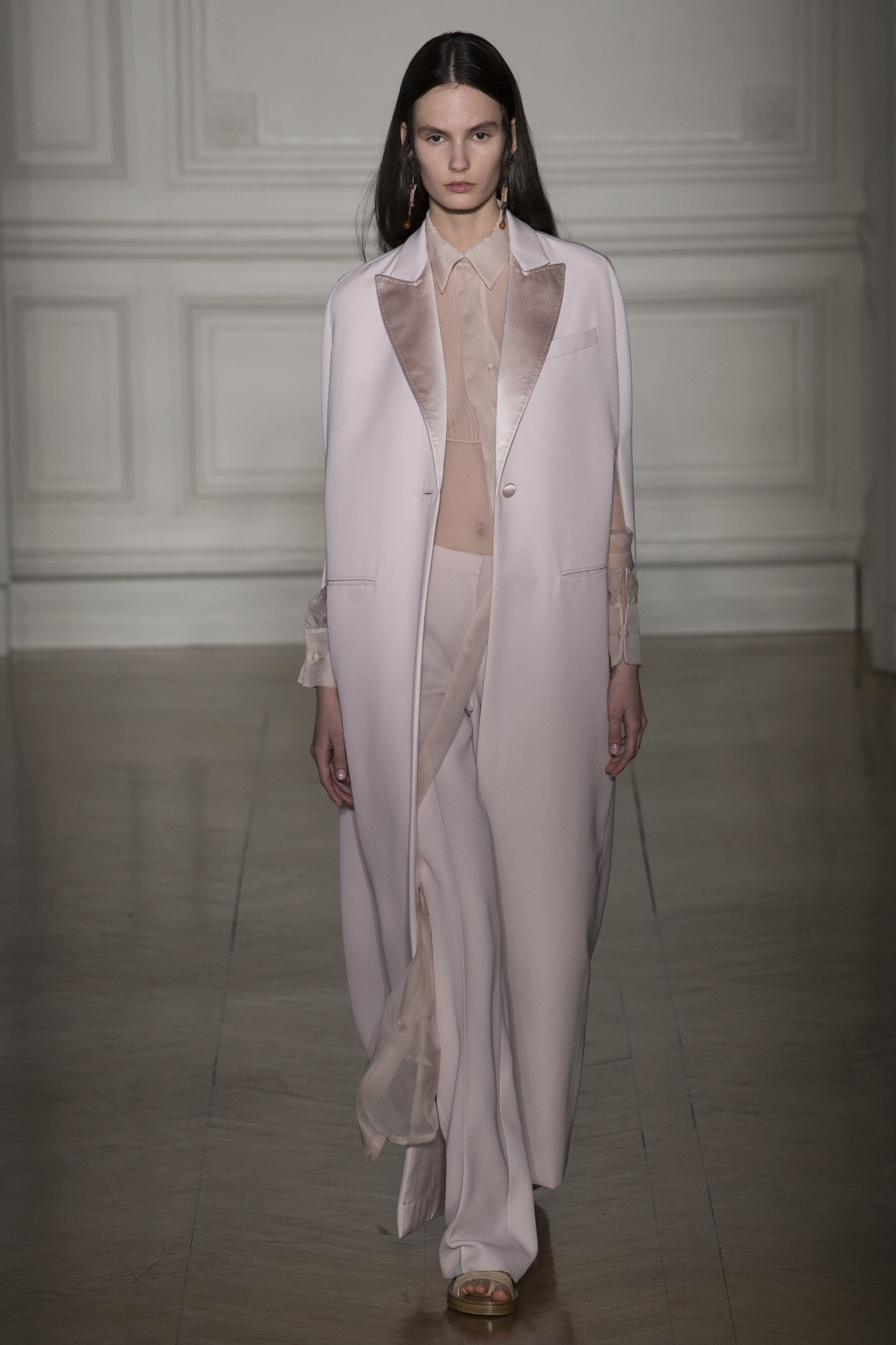
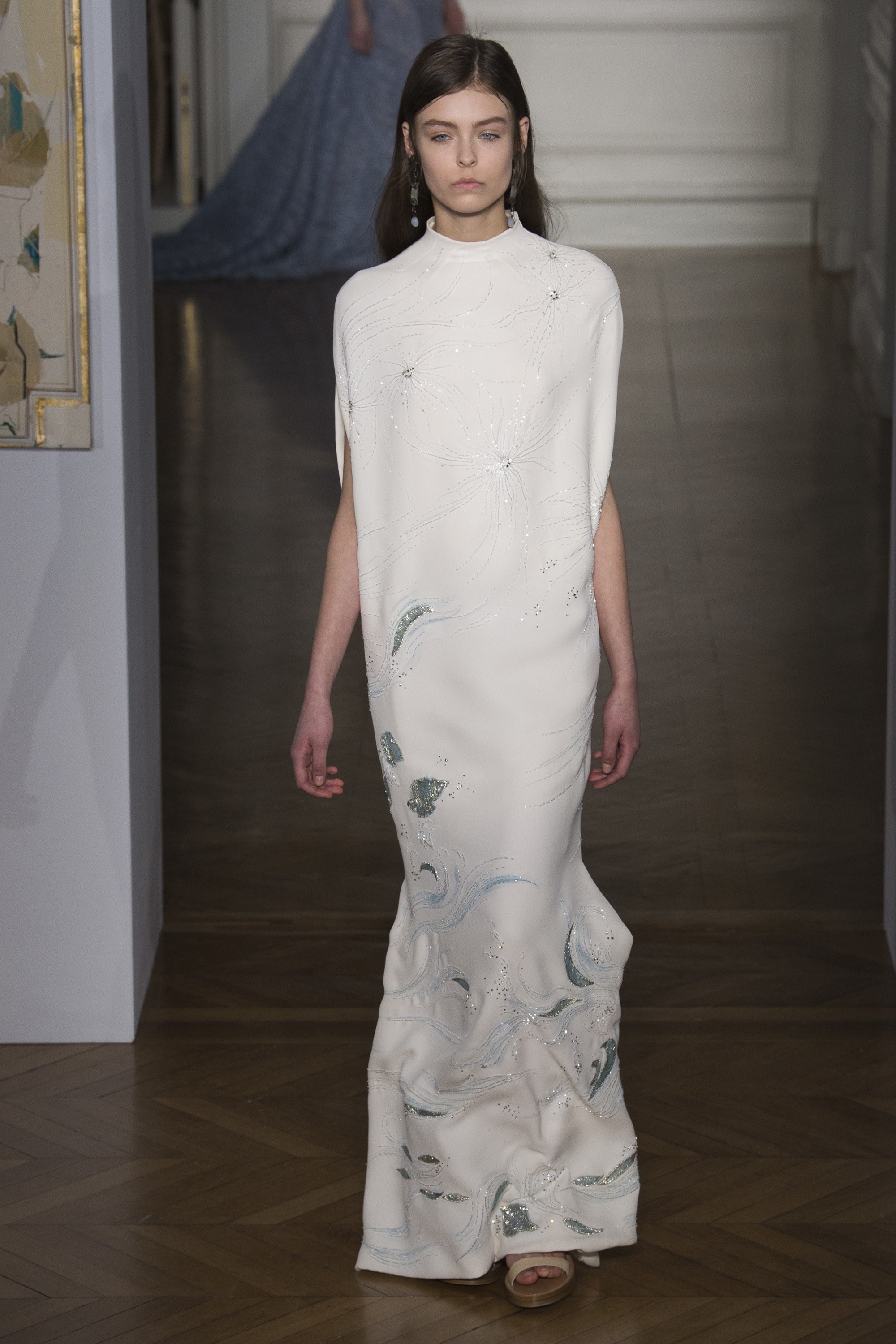
VALENTINO: Subtle Impact
This collection really spoke to the power of simplistic forms expressed through a very curated range of colors. It begs the question, what do you want to say without saying anything at all? Highlights for me were the subtle pleating details and long statuesque silhouettes—the entire collection felt very architectural. Bravo Pierpaolo Piccioli! Hard to believe it's his first time showing at Couture Week!
ELIE SAAB: More is More
From jaw-dropping jewels and billowy feather accents to strategically embellished patterns displayed on sumptuous fabrics, Elie Saab's couture collection is beyond stunning. What a story teller! There is truly so much to love about each perfectly put together ensemble, and what struck me most was Mr. Saab's effortless use of accessories—everything from belts, headbands, sunglasses, and to-die-for statement earrings. Man after my own heart!
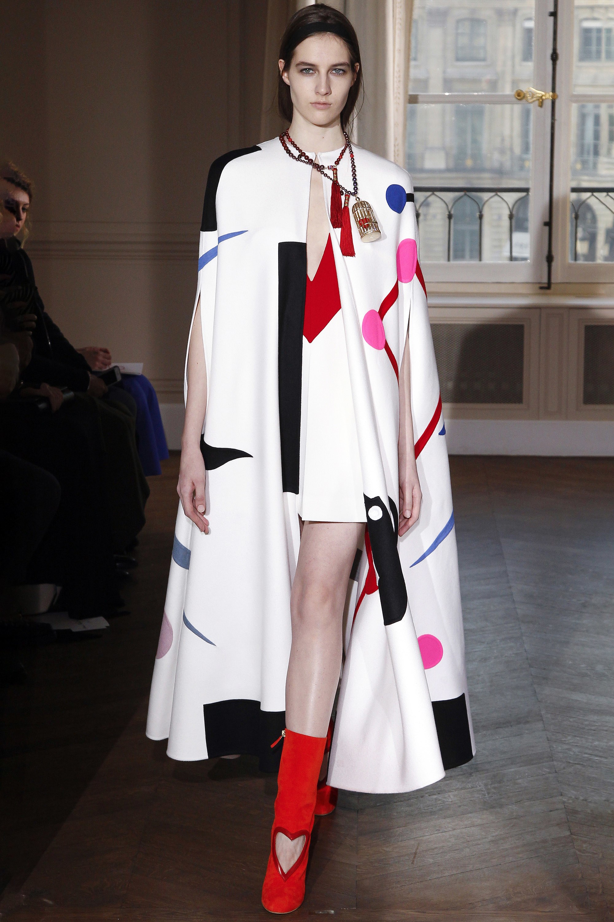
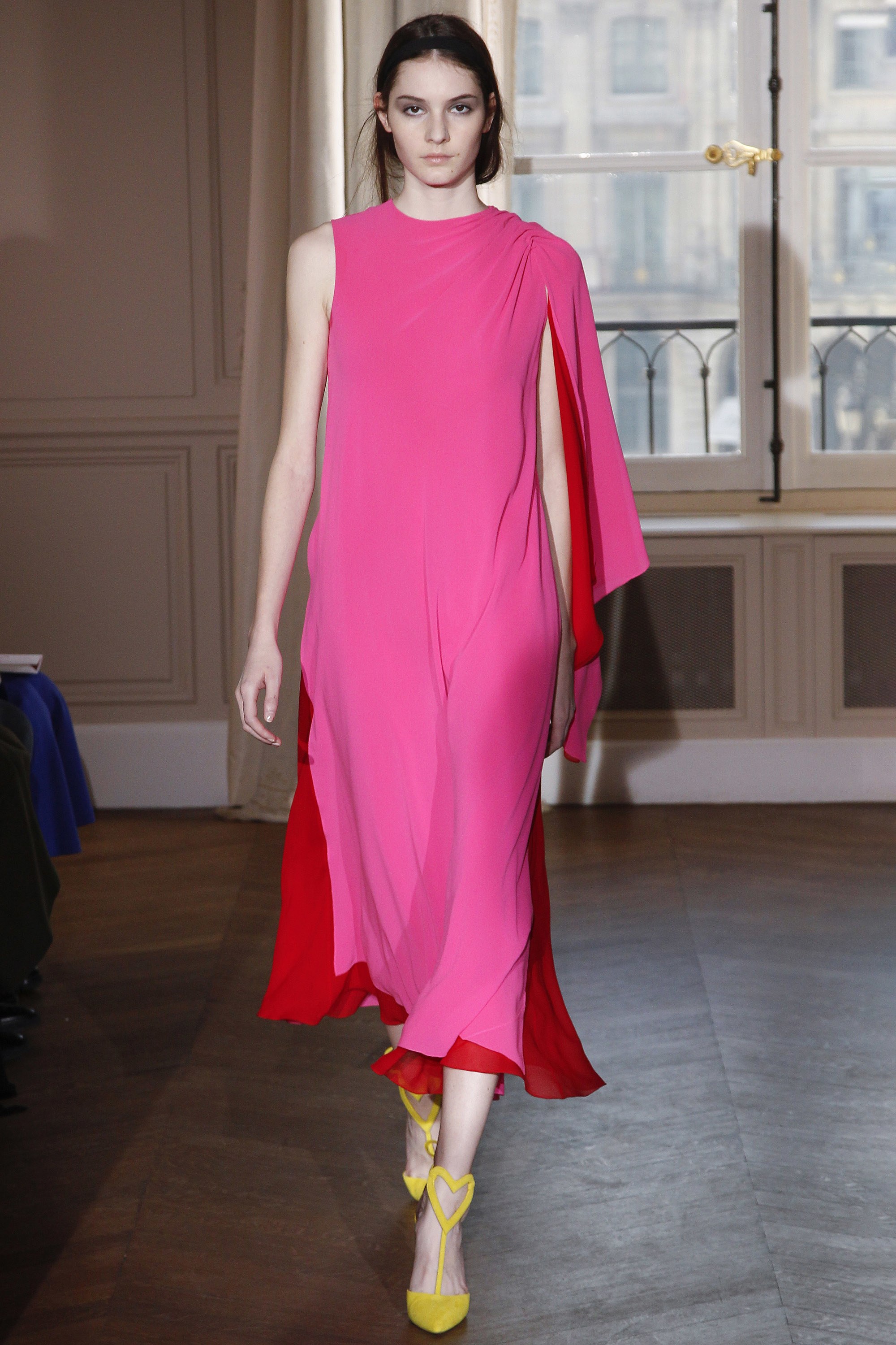
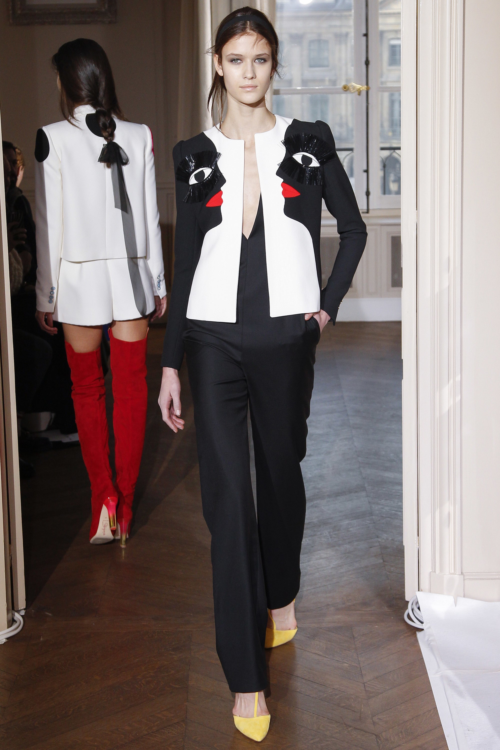
SCHIAPARELLI: Wearable Architecture
When I first laid eyes on this collection, I immediately felt that each look acted as architecture for the body. As the models moved down the runway, structures and formations came to life and morphed with each step taken. The color pairings are are pure magic and I'm just loving all the geometric shapes!
DIOR: Fantasy at Play
Haute couture is theatre. It's about making a statement. The creator imagines a women in the piece, pondering where she will go, who she will see and how she feels in it. Here, Dior's Maria Grazia Chiuri took us on a journey through a whimsical garden set at the Musee Rodin where her imagination revealed free-flowing, ultra-feminine masterpieces straight out of a modern-day fairytale.
CHANEL: Classic & Current
Last, but certainly not least—Chanel. True to form, Karl Lagerfeld did not disappoint. From meticulous embroidery and unexpected sequin moments to archetypal tweeds and chunky wools, the collection is flawless. Like a beautifully composed song, this couture line really moved me and reiterated for me the importance of making an impact and leaving a lasting impression.
{H O R I Z O N} I Have This Thing For Side Tables /
Fendi's collaboration with Italian designer Cristina Celestino for THE HAPPY ROOM, which debuted at this past Design Miami/ still has me smiling. It also has me saying... "Wow! Those tables!" I honestly can't wait to spec these babies for one of my clients. (Notice how they are shaped to mimic a stud earring...brilliant!) I've always felt that accent tables were a great opportunity to be playful and witty in a space—adding that perfect touch of whimsy. Here's a peek at a few other side tables I'm crushing on these days, including the tops of these stunners...
{F A S H I O N} Inspiration Is Everywhere /
Above images via Tomorrowland New York
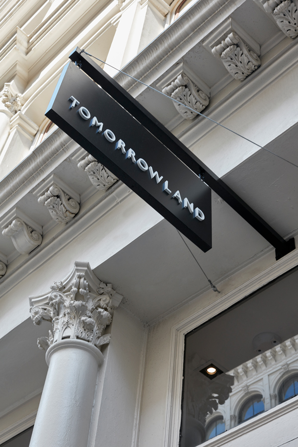
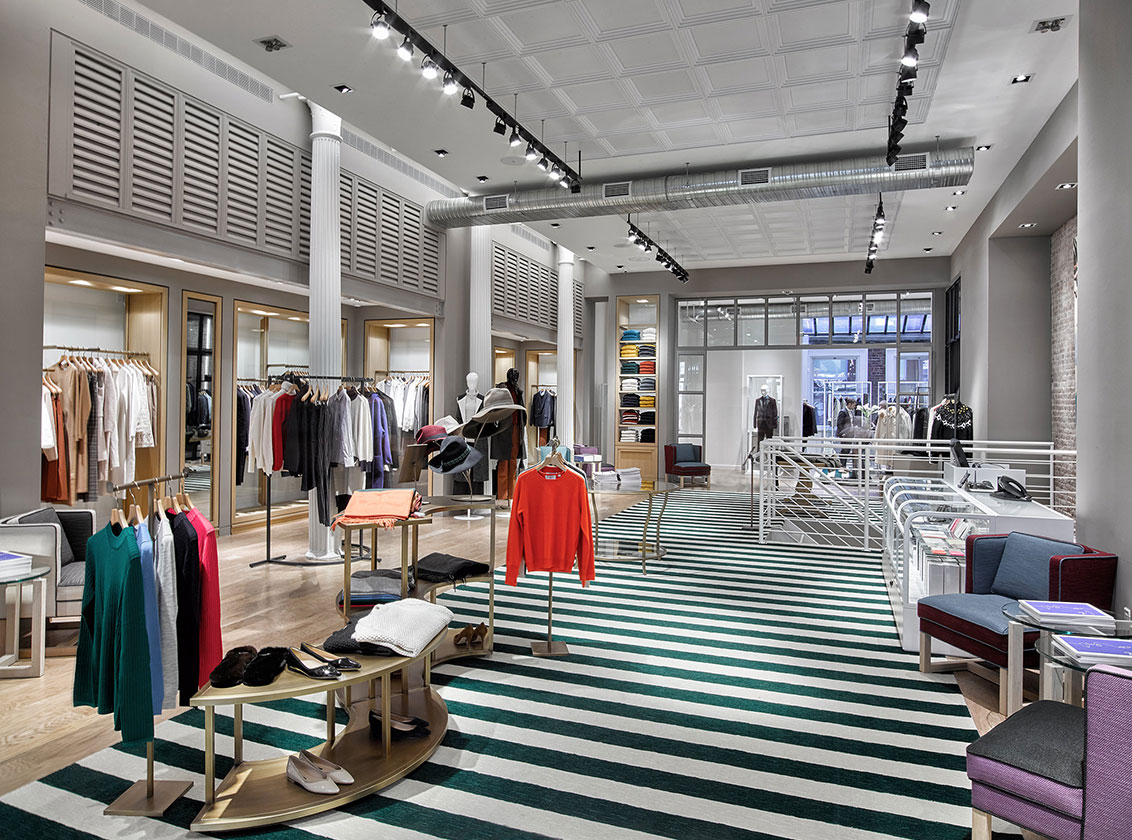
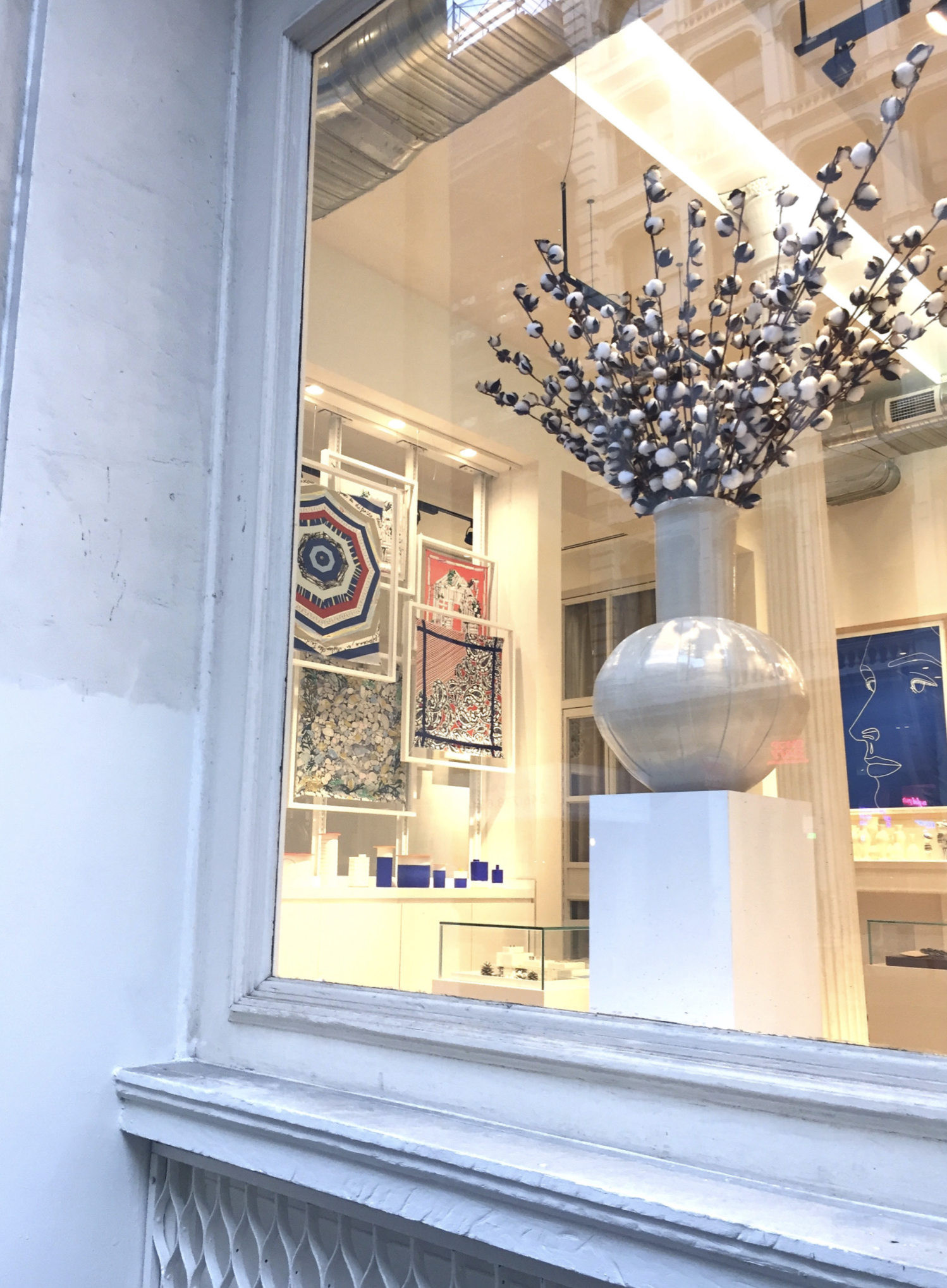
A few weeks ago, Beth and I went into the city to meet with a client. We were walking down Broome Street in Soho and just as we were about to pass by Tomorrowland, a beautiful art display caught my attention and we just had to go inside to see it. It turns out the uber-cool Japanese boutique had taken its collection of scarves and artfully suspended them in frames as an art installation. I'm constantly inspired by fashion and the intersection of design in all forms, and seeing these silky, wearable works of art were no exception. Not to mention the great design books, sartorial eye candy and chic jewelry all housed in a really fun space. My creative wheels have been turning ever since!
{R O A M} Chic Eats /
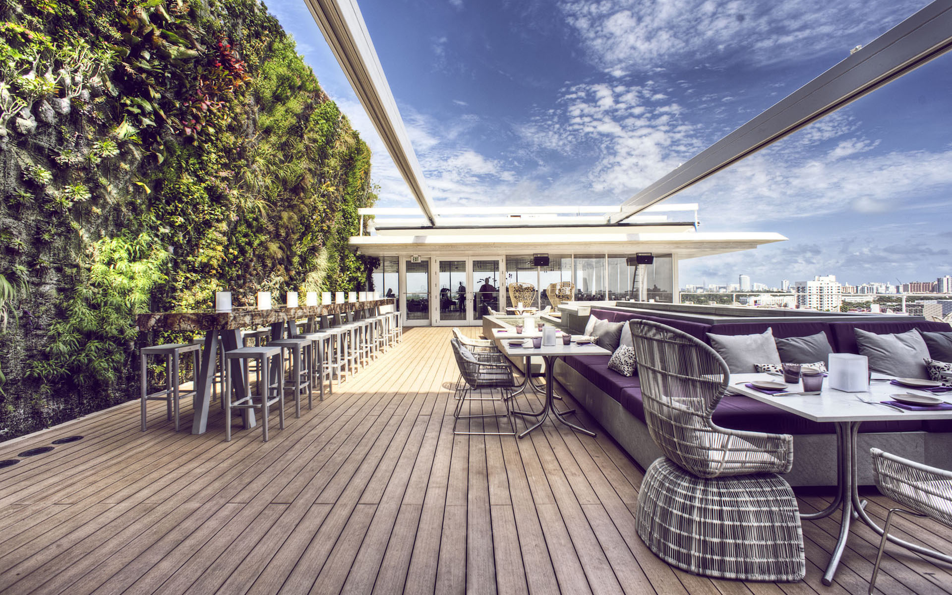
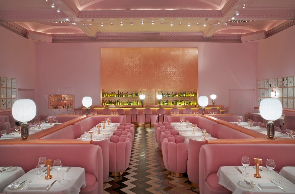
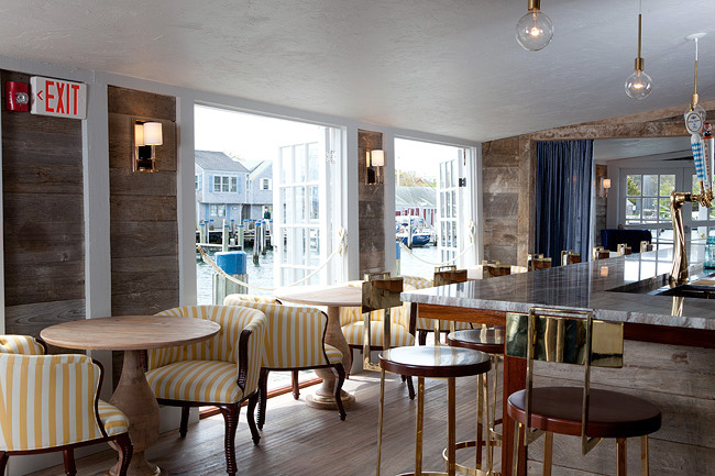
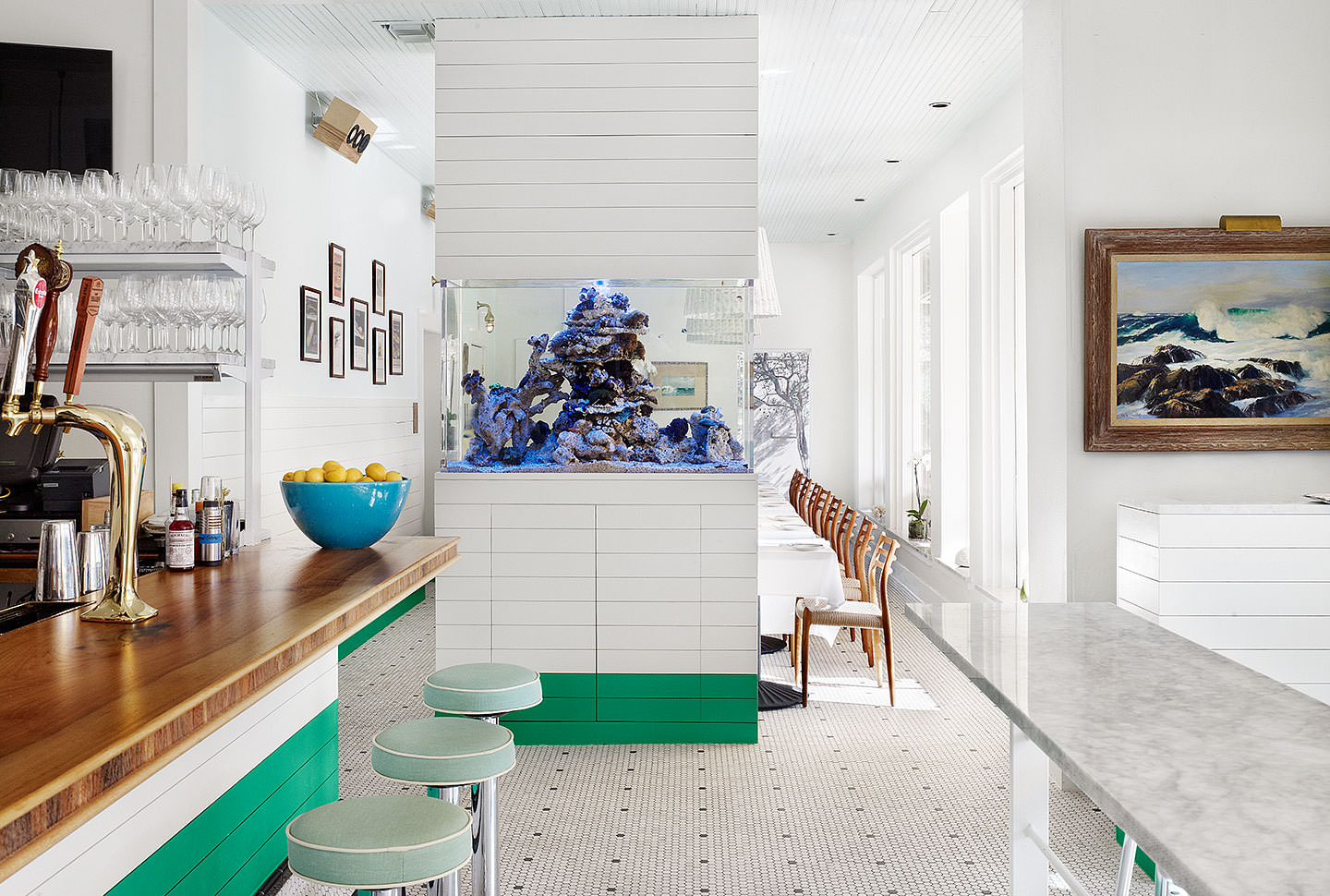
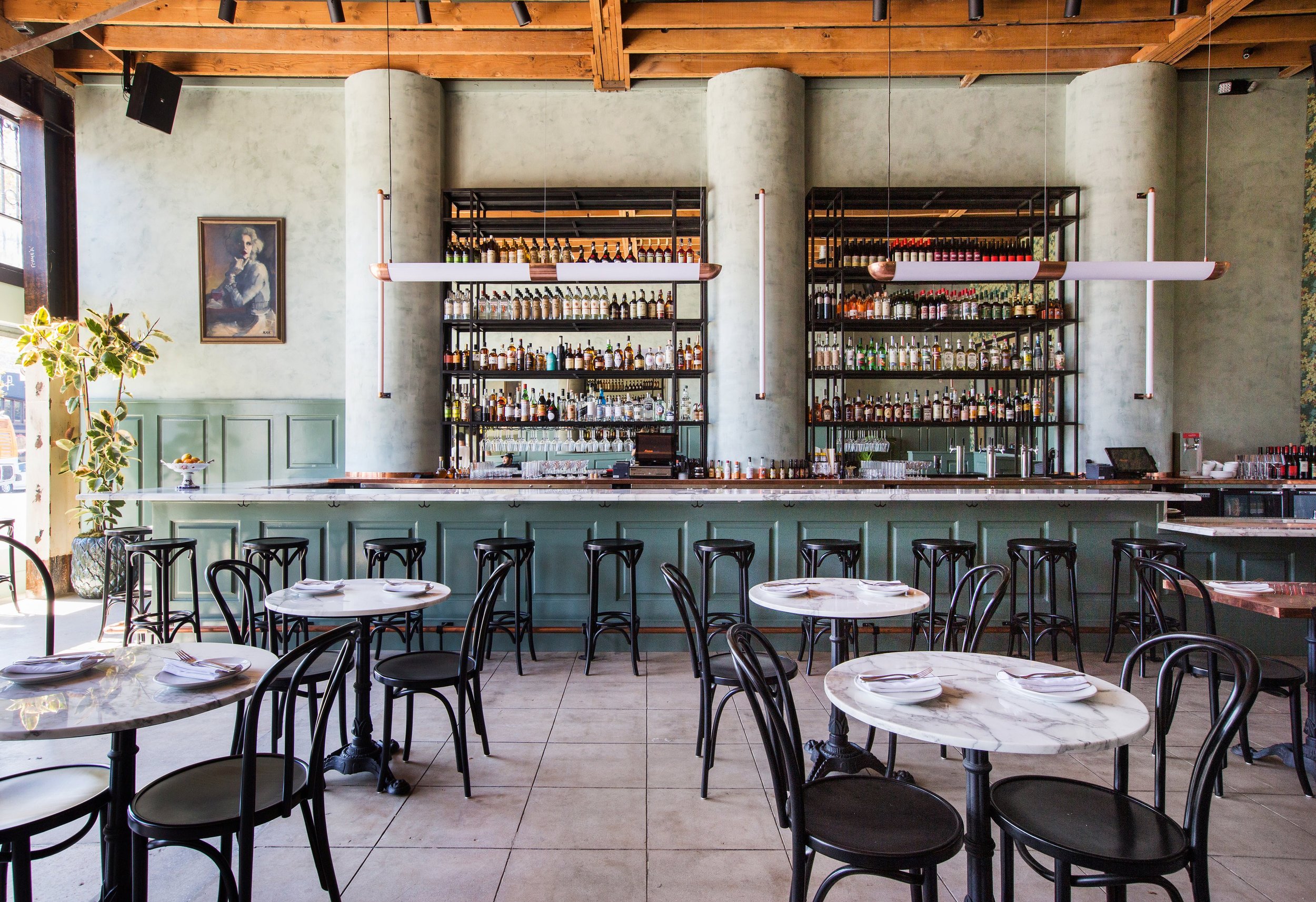
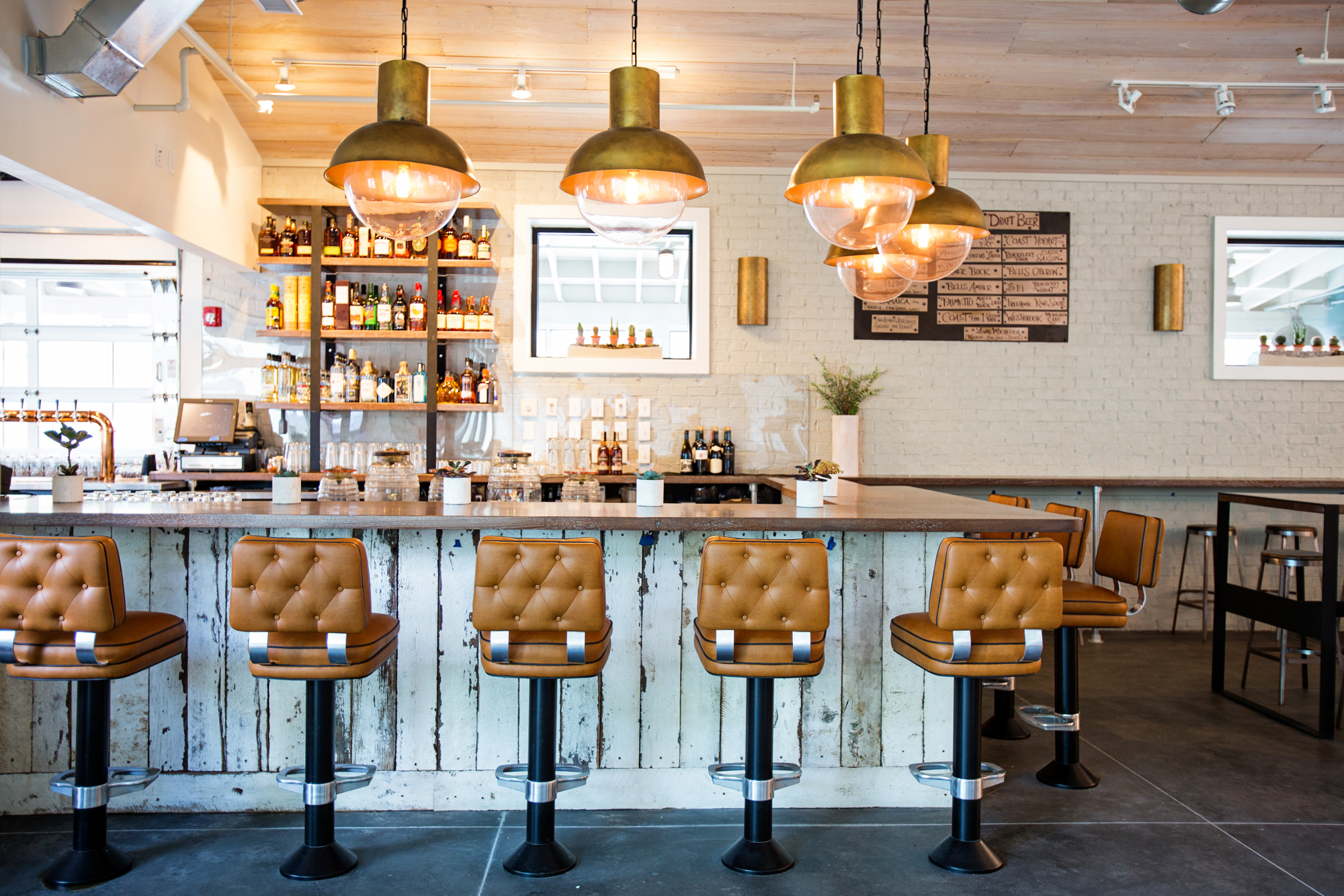
I don't know about you, but I'm all about the ambiance when it comes to choosing a restaurant—especially when I'm traveling. I make it a priority to visit high-design eateries wherever I am and I've come across some real beauties. From The Musket Room in Manhattan to The Jane in Antwerp, Belgium (shown above), these chic restaurants satisfy both palate and palette. Check out a few of my favorites and consider their inspiring decor the amuse-bouche to their delectable fare...
And, like the rest of the world, I'm so mesmerized by the artistic geniuses that comprise Netflix food phenomenon docu-series: Chef's Table. These masters truly see food as art and the plate is their canvas—this is certainly an ideal that resonates with me and my approach to interiors. Here's a peek at Season 2...
{H O R I Z O N} Kinetic Energy: Mobiles + Pendants /
Image via Hotchkiss Mobiles
I have always been attracted to kinetic sculptures—to their movement, their energy, their artistic nature. I fell in love with the art of Joel Hotchkiss after buying one of his mobiles from the Guggenheim Store in NYC. After researching more of his work, calling him and getting to know him on the phone, he made several custom pieces for me. I then had him make eight pink sculptures for a Pink Aid fundraiser two years ago, and they were a huge hit. Today, I still love his work just as much, if not more, and I’m happy to say I can now call him a friend.
Here are a few swoon-worthy light fixtures whose grace and sculptural quality remind me of mobiles.
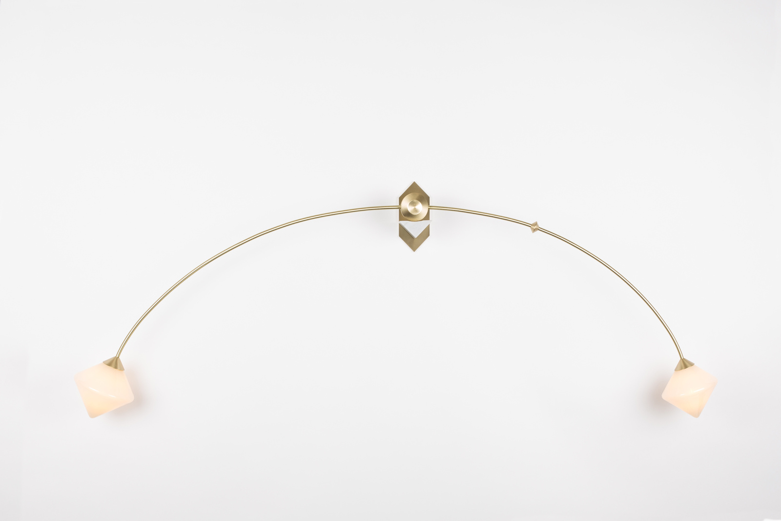
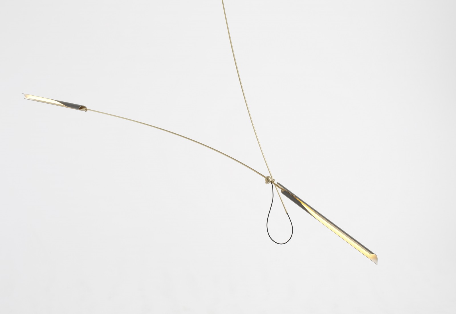

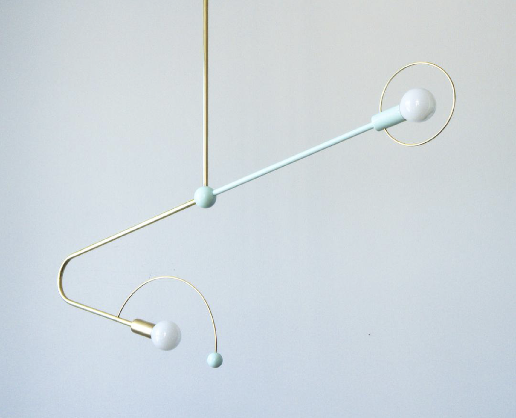
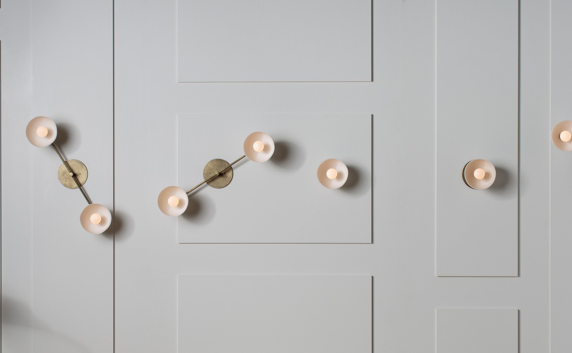
1. I love everything Bec Brittain does, but her Themis 68 sconce in brushed brass with white marble and ivory glass is extra special, and the arch gives it that mobile-like movement. Image via
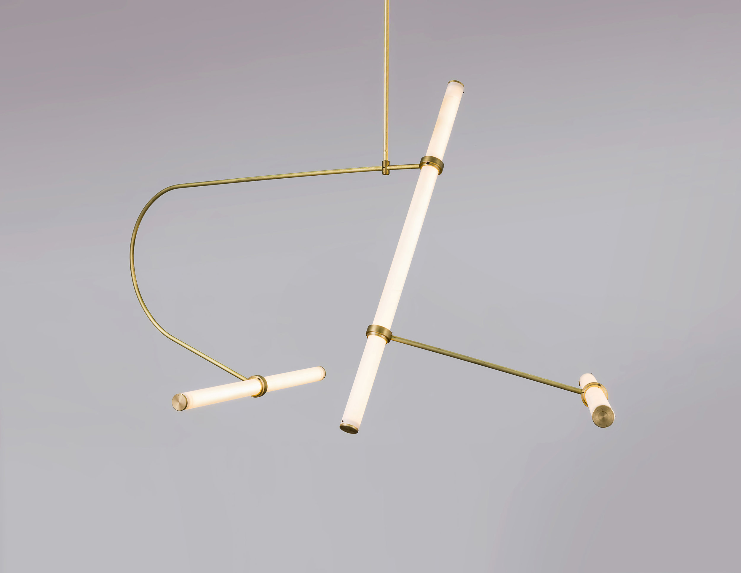
2. Talk about kinetic energy. Naama Hofman's Tube Pendant Collection has so much flexibility, with brass arms and LED-lit acrylic tubes that can be reconfigured into different arrangements. Image by Uri Grun via
3. The OTTO Double fixture from David Weeks Studio might be a bit more linear than the traditional mobile, but the delicateness and arc in its form still conjure the same visions. Image via
4. Örsjö gives the best description of its Decostick pendant: "a modern chandelier flirting with the 1930s." JV Arkitekter designed the fixture as part of a renovation of the Hotel Riviera Strand in Båstad, Sweden. It allows for different strengths of luminosity to emit from the spheres verses the spotlight, so there's movement even in the light itself. Image via
5. Jean-Pascal Gauthier. An instant favorite when I discovered his sculptural, mobile-like lights. They're minimalist and avant-garde at the same time, and the inspiration he draws from Calder is clear. Image via
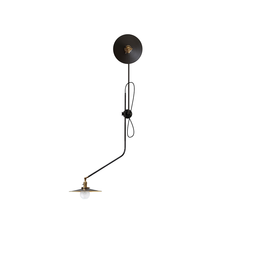
6. Workstead certainly knows how to create a light fixture as an art piece. Its Bent Wall Lamp is the perfect example. The composition of steel, cast iron and brass keep it industrial and debonair. Image via
7. No mobile-esque post would be complete without including Apparatus. These Trapeze lights are inspired by the dynamics of a circus act, and their seriously fun demeanor comes across especially in Trapeze 1 & 2. Image via
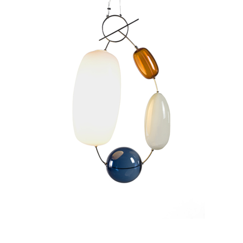
8. And finally, the Hely light by Katriina Nuutinen for Klong, made of colored glass, stainless steel, plastic and LEDs. It looks like a piece of jewelry more than anything else, but the shapely form brings me back to the geometry of a mobile structure suspended in midair. Image via
{I N S P I R E D} The Magic Of Fonts /
I always say that design is a choice. Even when you nonchalantly select a font to use, every letter tells a story about your choices, whether straight or script, chunky or thin, serif or sans serif. Fonts are always catching my eye, so I'm naturally drawn to artists who have captured the art of calligraphy and hand lettering so effortlessly—like Seb Lester, an artist and designer living in England. All videos of him showcasing his talents are worth watching, but here's one of him drawing water calligraphy using water and colored ink. It's mesmerizing!
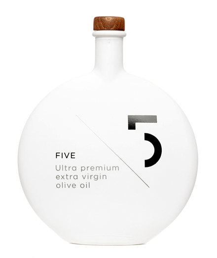
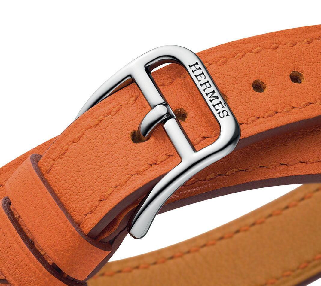
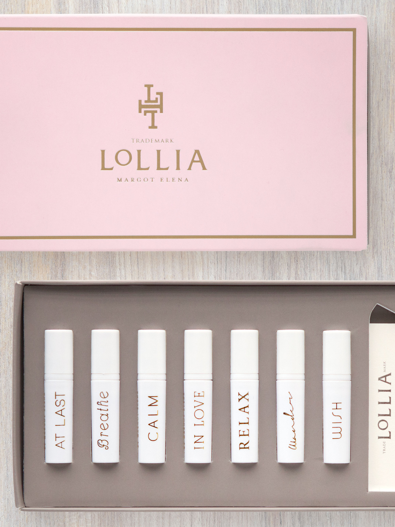
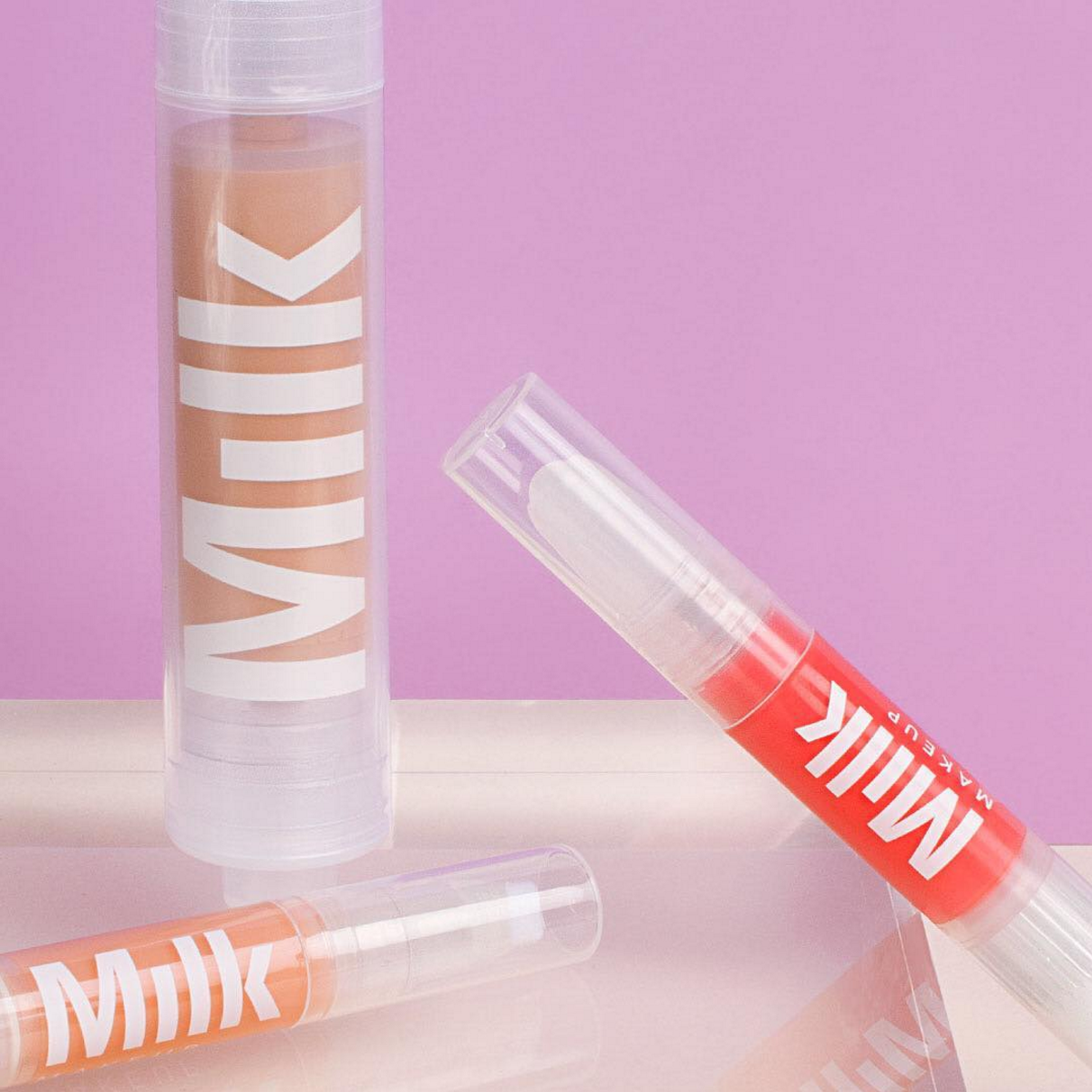
And here are a few brands that I love who know just how important it is to choose fonts that speak to their company philosophies. Take the serif font Hermès uses for example—it's classic, timeless, and instantly recognizable, just like the brand itself.
{I N S P I R E} Come On Baby Light My Fire /
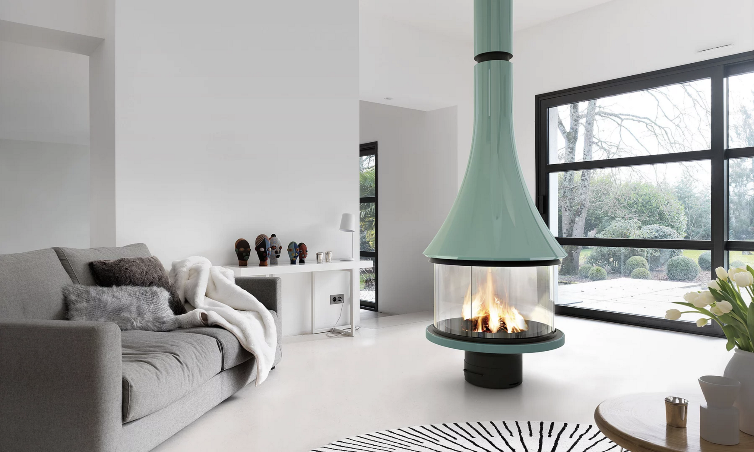
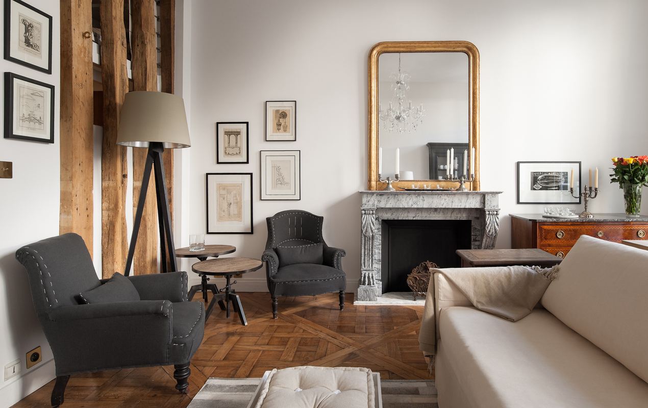
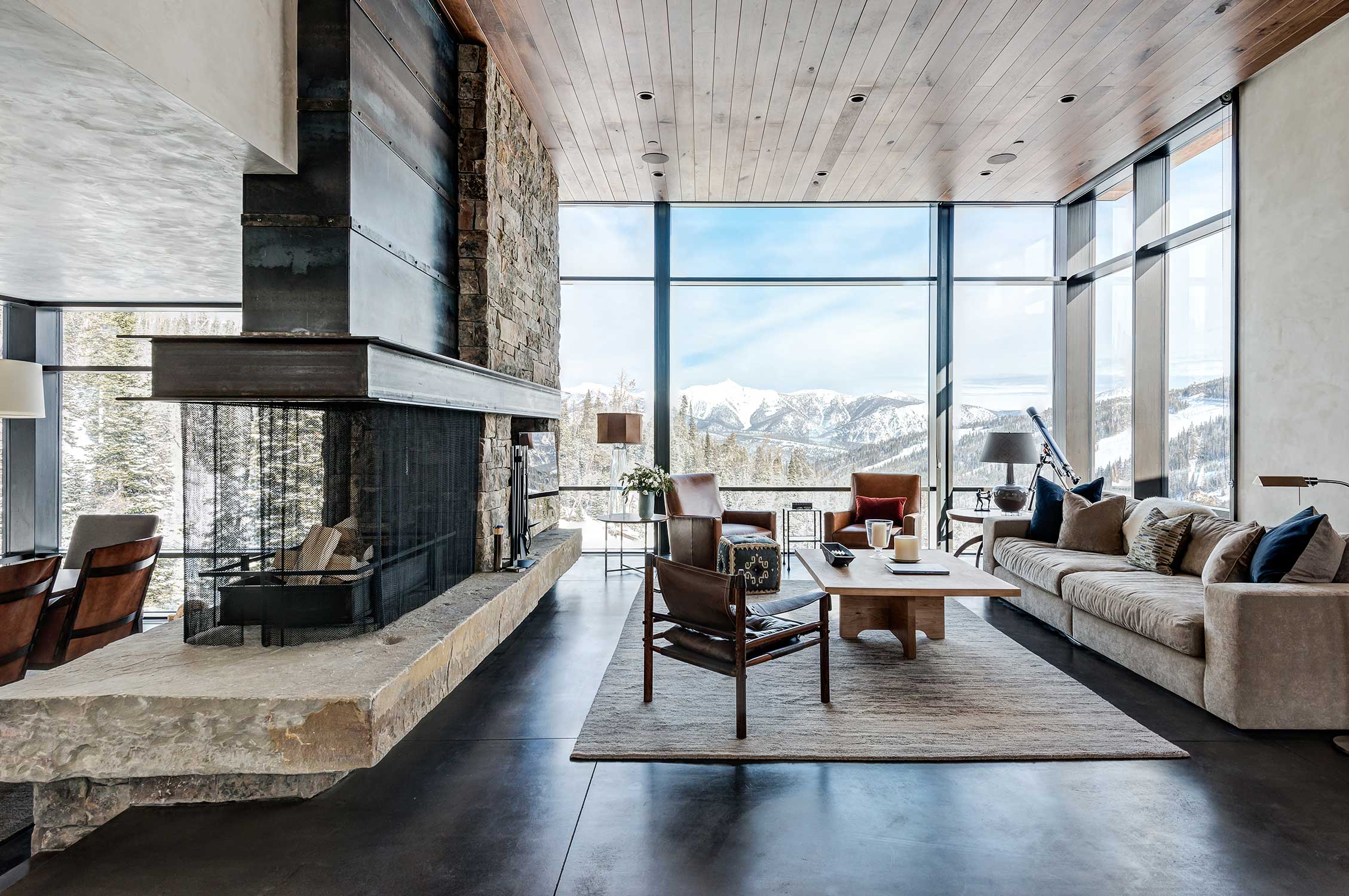
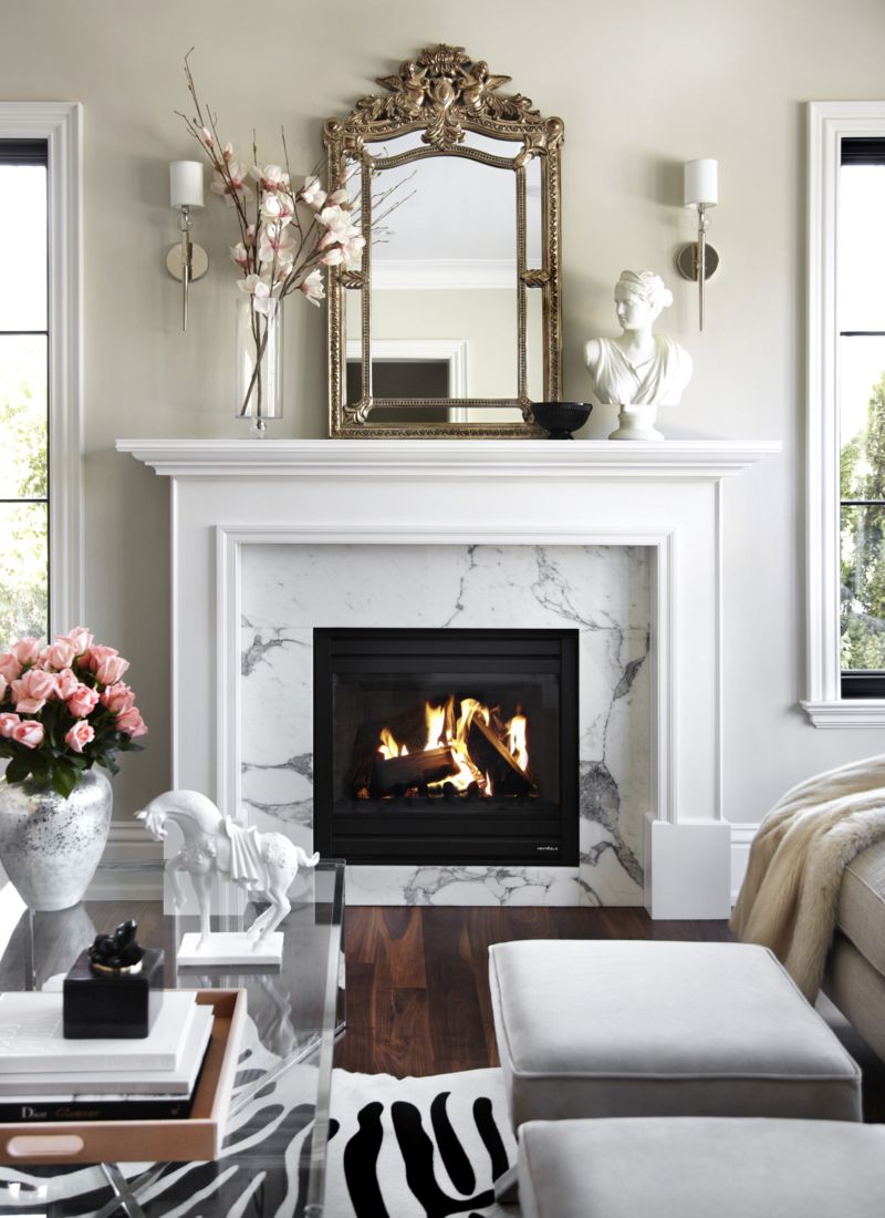
I'm very affected by seasons, and one of my favorite things about winter in New York is coming in from the cold and cozying up to a roaring fireplace with a good book and a cup of hot cocoa. From the always colorful and luxurious Designers Guild to the masterful masonry of Lew French and a modern chalet by Pearson Design Group, just looking at these beauties helps to cure some of this frost bite!
{F A S H I O N} Mish New York: Experiential Jewelry /
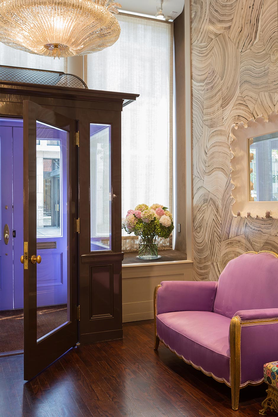
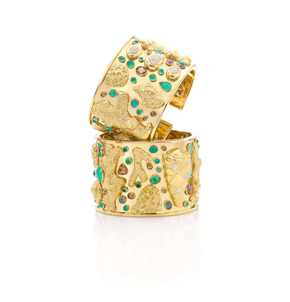
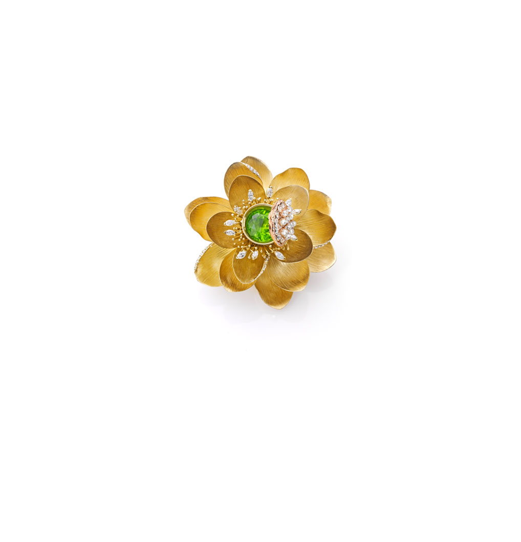
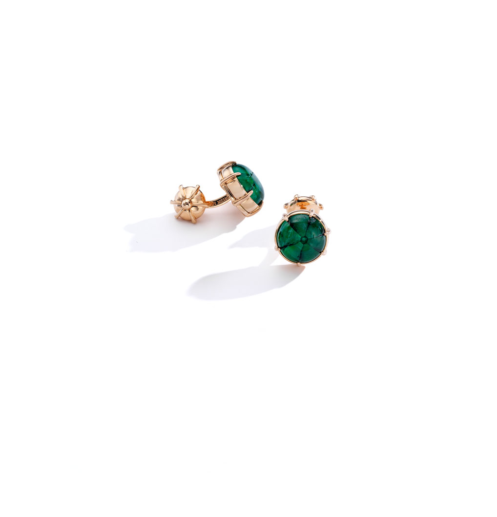
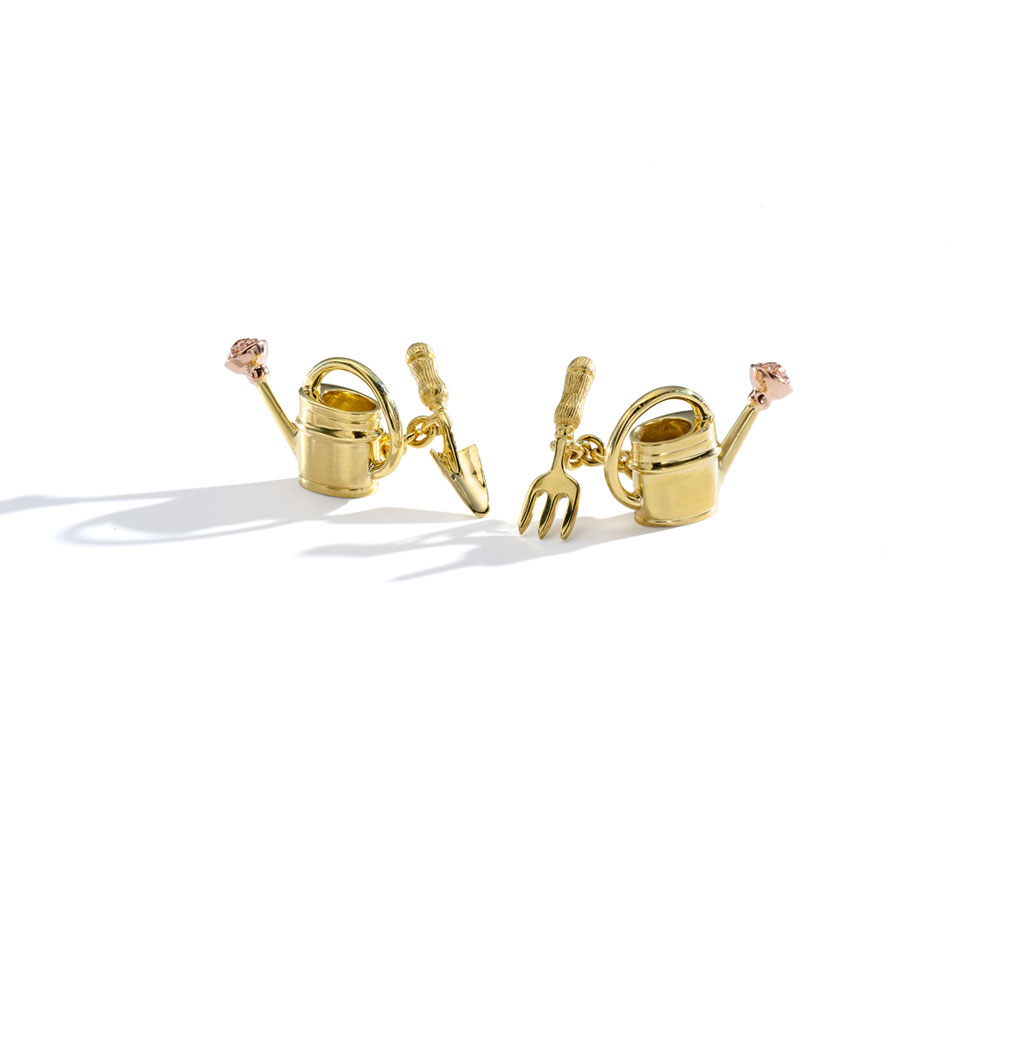
Image credit: Mish New York
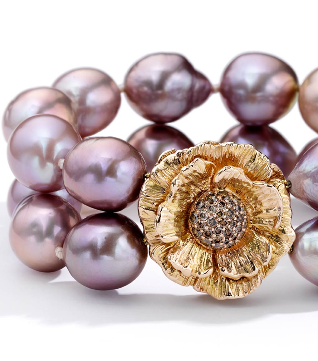
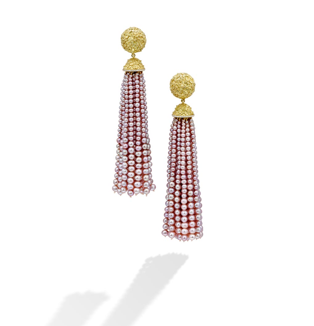
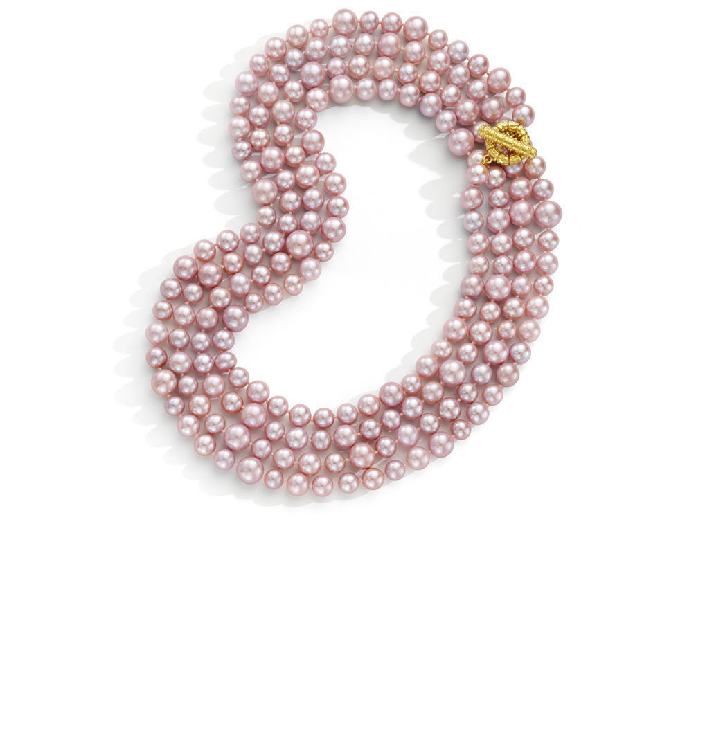
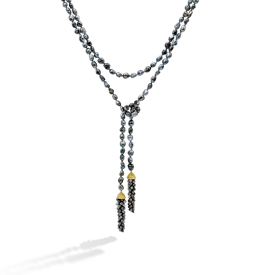
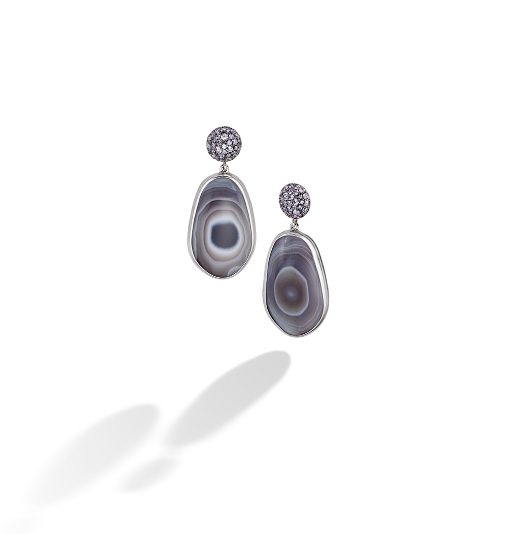
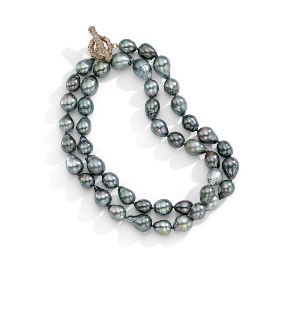
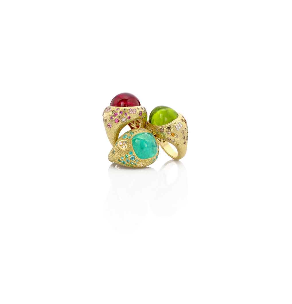
Walking into Mish's 30 Bond Street studio in NYC isn't like shopping for jewelry at just any jewelry boutique. It's an unforgettable experience that speaks to all of the senses. Beth and I paid a visit to Mish a few weeks ago on a trip into the city—the purple door and green facade called to us immediately of course. (With the fashionable charm and historic architecture outside, you'd think you were on Bond Street in London.) Once we stepped inside, the feast for the eyes continued, from the hand-painted malachite mural, to the upholstered walls with nailhead trim, to the jewels themselves, all on display like pieces in a museum. Made with South Sea pearls and precious stones, Mish Tworkowski's fancy and whimsical baubles, bracelets, brooches and more will stop you in your tracks. See for yourself!
{V I B E S} New Year, New Blog /
Photography by Stevin Tuchiwsky via Wit & Delight
Happy New Year everybody! And, welcome to the start of my new design blog, which I'm really excited to share with you all. For a long time I have been compiling an extensive library of fashion and interior finds and cultivating unusual sources of inspiration. I hope you leave with an invigorated creative spirit. So here goes... Enjoy!
With most of the country dealing with arctic chills and negative temps, it's hard to keep my mind off anything other than winter vibes. I really love this second floor landing designed by Jenny J. Norris—those beautiful aged floors, deep navy doors and rich brass accents create such a warm envelop when traveling through the space.
Photography by Genevieve Garruppo
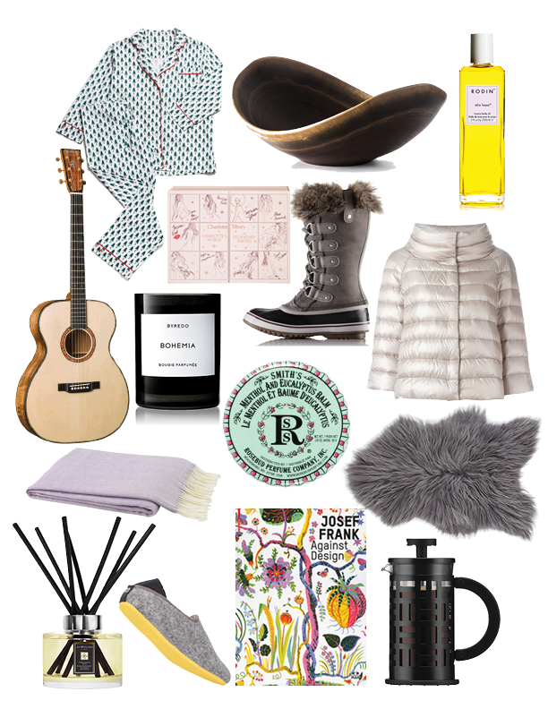
In the spirit of all things cold, I wanted to share some of my favorite plush pieces and bundled-up attire...

